Which?
Expanding the meaning of Which?
- Consumer Advocacy Sector
- Rebrand
- Brand Strategy
- Proposition
- Visual Identity
- Verbal Identity
- Motion
- Brand Guidelines
Which? was trusted but typecast and underused. Best known for product reviews, it was seen as something you visited occasionally, not something you relied on day to day. Its broader value was there, but largely unseen. We were engaged to make Which? more relevant, more useful, and more trusted day to day.
The opportunity: from occasional use to everyday relevance. Behind the scenes, Which? already offered expertise across pensions, consumer rights, and more.
The challenge was making that value visible, usable, and top of mind.
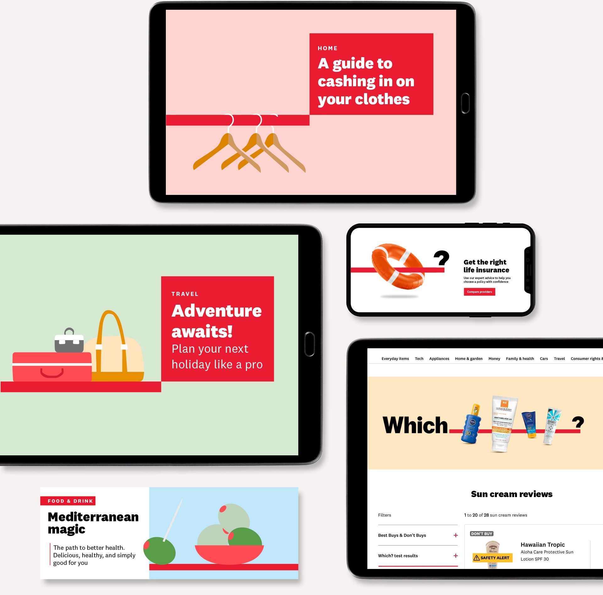
We repositioned Which? as a trusted guide for everyday decisions. From a review platform to a brand people turn to regularly – for both small choices and major life decisions.
From questions to answers
We shifted the meaning of Which? from uncertainty to clarity – making it a destination for trusted answers.
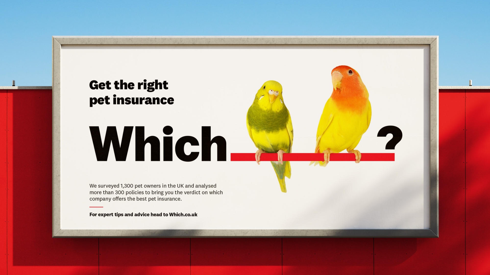
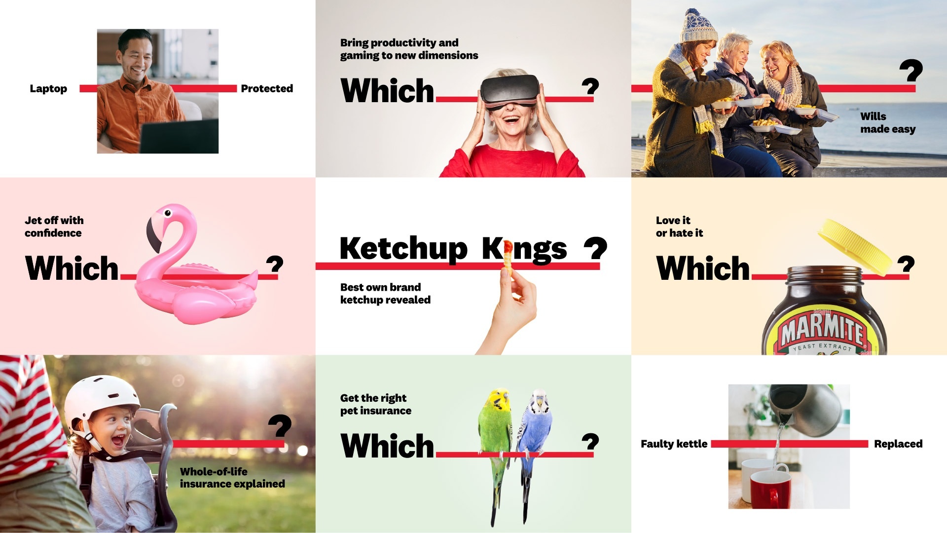
OWNING ANSWERS
We opened up the Which? logo to create space for real questions and clear answers.
A simple shift that made the brand more relevant, more useful, and more active.
The question mark became a gateway – not just asking questions, but answering them. Reinforcing Which? as a brand people can rely on.
“I’m extremely proud of the results. The brilliant ODA team gave us a clear strategy that the whole organisation has been able to get behind, alongside a fresh modern brand world.”
Kat Chinnock, Head of Brand and Communications Planning, Which?
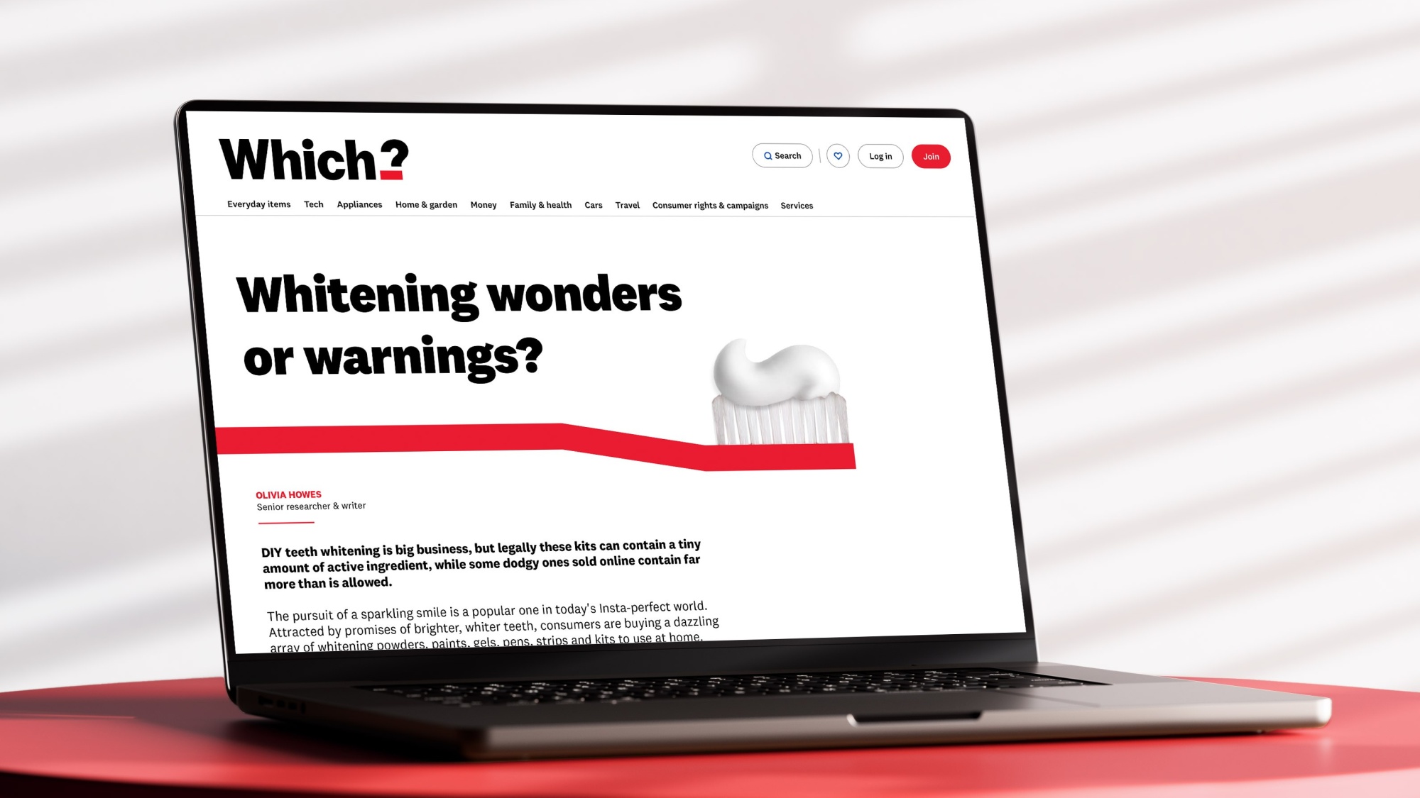
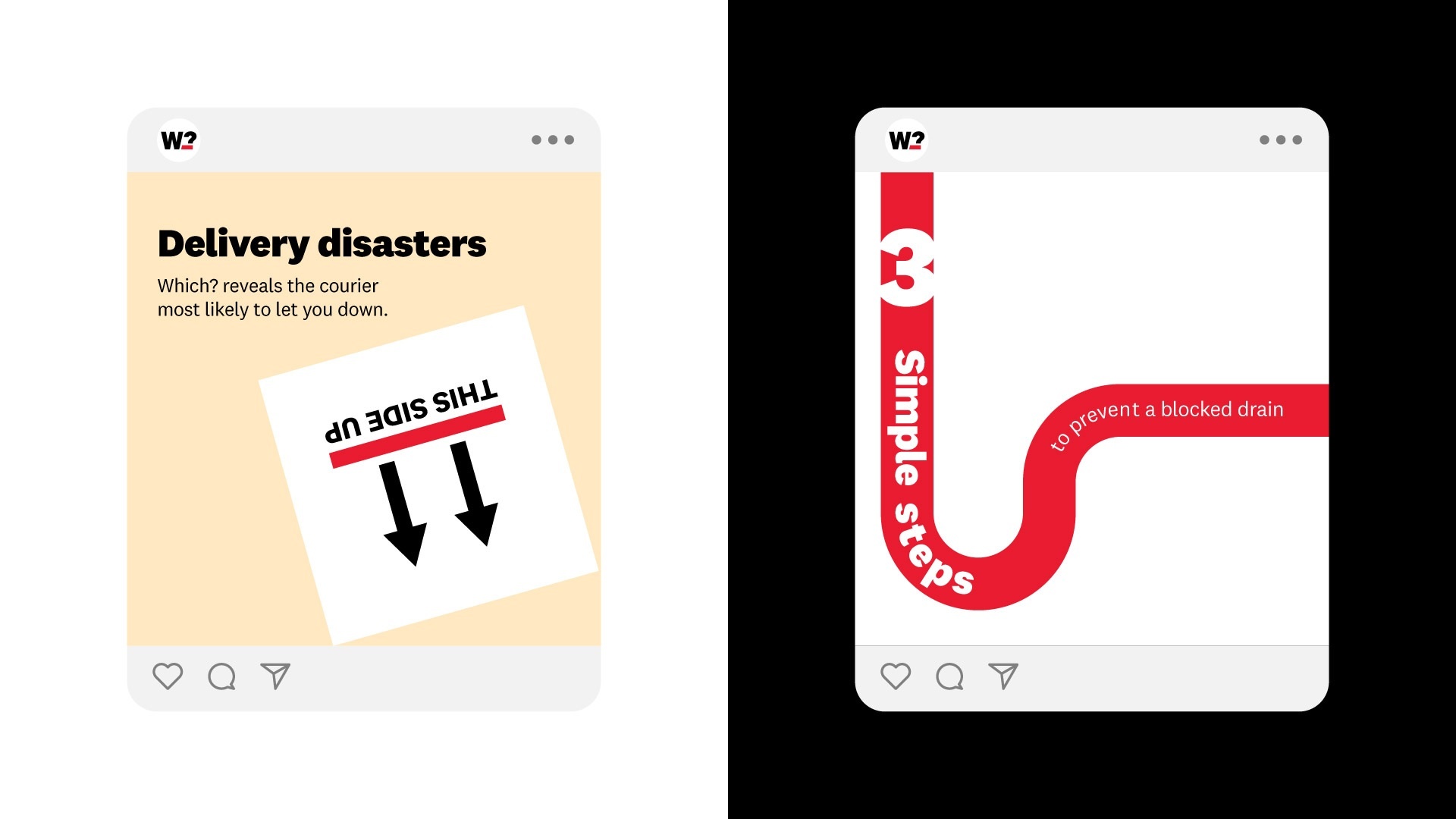
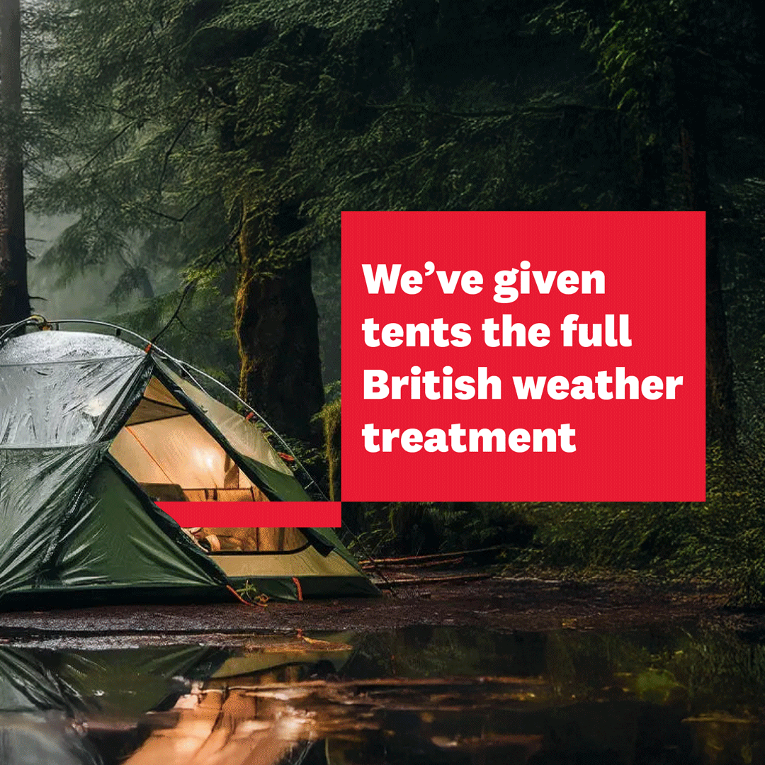
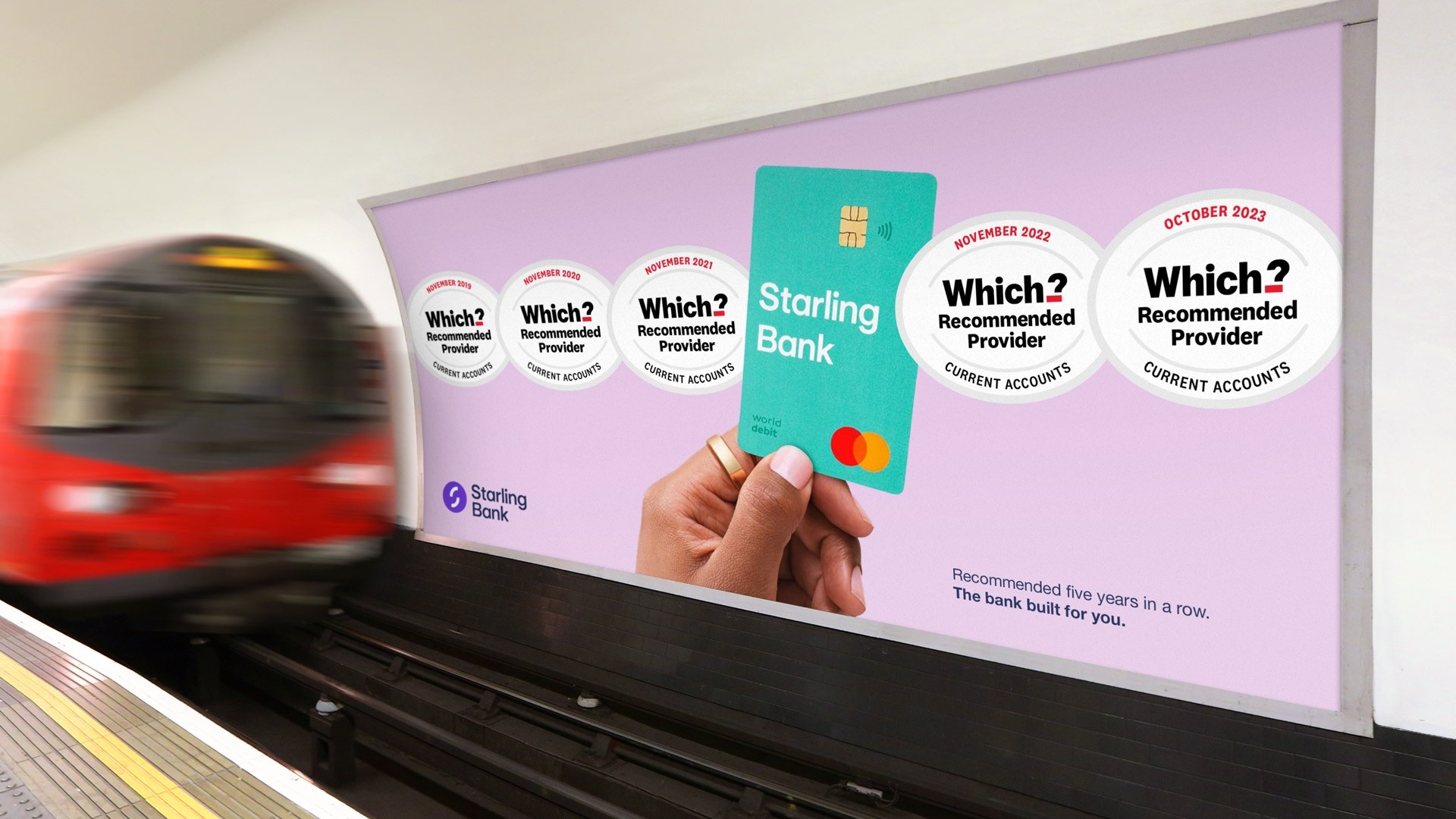
A SYSTEM BUILT AROUND CLARITY
The red line became a functional asset – cutting through complexity, highlighting key information, and guiding users to decisions.
“We’ve given Which? a massive shot in the arm! With great insight, great strategy and great creative, ODA have brought the brand to life.”
Neil Caldicott, Brand and Communications Director, Which?
THE POWER OF NEUTRALITY
We reinforced Which?’s independence through a tone and visual style that feels clear, human, and unbiased.
Approachable, but authoritative.
“It’s been a brilliant experience working with our talented and passionate agency to move the brand into a place where it’s now seen as more modern and relevant than ever.”
Kat Chinnock, Head of Brand and Communications Planning, Which?
Impact
-
+8% increase in perceived modernity
-
+4% increase in helping customers make confident decisions
-
+4% increase in making customers’ lives easier