The Royal Automobile Club
Modernising an iconic club for a new generation
- Hospitality Sector
- Rebrand
- Brand Strategy
- Brand Identity
- Digital Design
- Messaging
- Tone of Voice
- Photography
The RAC had become defined by one thing, and it was
holding it back.
Once a club built on progress, it had become narrowly associated with motoring. It was respected, but increasingly seen through a single lens. The relevance was fading.
We were brought in to reposition the brand, broaden perception and restore momentum. Not by rewriting its heritage, but by reconnecting the Club to what it had always stood for: progress.
ALWAYS MOVING FORWARD
The Club was founded on curiosity, ambition, and forward motion.
Tradition here isn’t about standing still.
It’s about carrying momentum forward.
“ODA took some considerable time to research and understand the culture of the Club and ensure that the rich heritage was sustained in a creative way”
Miles Wade, Club Secretary, The Royal Automobile Club
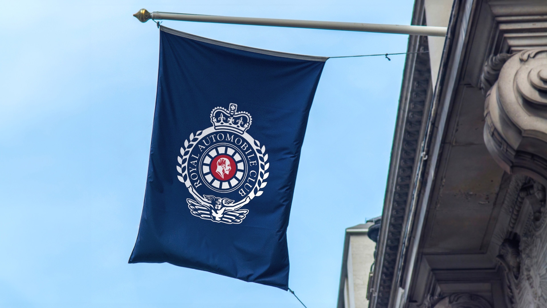
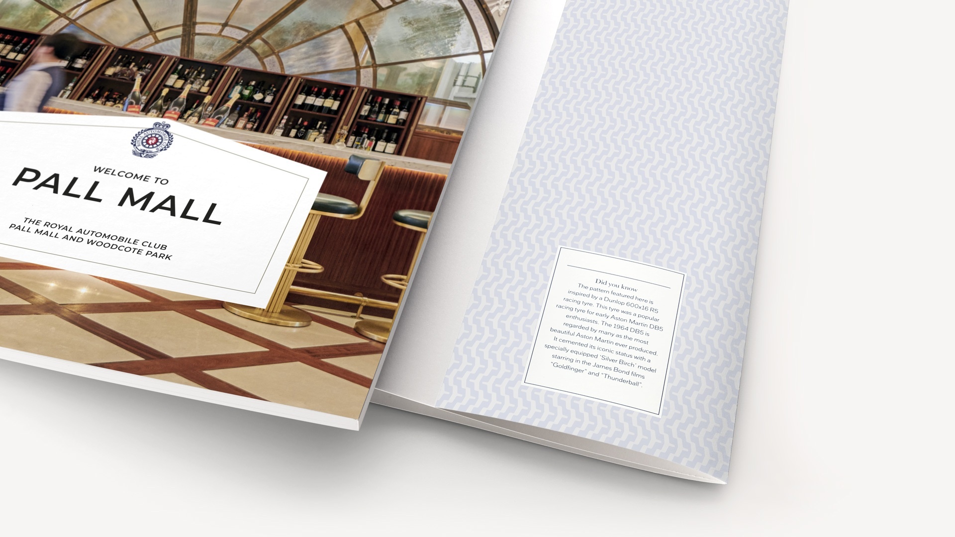
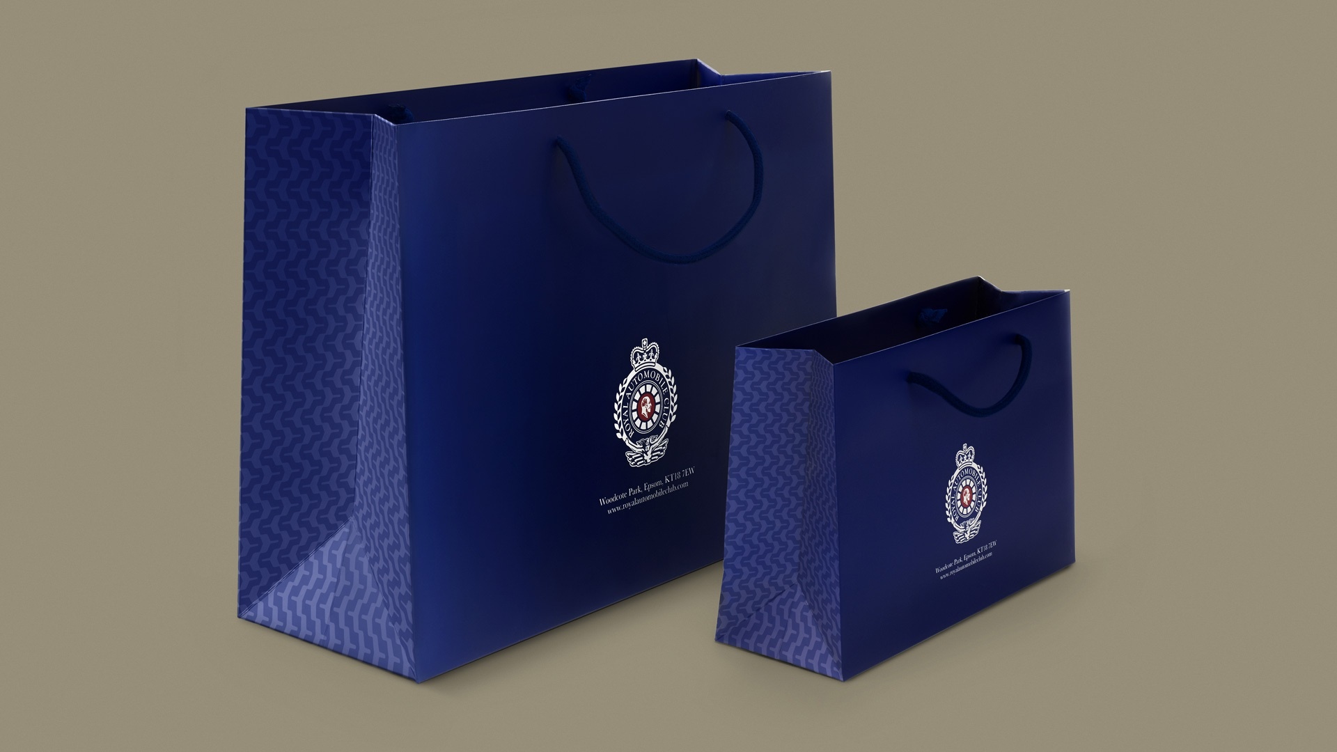
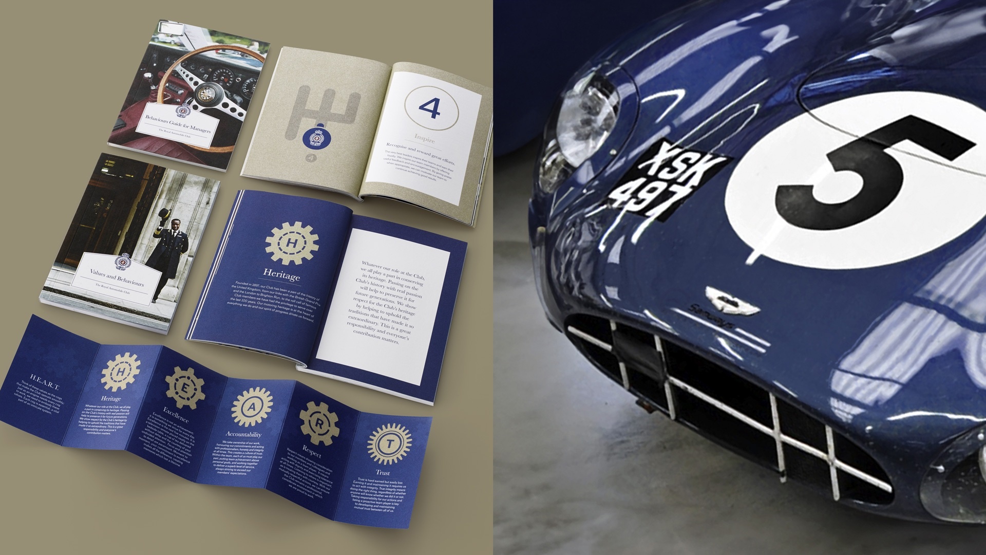
REINSTATING THE WHEEL
We restored the original car badge, placing the wheel back at the centre. A symbol not of nostalgia, but of progress. A mark that signals movement, ambition and continuity.
FORWARD MOTION
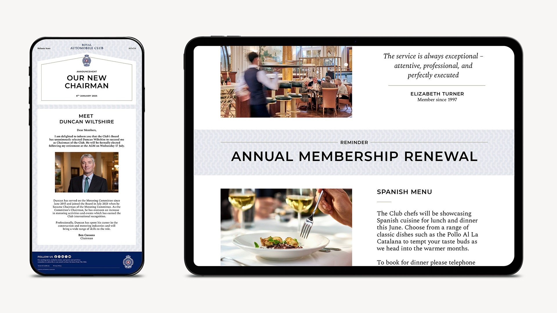
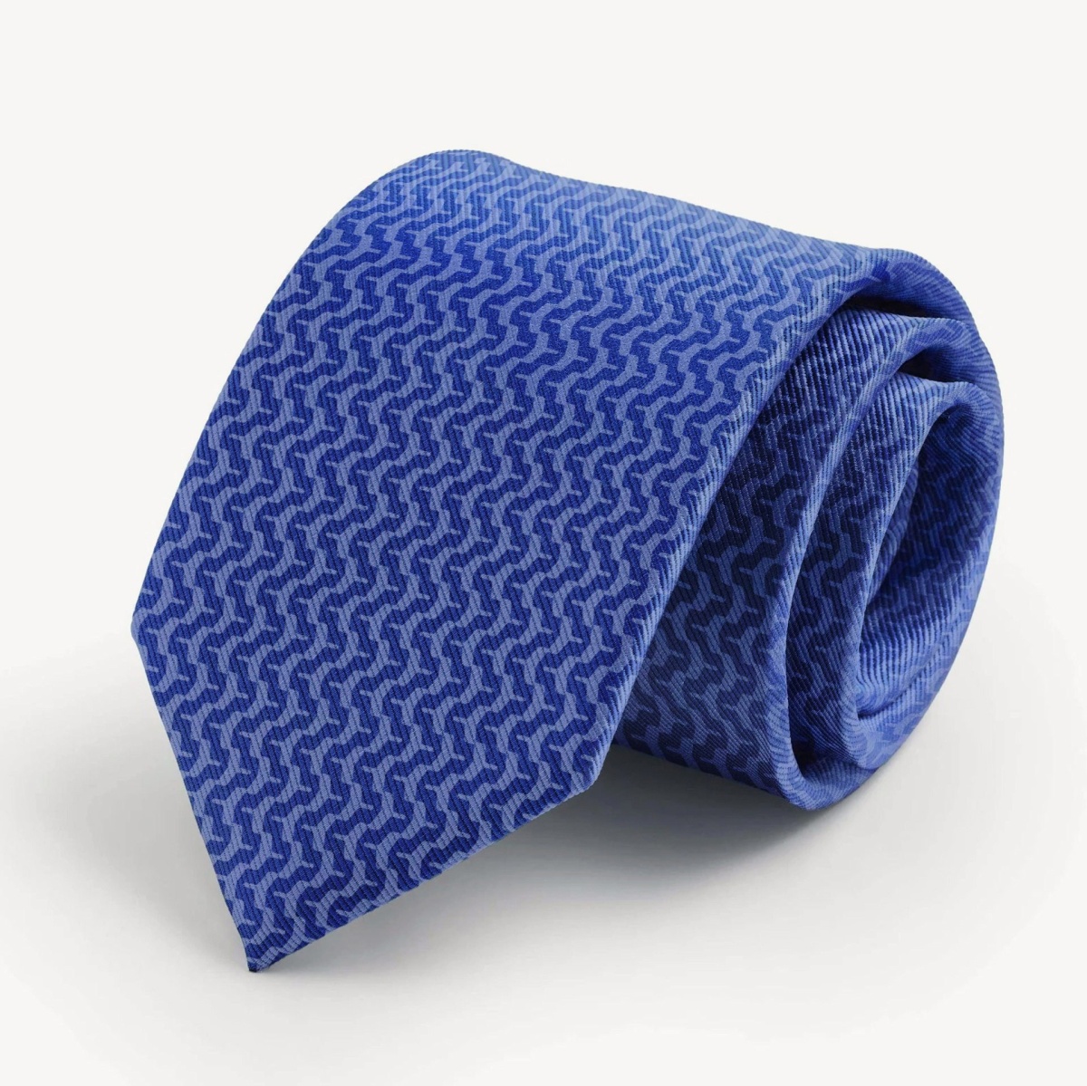
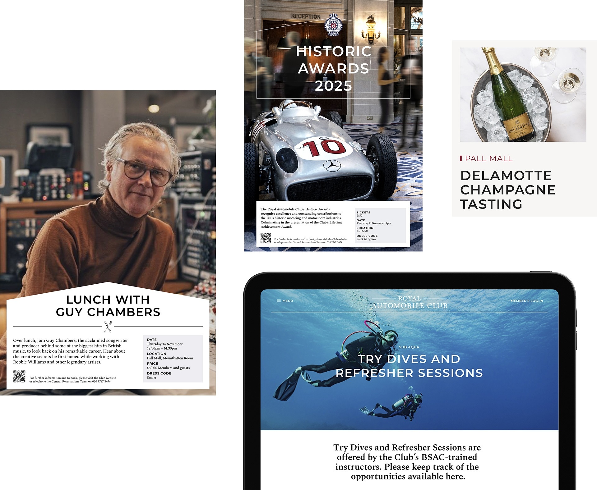
We rooted the brand identity in the Club’s motoring heritage, but expressed it through craft rather than cliché.
Precision. Texture. Detail.
The tyre tread from the Monte Carlo rally-winning Mini was distilled into a refined pattern, unifying communications with subtle confidence. A nod to history, and meaning and rendered with restraint.
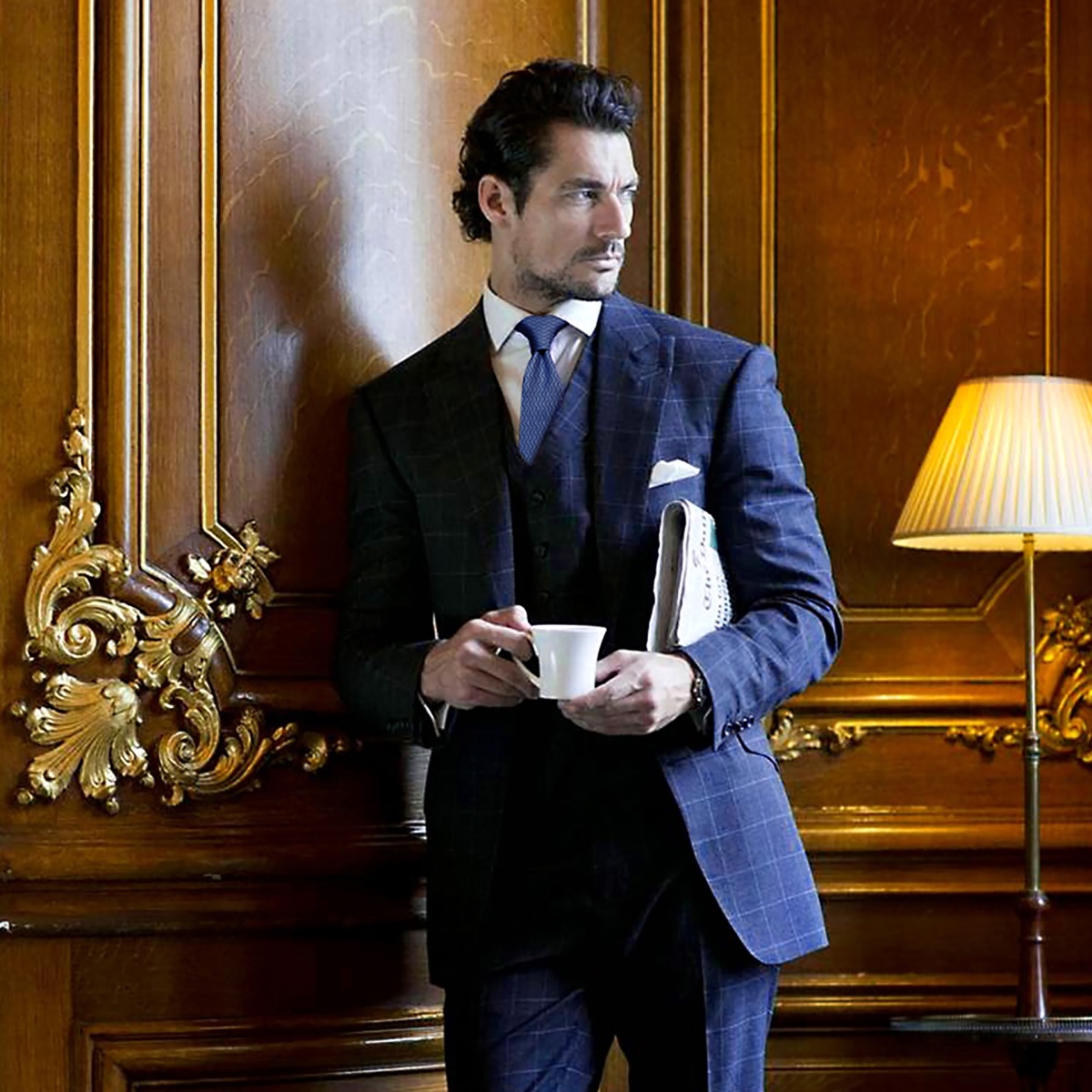
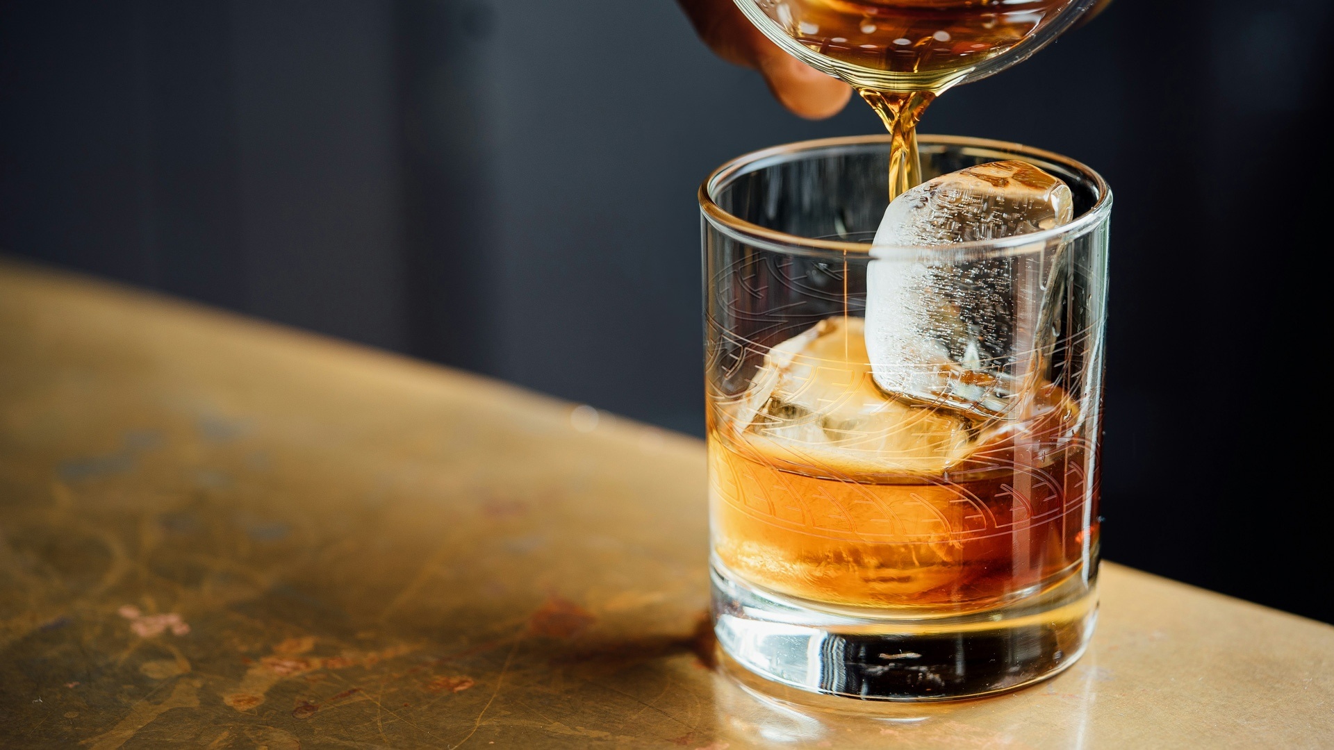
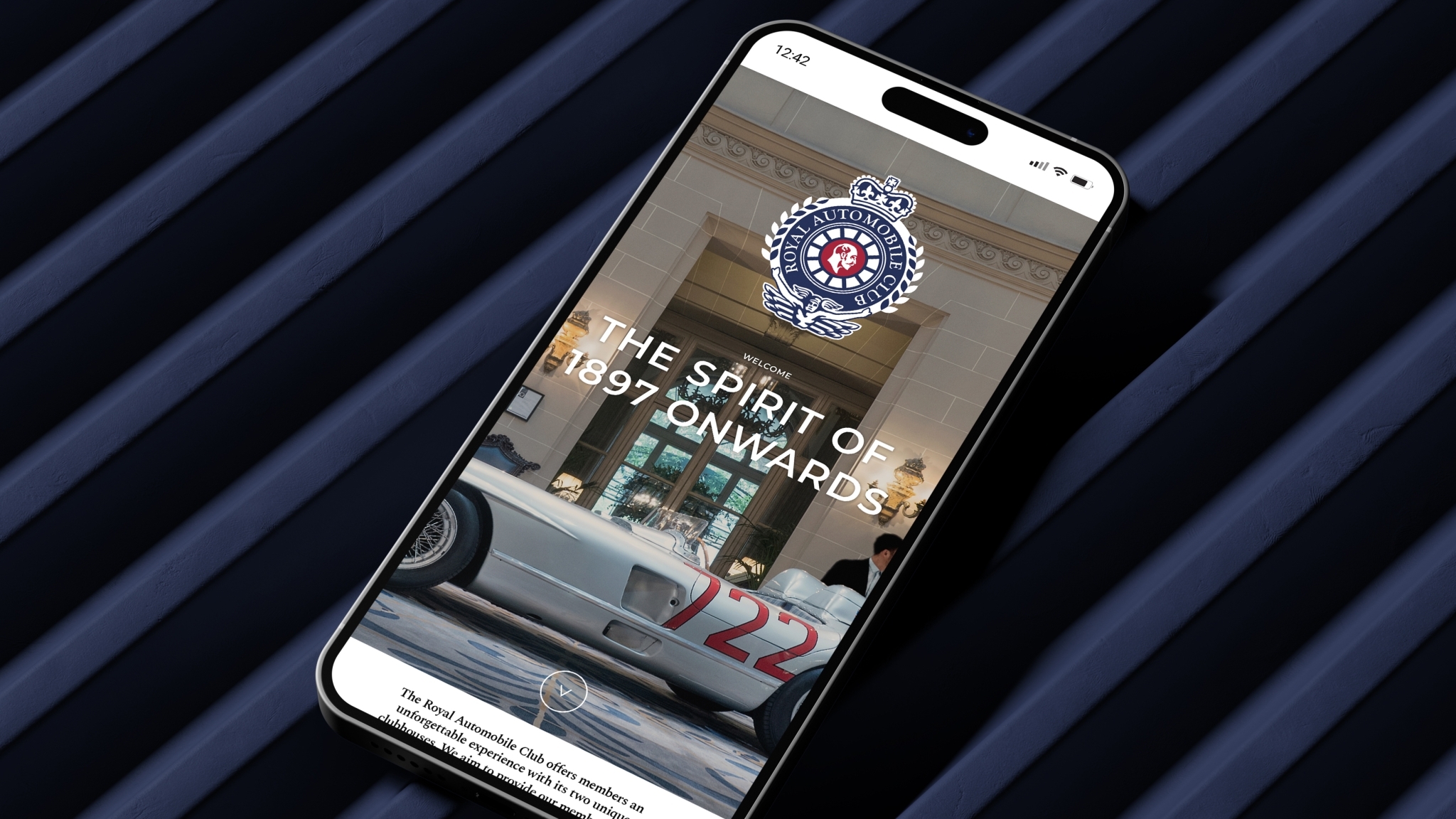
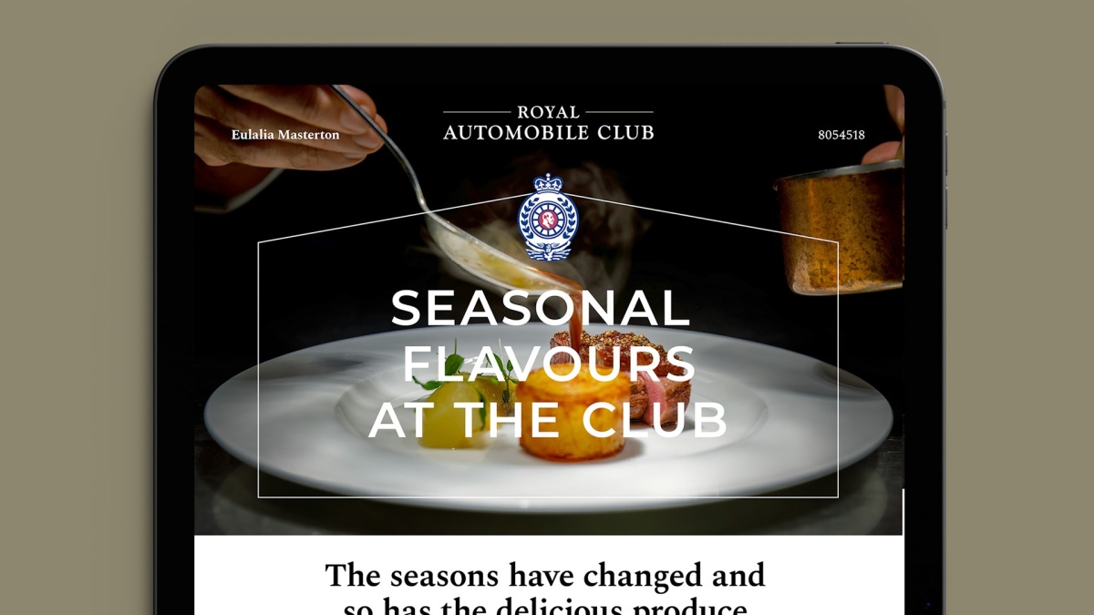
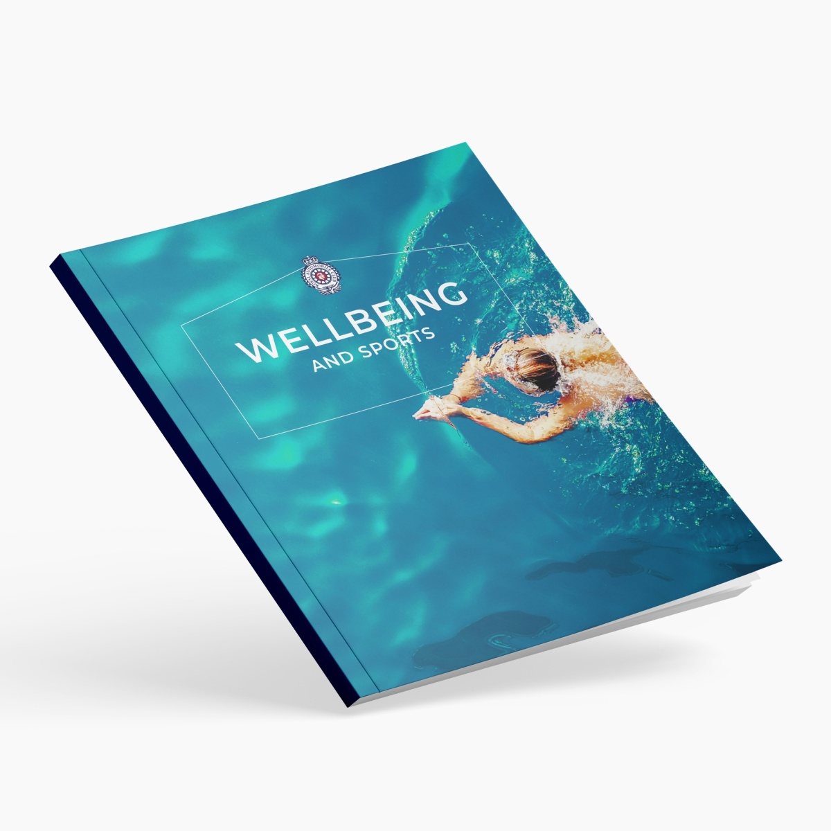
DRIVING ASPIRATION
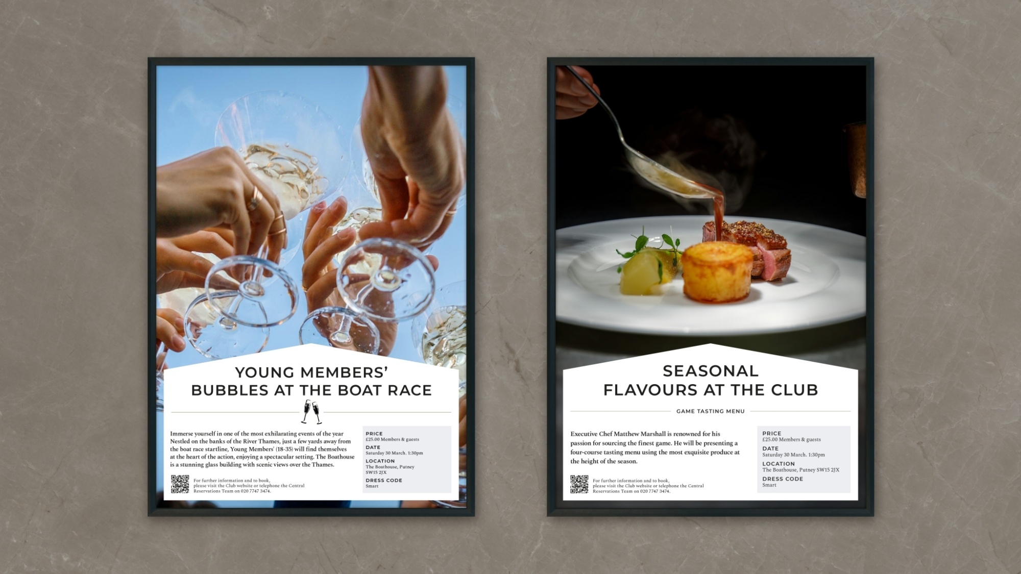
Photography shifted from documenting place to capturing atmosphere. Moments of occasion that captured texture of place and anticipation.
The RAC became less about facilities and more about feeling. A club people wanted to belong to, not simply attend.
“Demonstrating uncommon intellect and shrewd perception, ODA created a modern brand identity system with a real spark of ingenuity.”
Miles Wade, Club Secretary, The Royal Automobile Club
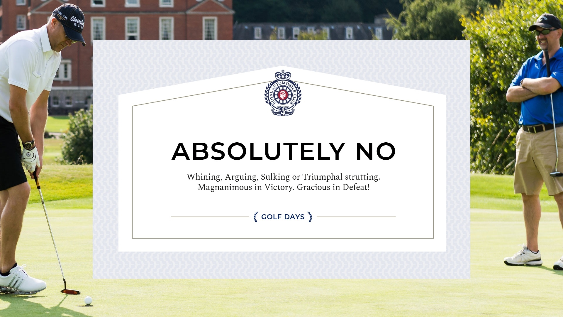
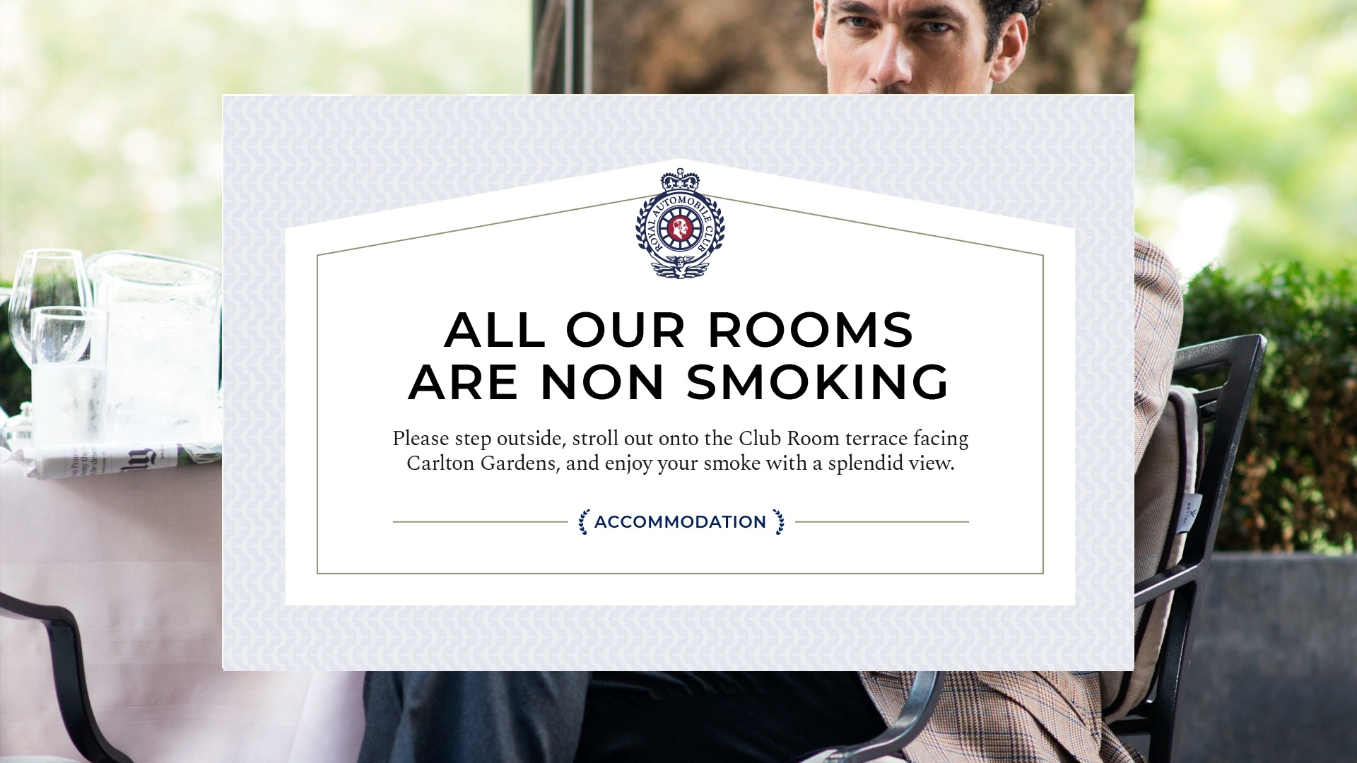
CHARACTERFUL COPY
We helped The Club find its voice again. Confident. Wry. Effortlessly composed. A brand tone of voice that balances tradition with lightness of touch. Welcoming without trying too hard. Intelligent without being imposing.
It speaks as the Club does, with quiet authority and a glint in the eye.
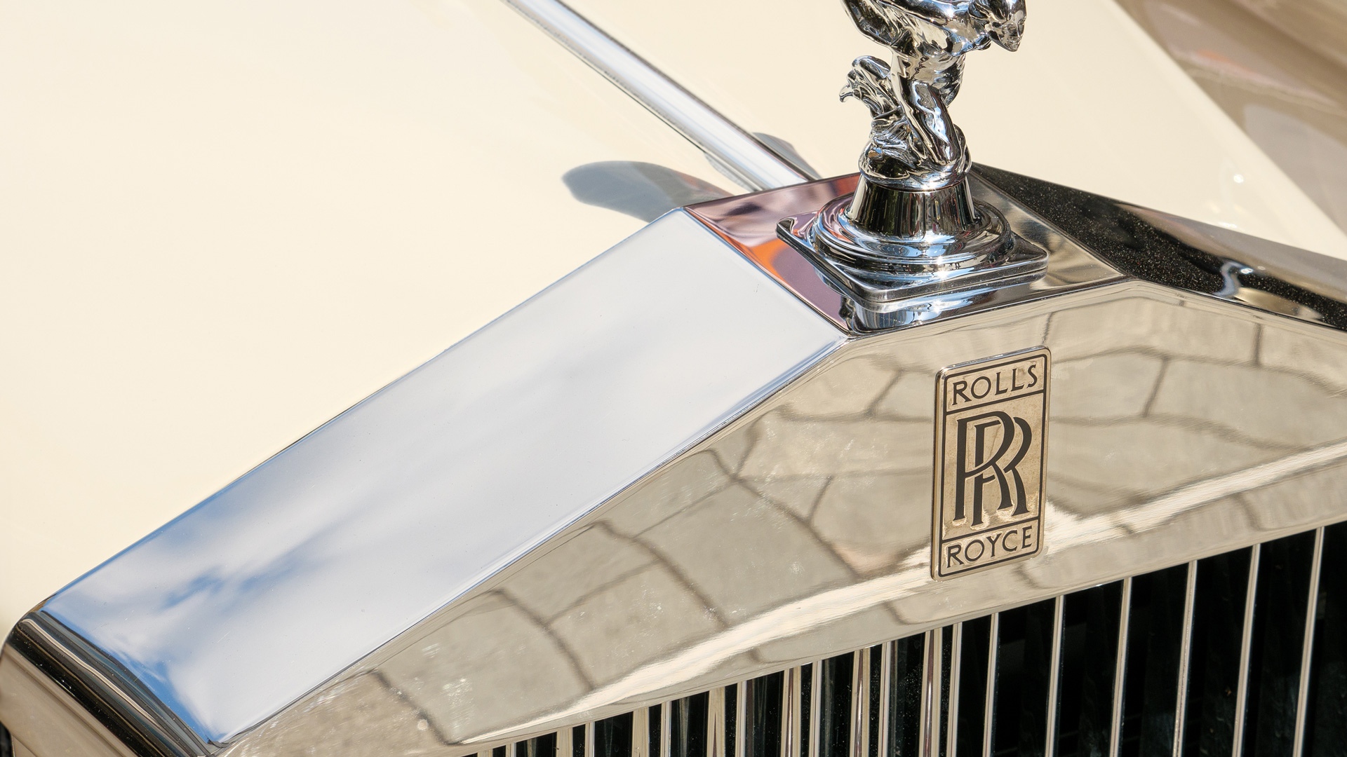
HONOURING HERITAGE
The radiator grille of a vintage Rolls-Royce inspired an ownable framing device. A shape defined by symmetry and strength.
Applied sparingly, it brought structure and elegance to Club communications. A subtle nod to motoring provenance, elevated into a mark of distinction.
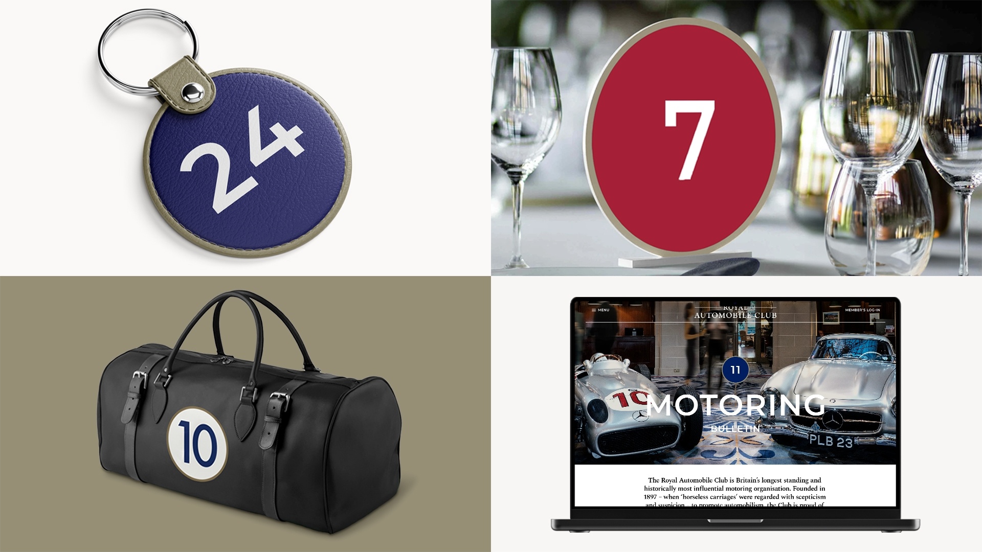
A BRAND BUILT TO WORK ACROSS THE ORGANISATION
Every element had a clear role.
We translated the creative strategy into a system the Club could use day to day – across communications, environments, facilities, events, and internal culture.
Workshops aligned teams and built confidence, ensuring the brand wasn’t just understood, but adopted.
IMPACT
-
Received the highest number of member applications for 16 years
-
Year on year, total revenues increased by 9.5%