Avanti West Coast
Making feel-good travel distinctly Avanti
- Rail & Transport Sector
- Brand Refresh
- Brand Strategy
- Proposition
- Visual Identity
- Verbal Identity
- Motion
- Brand Film
- Brand Guidelines
- Brand Launch
Avanti had a clear ambition but the brand wasn’t delivering it.
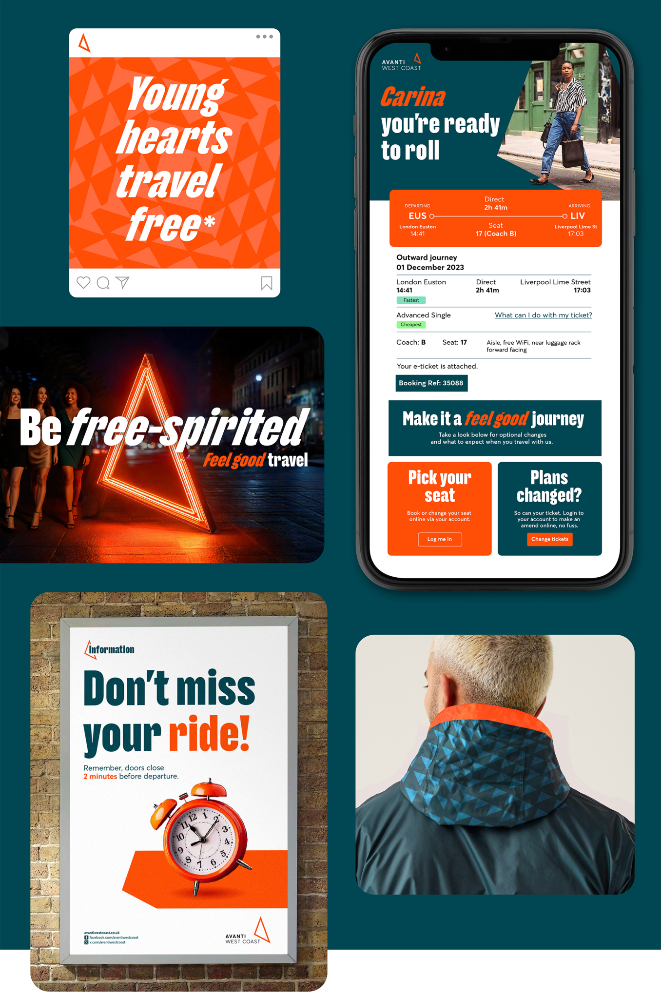
“Feel-good travel” was the goal: speed, comfort, and ease. But the brand wasn’t cutting through or expressing that experience clearly. It lacked distinctiveness, personality, and consistency across touchpoints.
We were brought in to make the brand clearer, more distinctive, and easier to use. Not by reinventing, but by unlocking what was already there.
The shift: from functional to feel-good
We stripped back the noise, sharpened the essentials, and built a system that made the brand feel more human, expressive, and immediate.
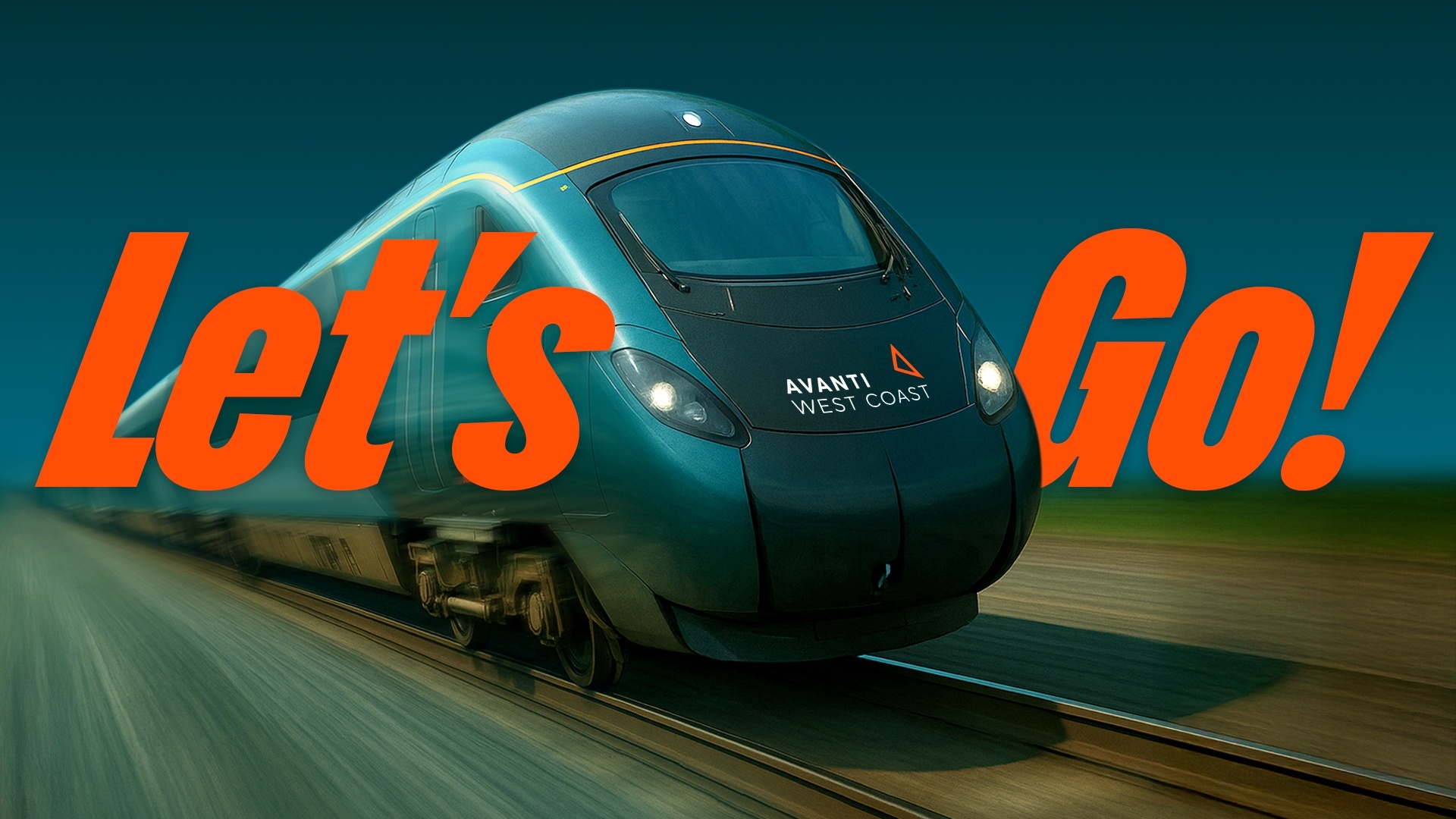
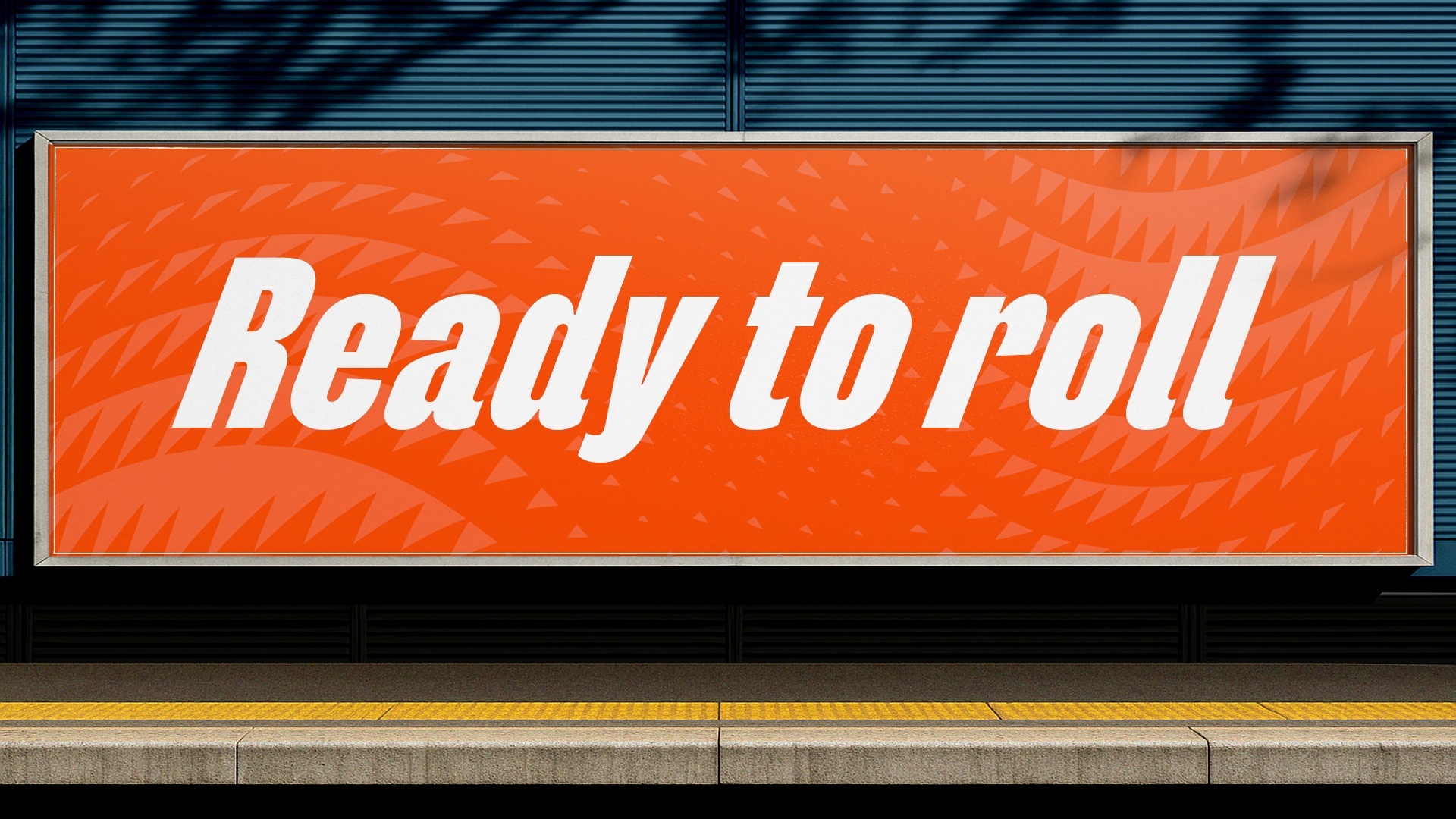
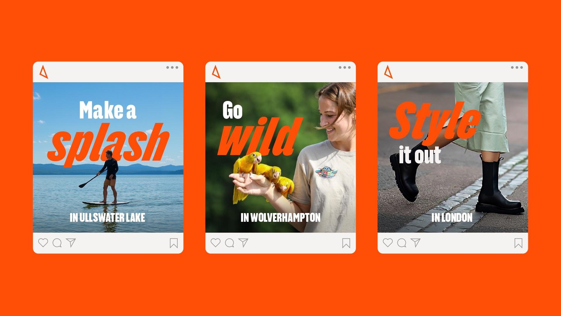
DISTINCTIVE BY DESIGN
Avanti needed a brand that could cut through quickly and flex across everything from service information to campaign moments.
We built a system designed for speed, clarity, and recognition.
“Suddenly the brand feels alive, clearer, more expressive, and a joy to work with. It’s got personality now.”
Ellie Woolmore, Head of brand, Avanti West Coast

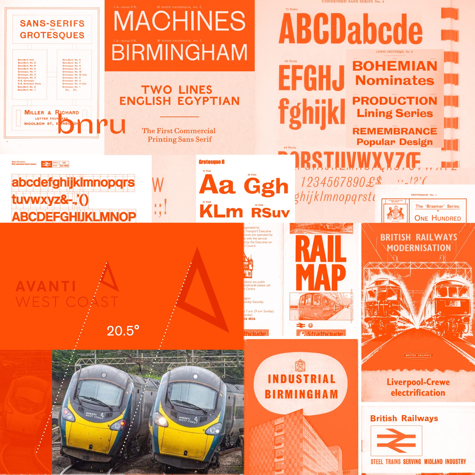
A TYPEFACE BUILT FOR MOVEMENT AND USE
We created a custom typeface that captures the forward motion of the Avanti journey.
Distinctive enough to stand out.
Practical enough to use every day.
Inspired by British transport lettering, it balances heritage with clarity – expressive without losing legibility.
“The brand is now sharper, more expressive, and makes producing impactful work faster without starting from scratch every time.”
Rikki Guy, Creative design lead, Avanti West Coast
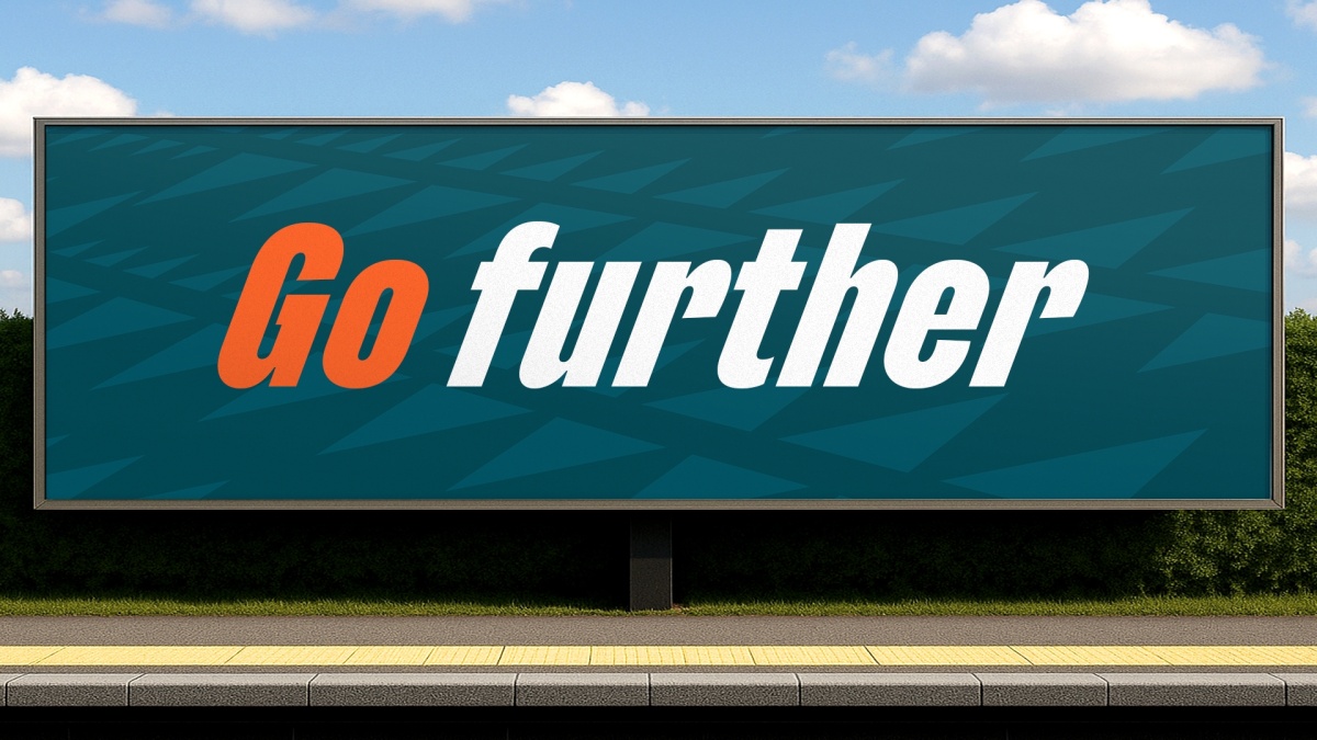
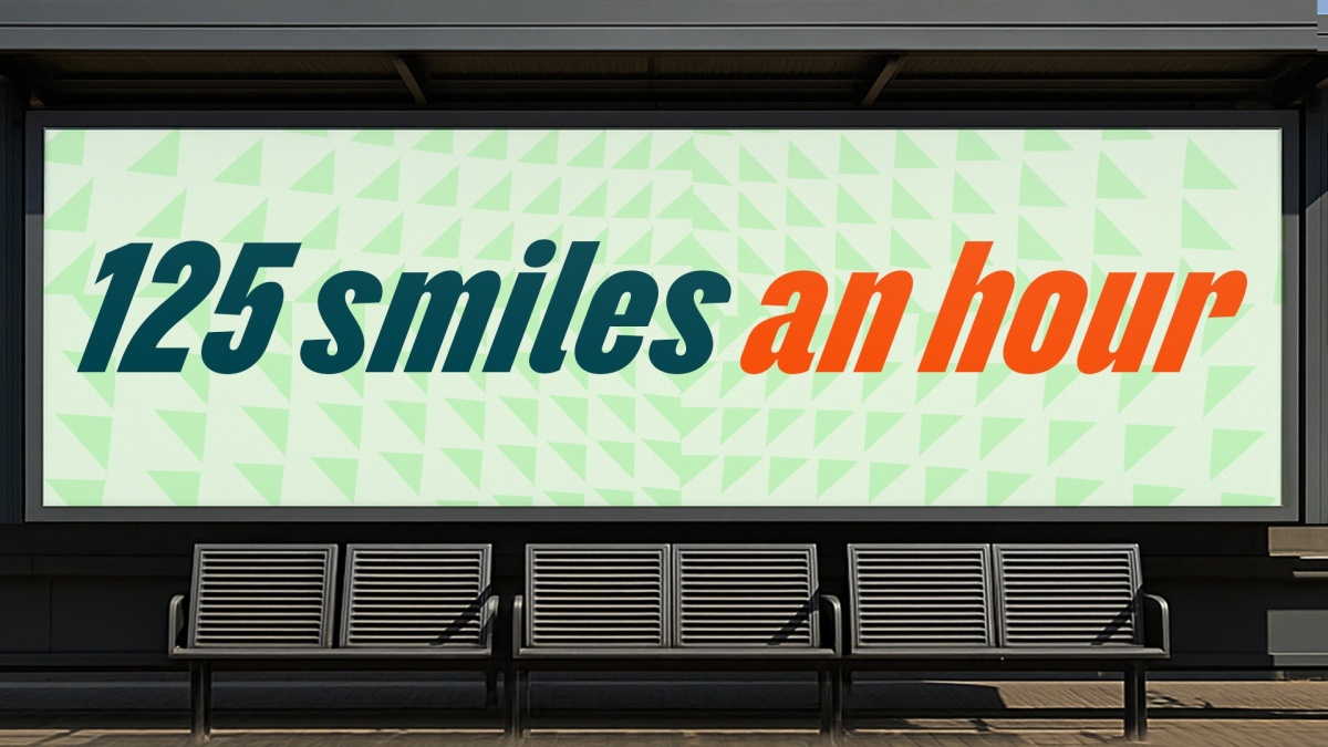
SIMPLIFIED, SWITCHED-ON PALETTE
We reduced a complex palette to a focused three-colour system – designed to stand out across digital and physical environments.
Feel-Good Green became the signature – bringing energy and recognisability to the brand.

FROM BADGE TO ASSET
We transformed the logo from a static marker into an active part of the system – scaling, moving, and working harder across touchpoints.
-
Clearer, more distinctive brand across touchpoints
-
Faster, more efficient production for in-house teams
-
Greater consistency and confidence in execution