Matchtech
Turning Matchtech into a people-powered superbrand
- Recruitment Sector
- Rebrand
- Brand Strategy
- Proposition
- Visual Identity
- Verbal Identity
- Brand Guidelines
- Brand Launch
Matchtech’s market had moved on, but the brand hadn’t.
As one of the UK’s leading engineering recruiters, Matchtech had deep expertise and heritage.
But the brand felt dated, transactional, and disconnected from the people behind it.
And the category was changing fast.
The shift we made was from recruitment to consultancy
The industry was moving from job-filling to intelligence, consultancy, and value creation. Matchtech’s strength was never the algorithm. It was the people.
We repositioned Matchtech for where the market was going. From transactional to transformational. A brand built around human intelligence, problem-solving, and progress.
ONE POWERHOUSE BRAND
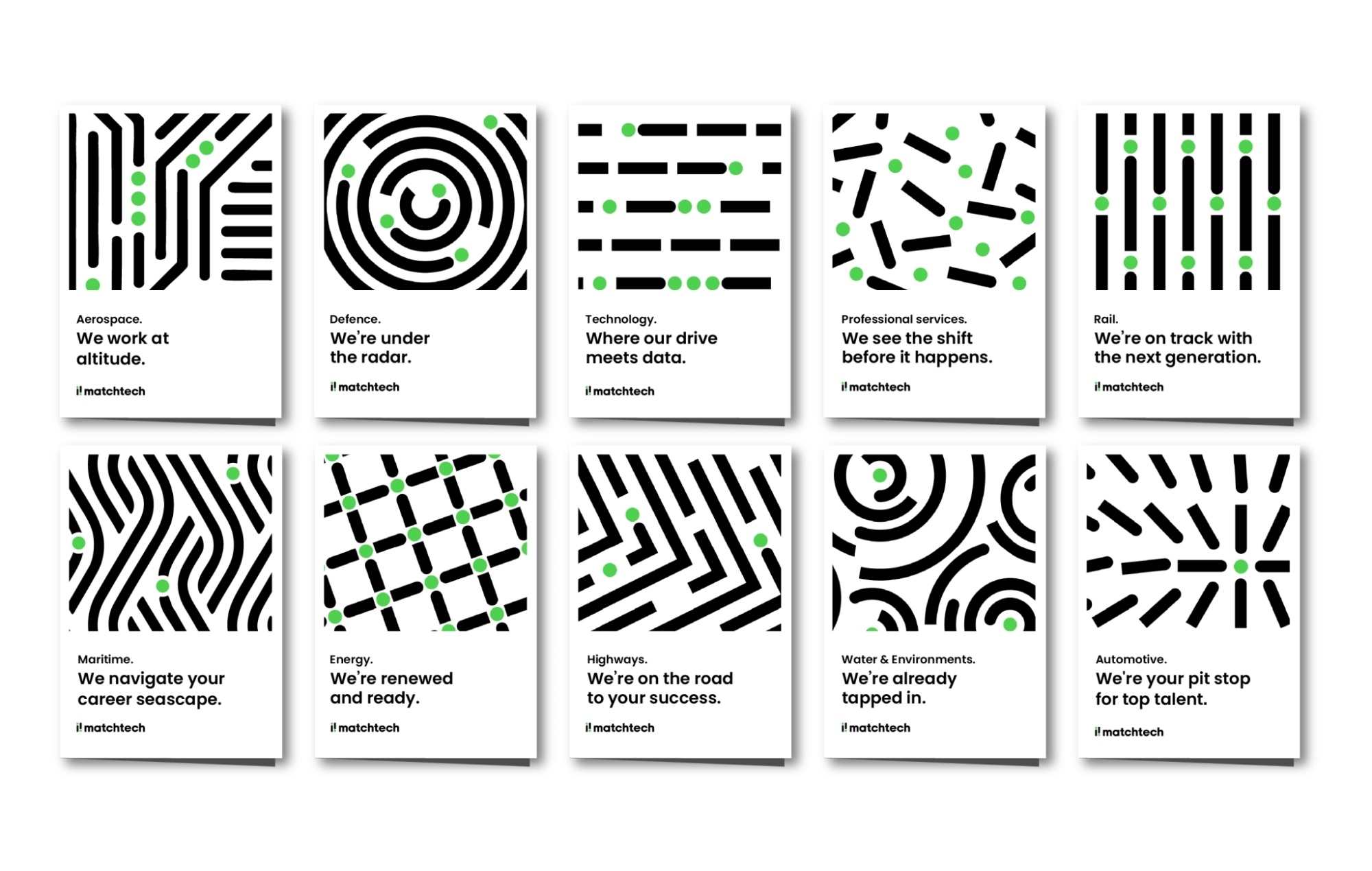
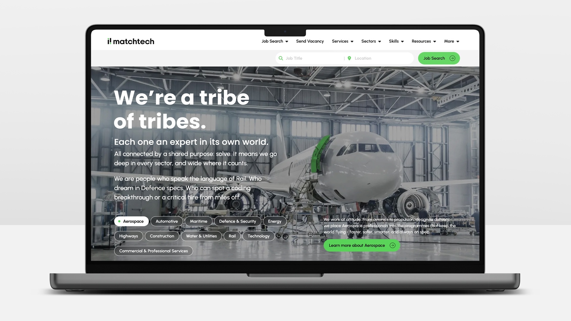
We unified Matchtech’s offering under one clear brand – bringing together its specialist sectors into a single, coherent proposition.
Distinct in expertise.
Aligned in purpose.
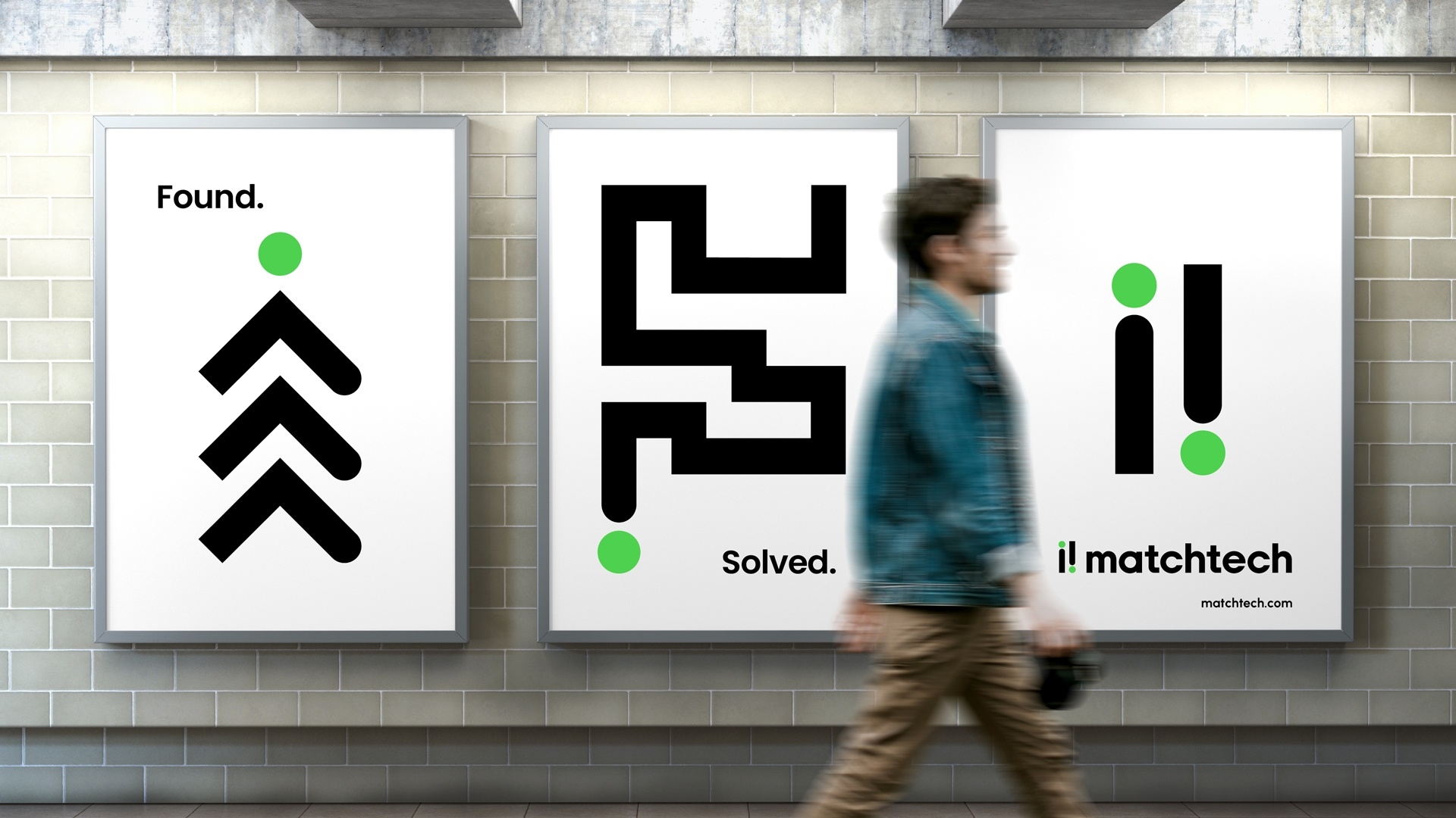
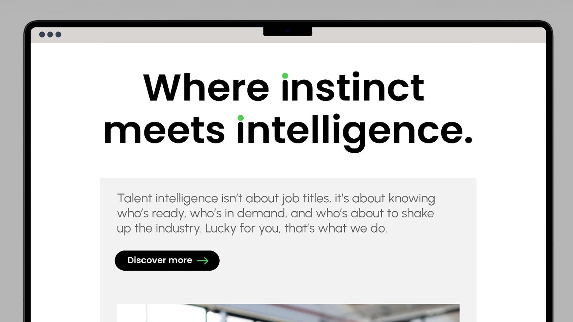
People Powered Problem Solvers
A simple, powerful idea that puts humanity back at the centre of a tech-heavy category.
A BRAND BUILD FOR CLARITY AND FLEXIBILITY
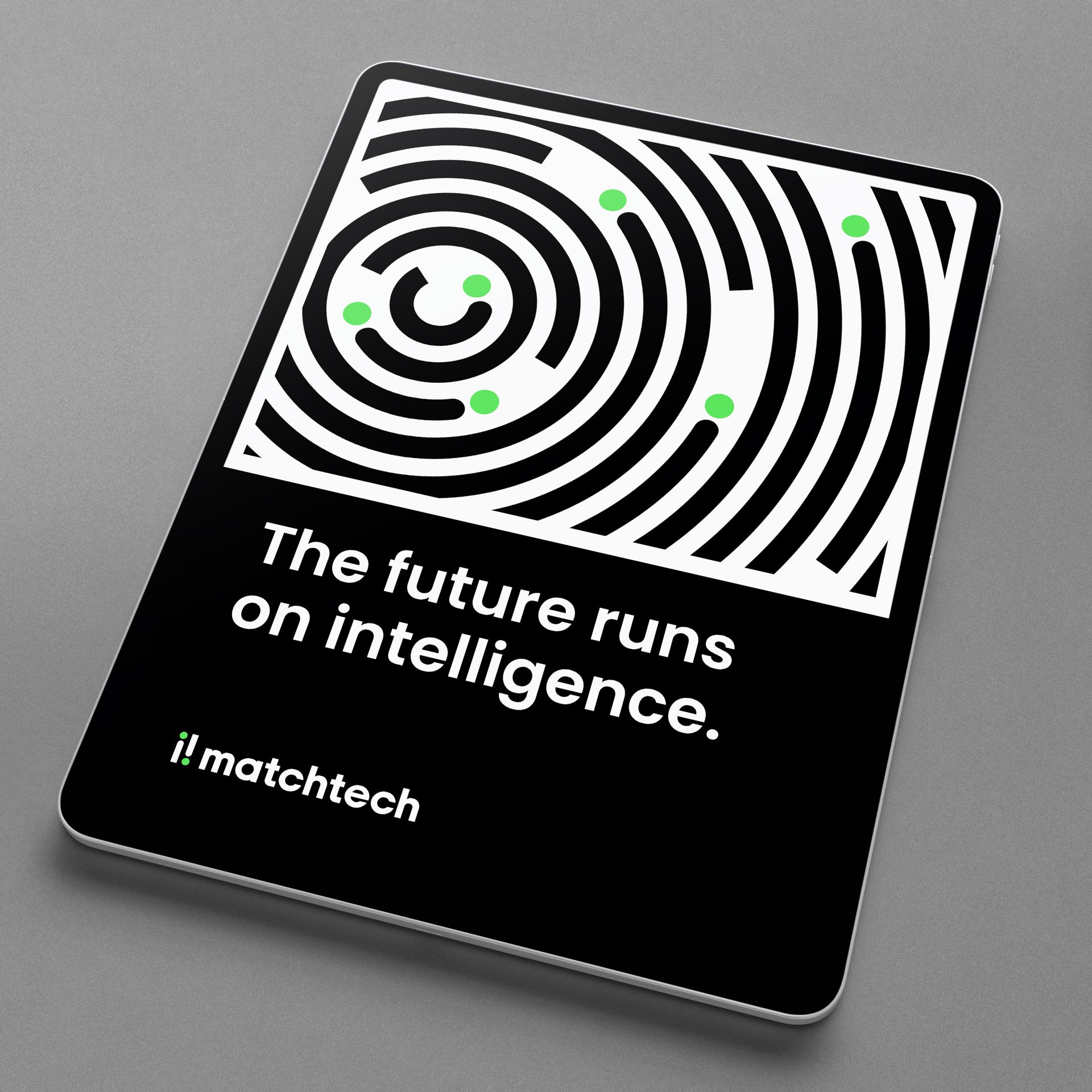
We created a simple, flexible identity system that allows each specialist area to express itself while staying part of a unified whole.
Clear enough to scale.
Distinct enough to stand out.

“The rebrand didn’t just refresh how we look, it’s completely reignited who we are and the confidence we bring to the industry.”
Leah Hill, Marketing Director, Matchtech | Gattaca Plc
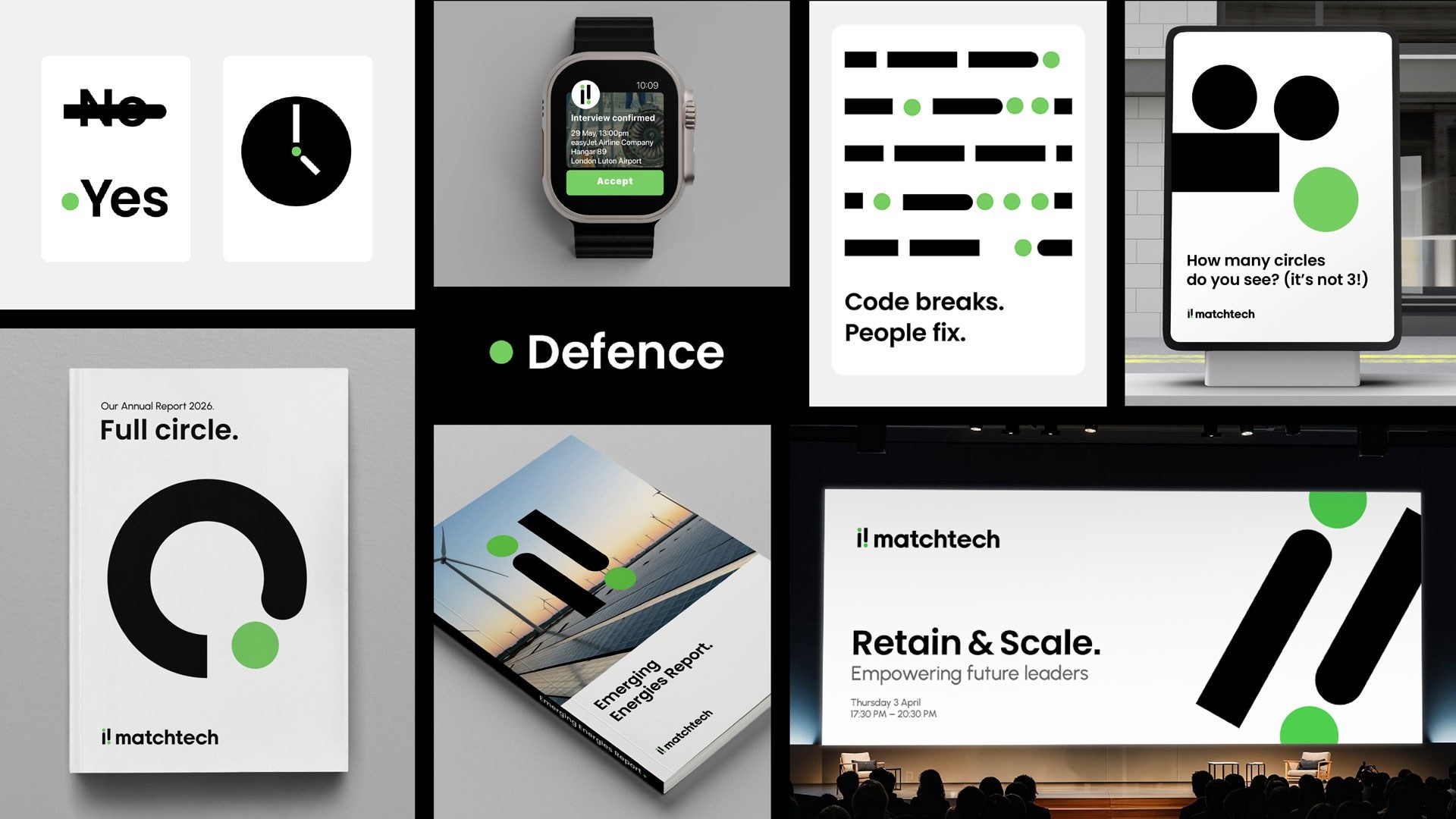
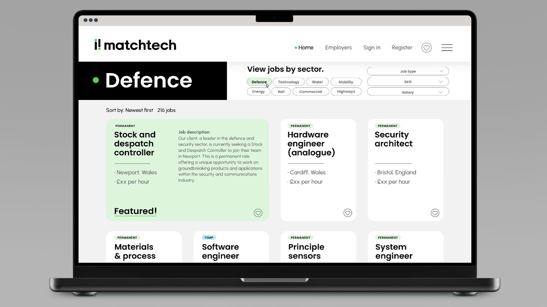
A SYSTEM BUILT TO WORK DAY TO DAY
The system is designed for real use – simple assets, flexible rules, and consistency across touchpoints.
Making it easier for teams to create work quickly and confidently.
CLEAR THINKING, POSITIVE ENERGY
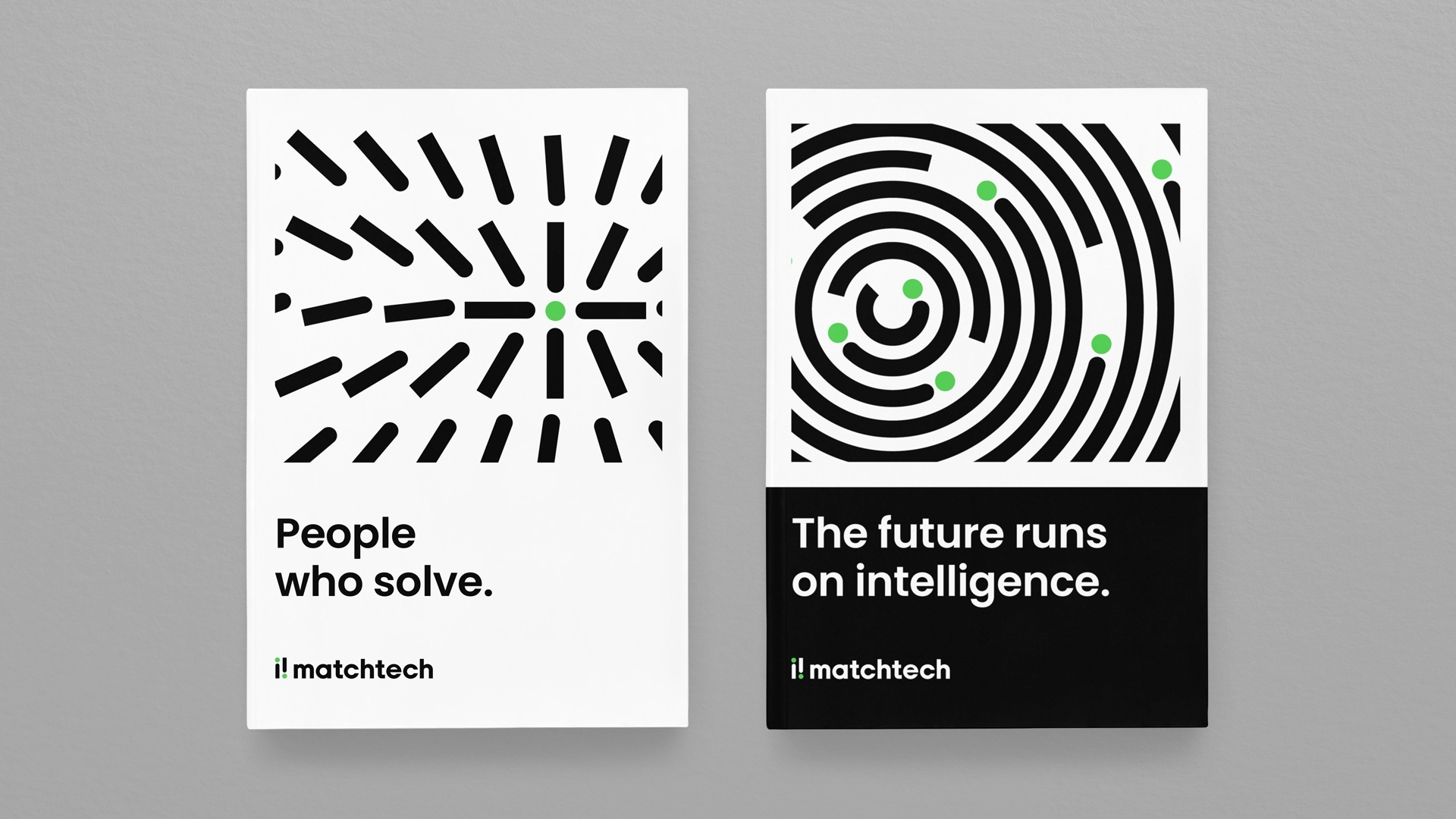
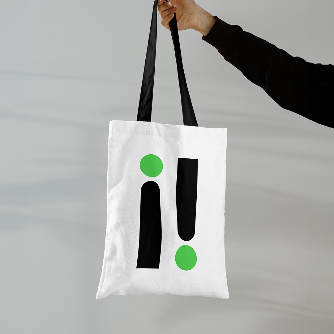
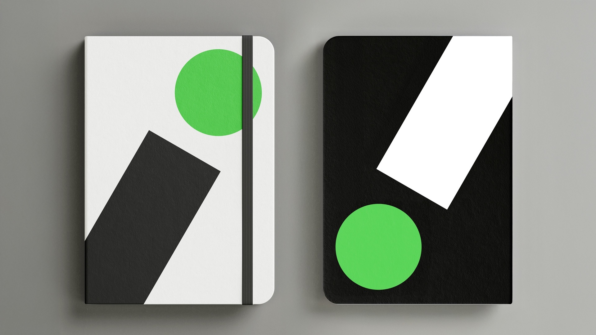
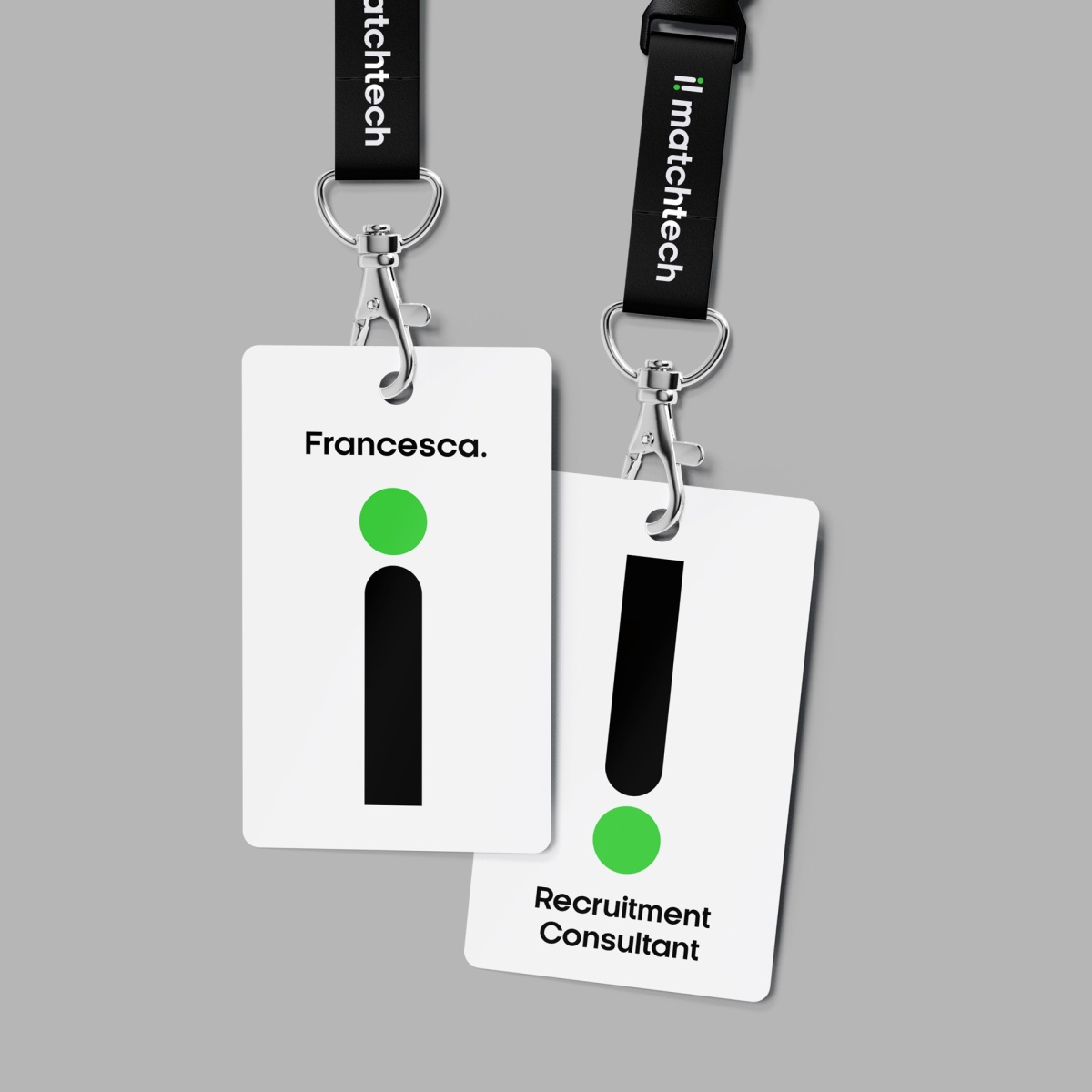
The identity is grounded in timeless black and white: confident, simple and uncluttered, giving Matchtech clarity and credibility.
Then we introduced a distinctive pulse of green, a super-positive, energised accent symbolising progress and the optimism of STEM. In a category weighed down by dark, heavy palettes, Matchtech stands out lighter, brighter and full of possibility.
SWAGGER AND SUBSTANCE
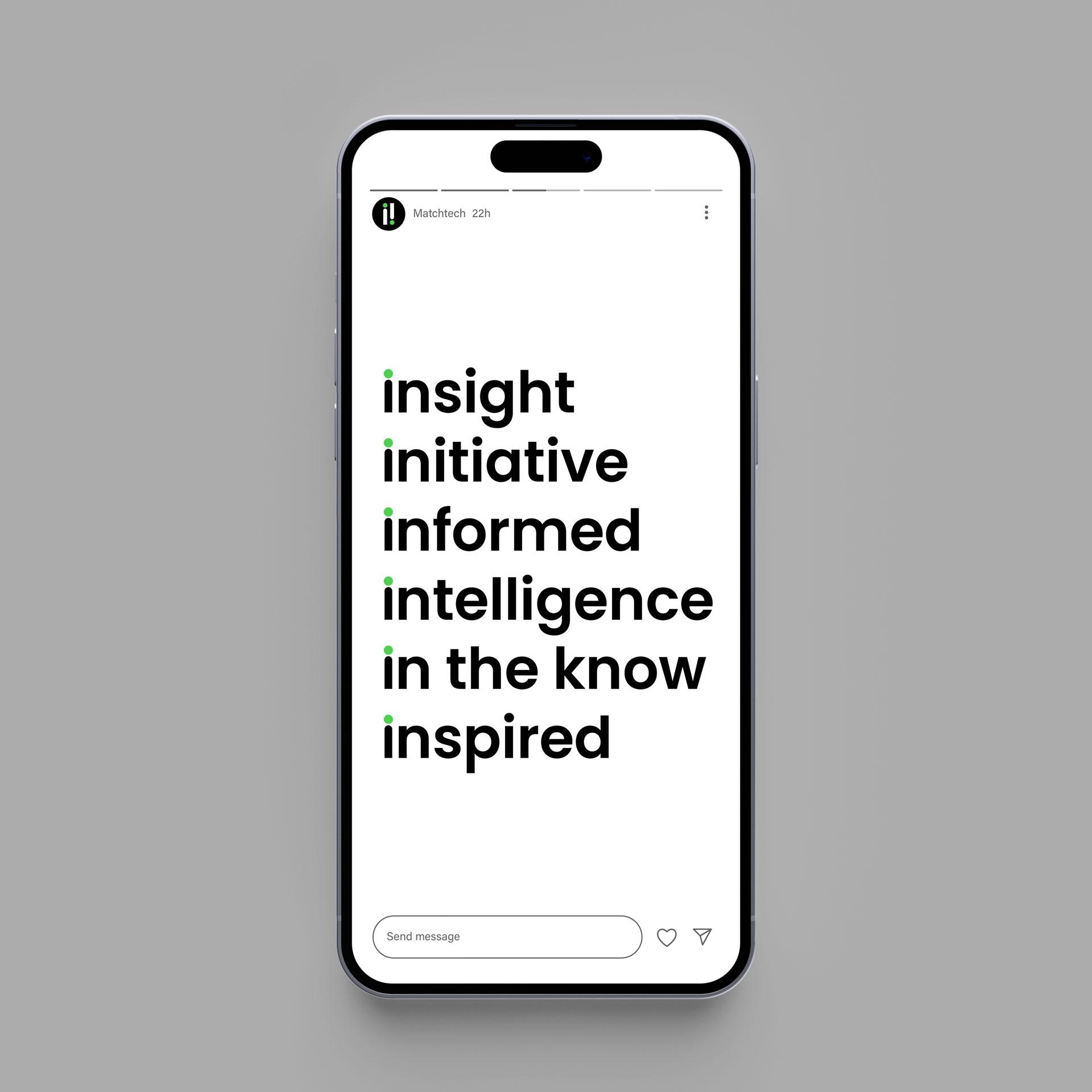
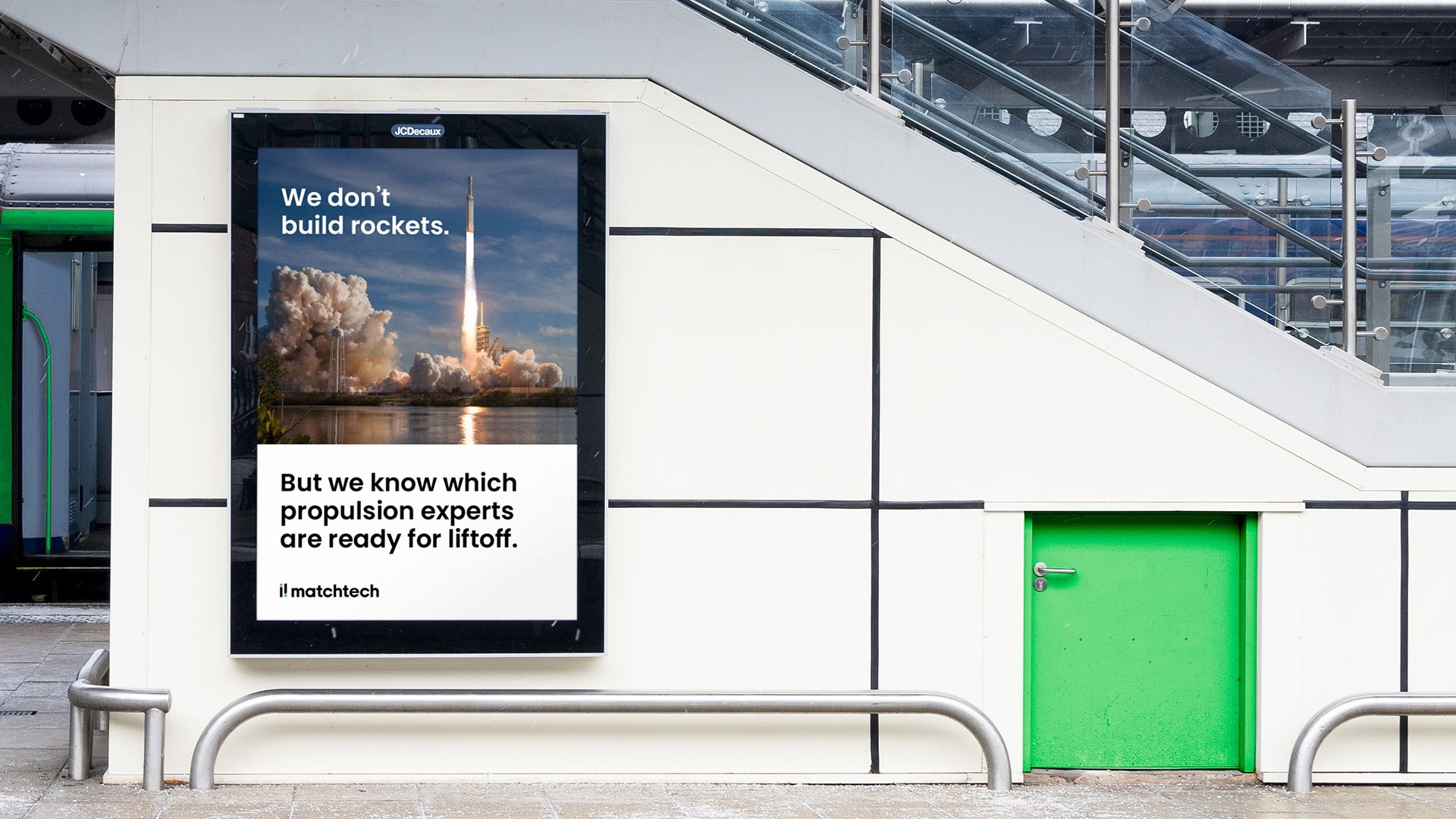
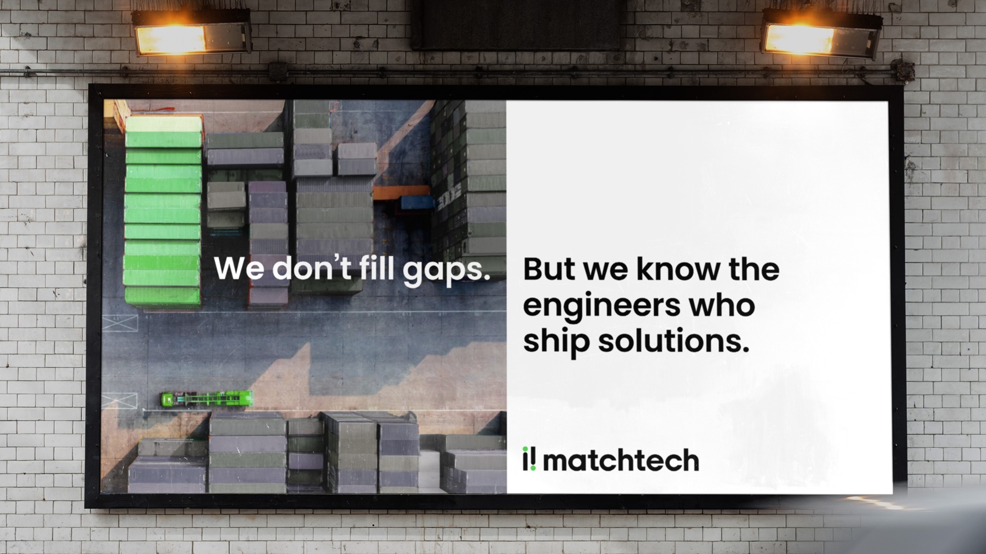
The new Matchtech voice is confident, human and unapologetically expert. It brings back a sense of swagger, a voice with something to say and the experience to back it up.
This isn’t the sound of recruiters chasing roles. It’s the voice of people who know the work, the industries and the possibilities inside out. It’s direct, warm and assured, speaking with authority, never formality.
Matchtech doesn’t just connect people to jobs. It connects human potential to progress, putting bigger thinking and deeper humanity back at the heart of recruitment.
-
Clearer positioning in a rapidly evolving market
-
Stronger, more unified brand across specialist sectors
-
Greater confidence and clarity internally
-
A system designed for faster, more consistent delivery