Domino’s Chick ‘N’ Dip
Helping Domino’s stretch into chicken
- Food & Beverage Sector
- Brand Creation
- Brand Strategy
- Proposition
- Naming
- Visual Identity
- Verbal Identity
The challenge: stretch the Dominos brand without diluting it
Chicken is booming. It’s one of the fastest growing categories in fast food, fuelled by flavour experimentation and customer demand for more variety.
Domino’s wanted a slice of that action. But when your name is practically shorthand for pizza, how do you stretch credibly into chicken?
Adding chicken to the menu wasn’t enough.
Domino’s needed a sub-brand that could: feel new, stay credible, and still belong.
We created Domino’s first sub-brand. One that could open up a new category while staying rooted in what people already love about the brand.
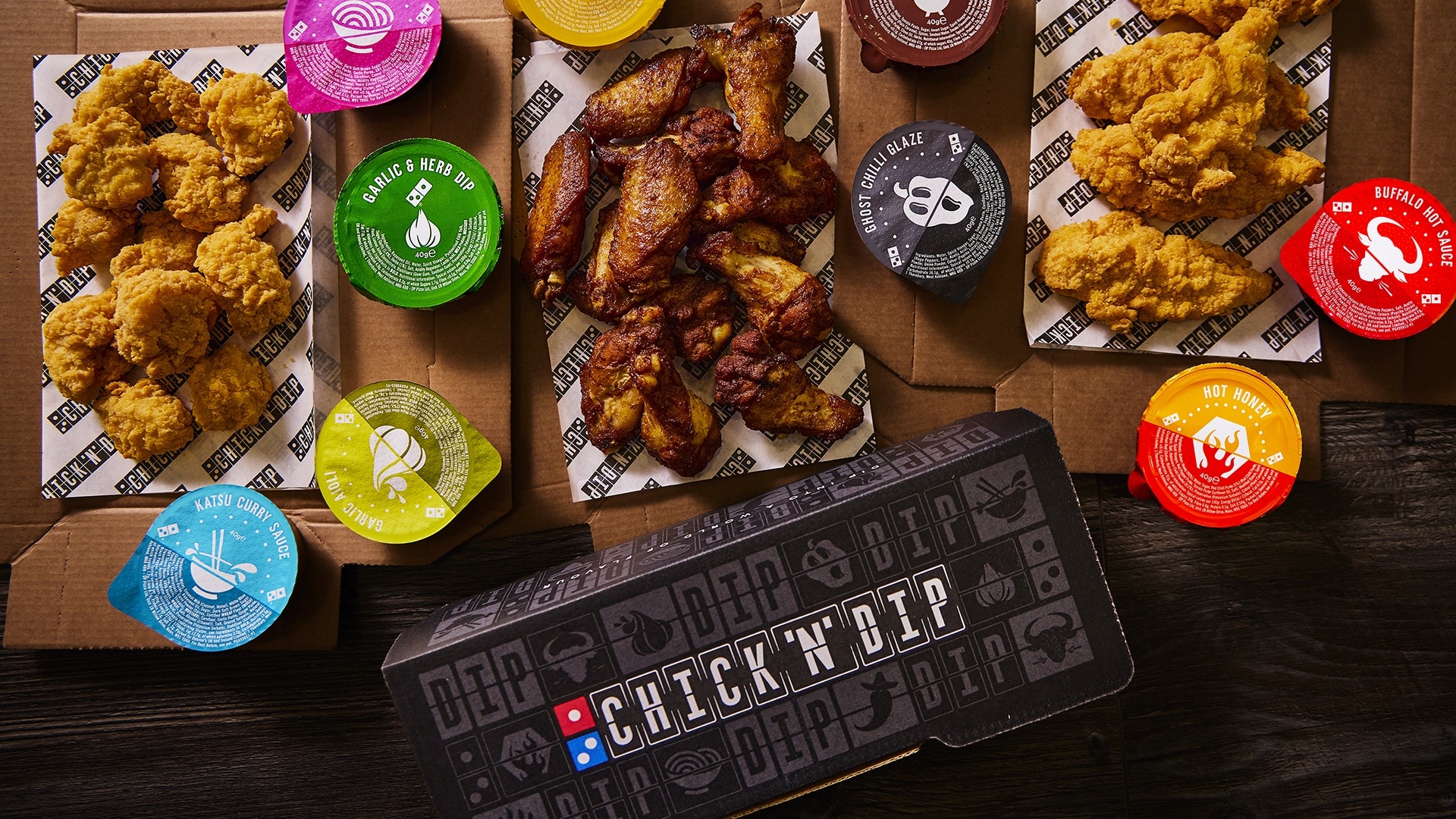
THE BRIDGE: DIPS
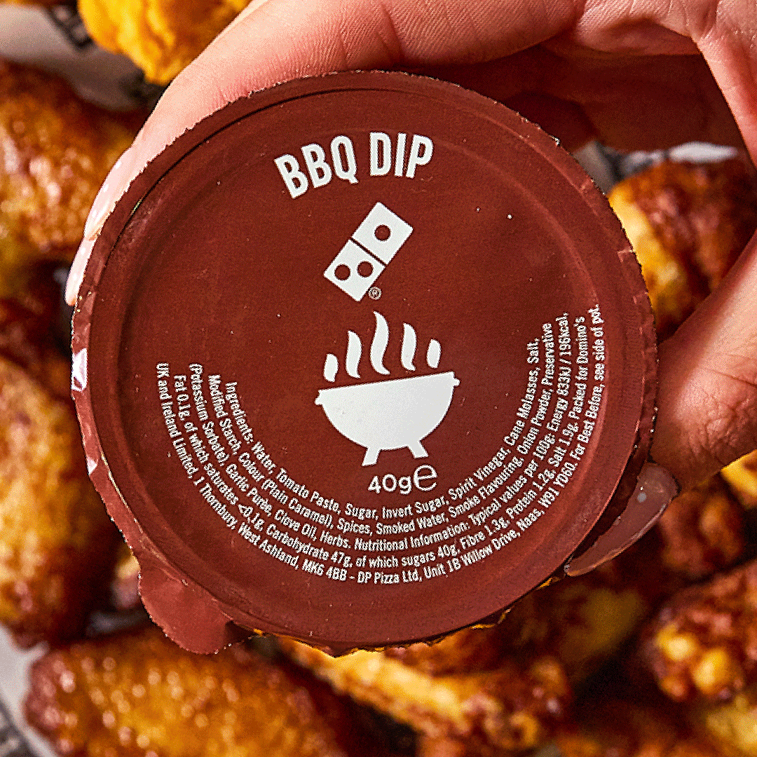
Domino’s already owned something beyond pizza – its dips. That became the entry point. A familiar asset, reimagined to unlock a new space.
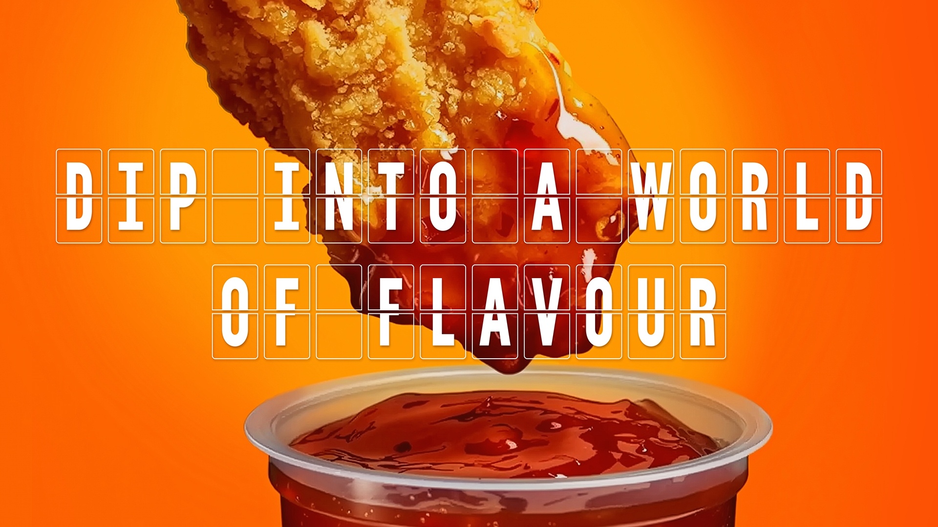
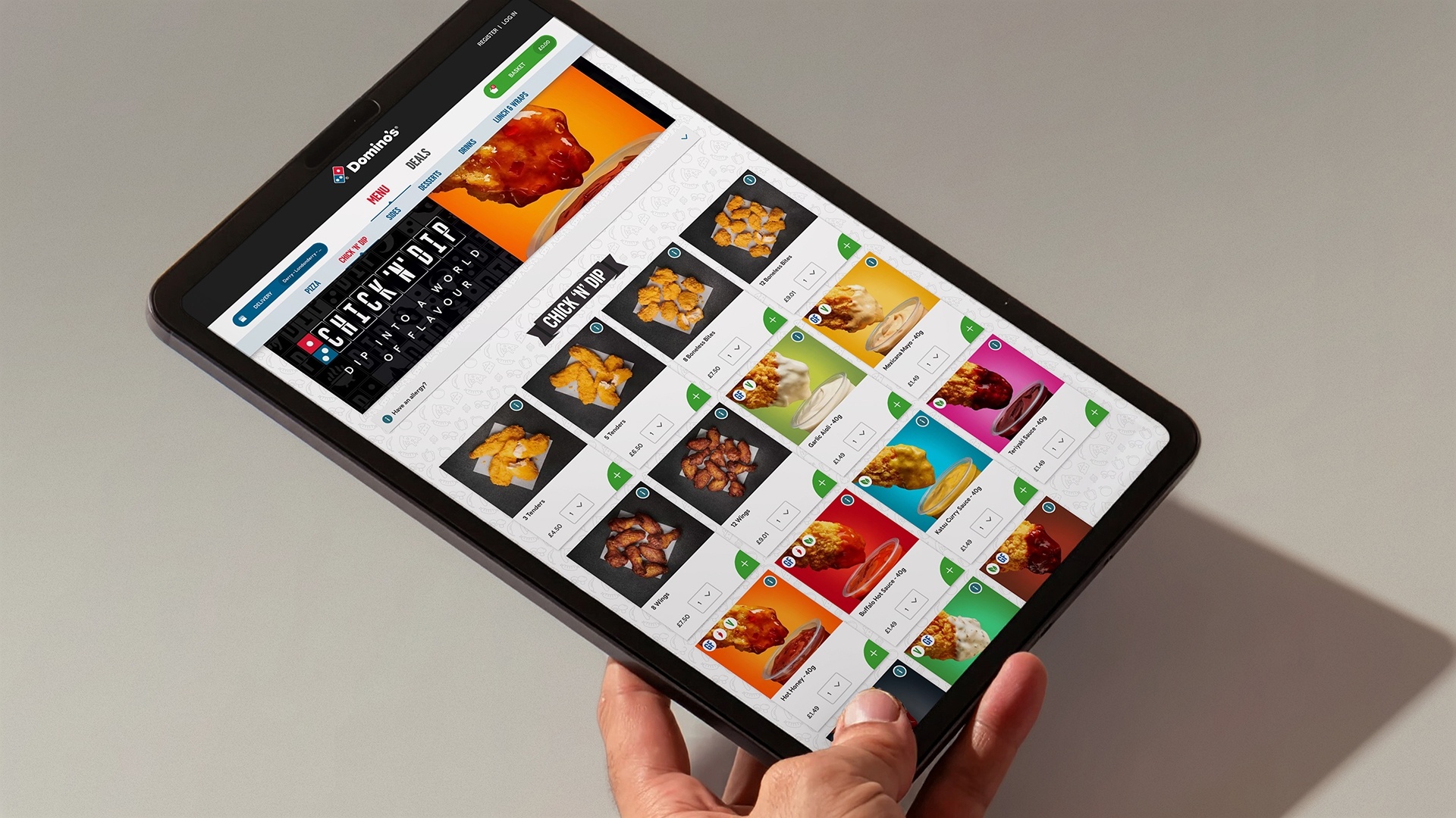
The proposition was simple: dip into a world of flavour.
A simple idea that connects Domino’s equity to a broader, more expressive chicken offer.
Familiar enough to trust.
Distinct enough to grow.
A NAME THAT DOES THE JOB
Chick ‘N’ Dip makes the offer instantly clear.
It ties chicken to one of Domino’s most ownable assets, while keeping the tone playful and recognisable.
“Chicken gave Domino’s permission to play, but it had to be rooted in recognisable brand assets. By straightening the domino and reimagining it as a flip-board, we created a design system that feels familiar yet opens up a whole new world of flavour.”
Grant Willis, Creative Director & Founder, ODA Branding
DOMINO’S BUT WITH ROOM TO MOVE
The identity balances familiarity and freedom. We evolved core brand assets to create something that feels recognisably Domino’s, but with more energy, playfulness, and range.
The domino shape became a flexible design device – reimagined as a flip-board to signal movement, choice, and variety. A system designed to work across menus, campaigns, and environments.

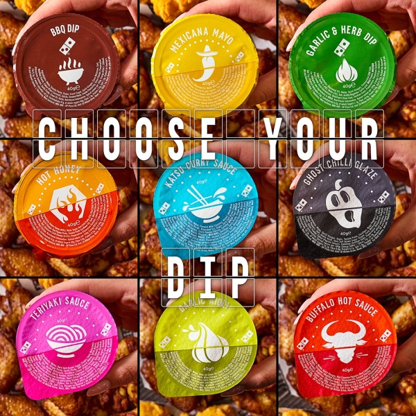
From there, Chick ’N’ Dip was given its own typeface and design language – distinct from pizza, but still recognisably Domino’s.
The palette builds on core brand colours for recognition, with bolder tones to bring the dips to life. Black and white provide a confident stage, while the flip-board device adds energy and movement.
The result is a brand that feels unmistakably Domino’s at its core – accessible, cheeky, and energetic – with enough freedom to play in the chicken space.

Art Direction & Design development by Domino’s Big Dip Studio
Bespoke font created by Hand Inc
PR stunt by Domino’s Earned Team
-
Enabled Domino’s to enter a high-growth category with a credible, ownable offer
-
Created a scalable sub-brand platform for future expansion
-
Extended the brand without diluting its core equity
-
Delivered a distinctive proposition in a crowded chicken market