ekko branding features in Design Week
ODA channels good vibes for eco-bank brand Ekko
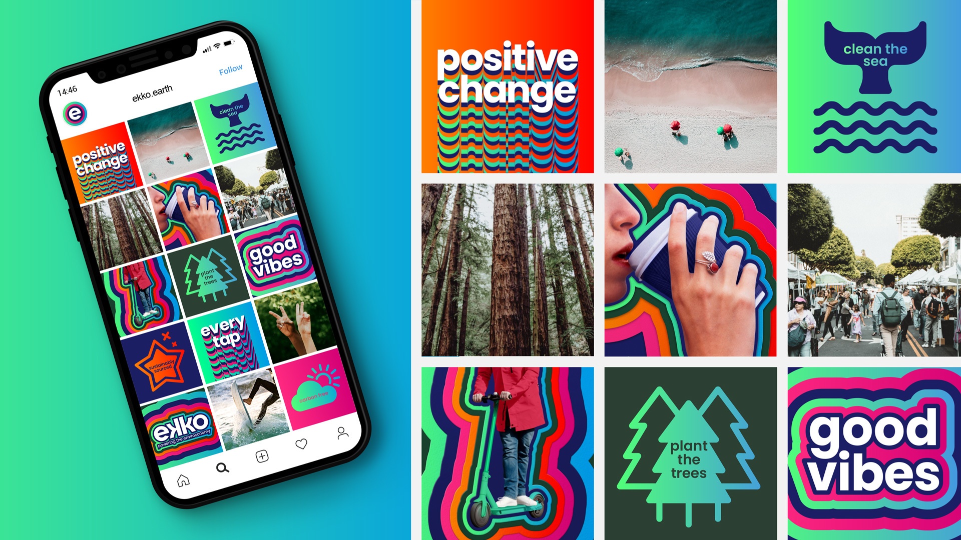
The “psychedelic” visual identity for the environmentally focused banking system resists the minimalist branding of start-up banks.
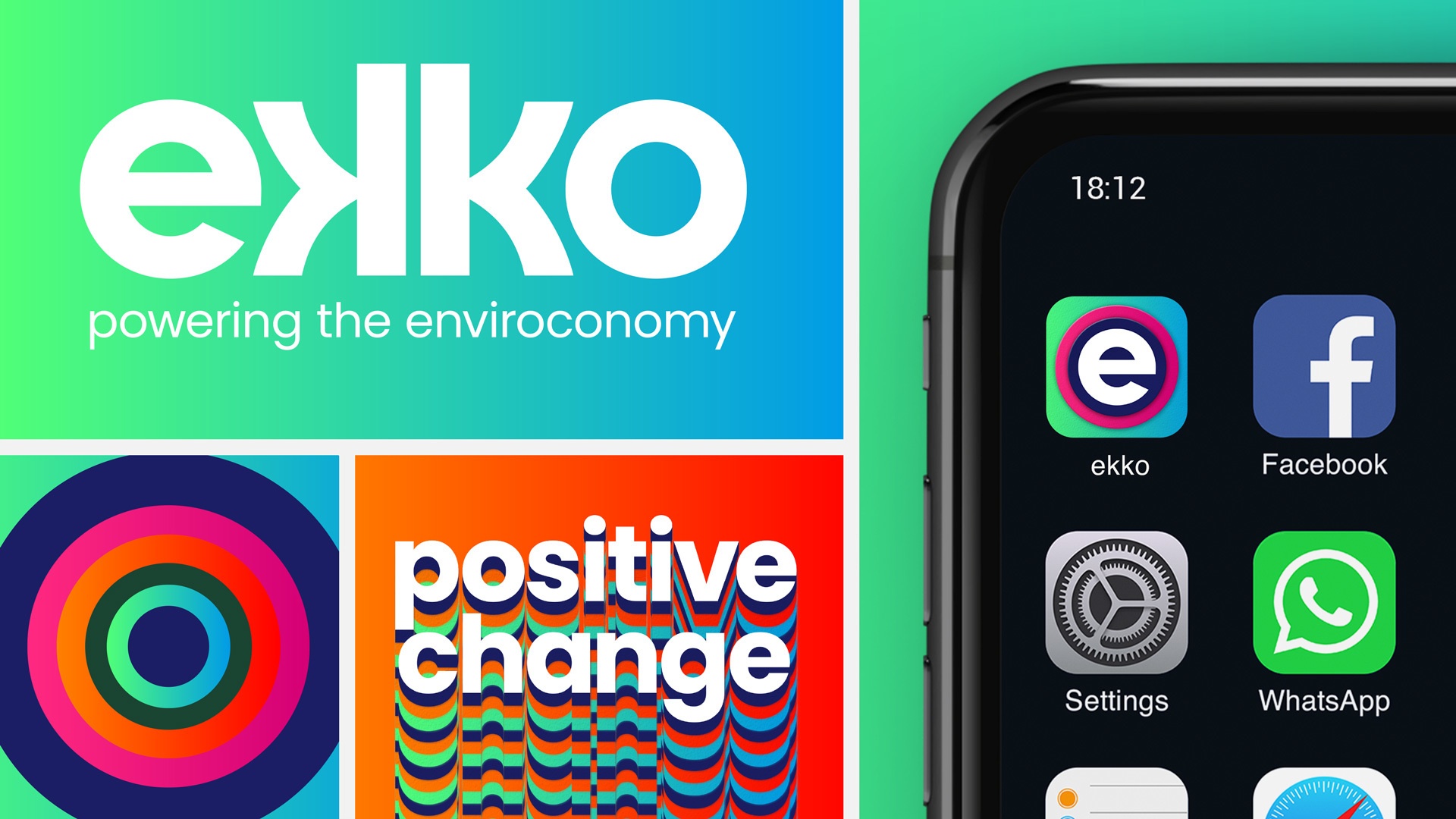
Our Design Agency (ODA) has created the branding for Ekko, a new banking app and card which matches transactions with environmental deeds such as planting trees.
As well as naming Ekko, London-based ODA has designed the visual identity for the app, debit card and social media presence.
Ekko launches in partnership with Mastercard and ties into research from the bank which shows that two in five Brits view reducing their carbon footprint as more of a priority now than before the pandemic.
For every five transactions that a customer makes, Ekko will pay for one plastic bottle to be collected before it enters the ocean. For every 50, it will pay for a tree to be planted. Customers can track their environmental impact in the Ekko app.
Inspired by the butterfly effect
When it came to naming the brand, the studio wanted something that would highlight the environmental aspect and positive impact, according to ODA creative director Grant Willis.
The idea for Ekko came from a discussion around the butterfly effect, he explains. “You’re going to buy a coffee in Camden, and you’re going to plant a tree in Colombia,” Willis says. “The impact you’re having is echoing out from the moment you tap that card.”
The changed spelling has a ring of ‘eco’ and provides more visual opportunities, according to the designer. ‘Ecco’ was already in use by other companies.
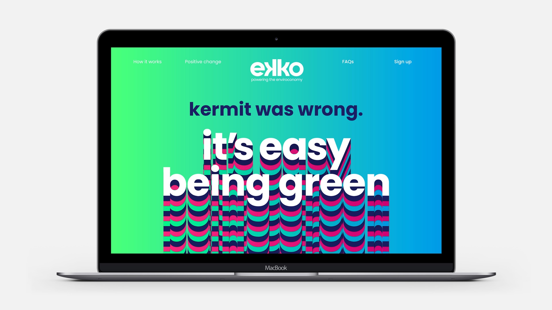
The wordmark uses symmetry to highlight this “echoing out effect”, Willis says. While the two ‘k’s are reflected, even the “e almost finishes out like an o”, he adds. “Everything looks perfectly symmetrical and echoes out from the middle.”
While the typeface Poppins is used for the brand’s copy, an adapted version has been designed for the wordmark.
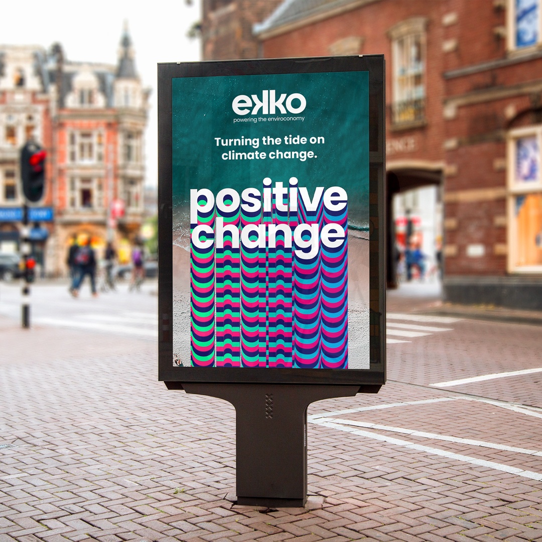
Resisting a “minimalist look and feel”
The bank targets an older audience than generation Z and millennials, according to Willis. The start-up banks for this younger sector such as Monzo and Starling have a “minimalist look and feel”, he says, and the studio wanted to do the opposite of that for Ekko. “All these neo-banks have serious muted colours, but we wanted to be big, bright and upbeat.”
Willis likens current eco-minded shoppers to a “modern day hippy”. The design team started to look into the language and visuals of this era, like psychedelic posters that “felt really positive and sent good vibes”, he adds.
“That design reference is only something someone in their 40s would understand,” he says, which was helpful for engaging the older demographic.
Although ODA has used stylings from these era, the “muddy colours” have been updated for a modern audience and digital applications, Willis says. The shades have names like Positive Pink and Optimistic Orange “for the right vibe”, the designer adds.
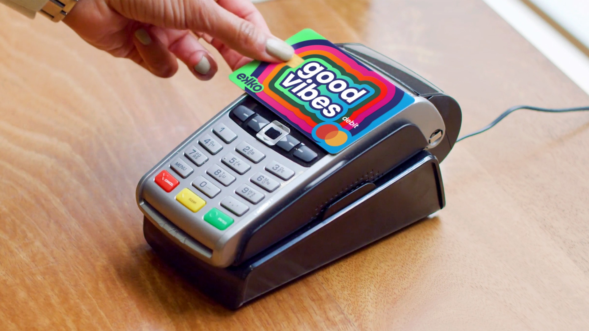
Designing the debit card
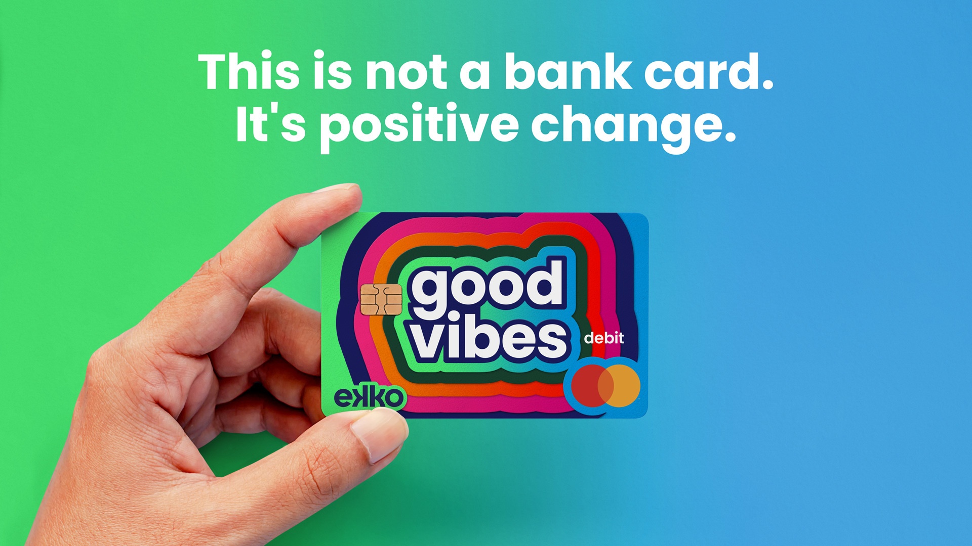
The debit card was a crucial way for the bank “to be noticed fast”, Willis says, though ODA wanted to avoid designing a card with the brand’s logo. According to the designer, the Ekko team wanted a card that would prompt conversations when customers took it out.
The original on-card statement was going to read ‘This is not a bank card, this is positive change’, Willis says. This was changed to the shorter line: ‘Good vibes’. “Every time you’re tapping, you’re sending good vibes across the world,” he says.
The tone of voice is rooted in “cool and hip” language from the 60s and 70s, adds Willis. These include phrases like ‘Right on’ and ‘Dig it?’. These have been used lightly so that it doesn’t appear too “cheesy or tacky”, he adds.
The studio has also designed a set of icons which include a ‘Clean the Sea’ lock-up with a whale’s tail. These were also inspired by the 60s and 70s too but the team was careful not to simply convey a “pastiche of that world”, adds Willis.
Check out the full article here
23 April, 2021 | Henry Wong