Design Week talks to ODA about rebrand of Relish
Dementia wellbeing brand Relish reveals “sensorial” redesign
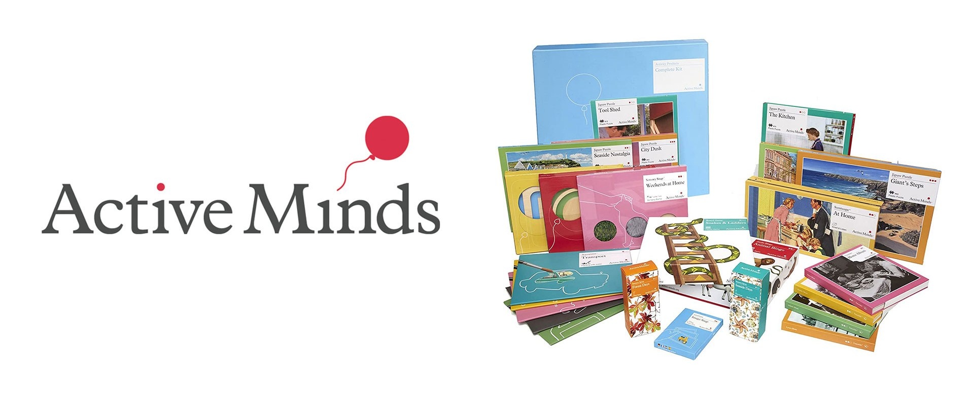
Our Design Agency has created the new look for Relish (previously Active Minds) which produces games and activities for people living with dementia.
London-based studio Our Design Agency (ODA) has rebranded Relish, with an identity that hopes to engage the feelings of people living with dementia.
The work includes a new name for the company (previously Active Minds) as well as a visual identity that rolls out across Relish’s website, social media, app, products and packaging.
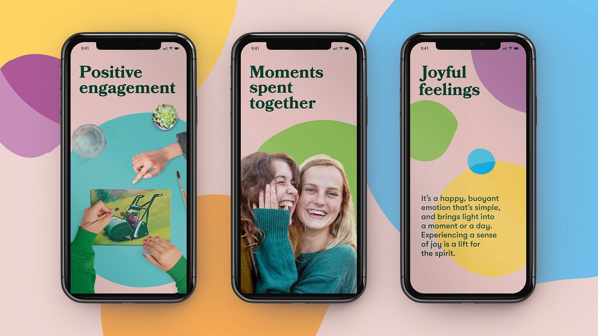
Established in 2010, Relish creates products in collaboration with patients and carers which aim to improve the wellbeing of people who live with dementia and their loved ones.
The company’s products, which include themed puzzles and paint sets, are sold internationally and have so far been bought by over half a million people.
“Why shouldn’t a range of products primarily for people with dementia not look stylish?”
In the UK, there are approximately 850,000 people living with dementia and an estimated 54 million worldwide, according to ODA. One ambition for the new branding was to reach these international markets, the studio’s creative strategist Sarah Westwood says, in particular the sizeable American audience.
While Relish used to deal primarily with care homes, anther aim is to reach people at a direct-to-consumer level online and in retail spaces, according to Westwood.
This meant that the new branding had to communicate information that might not be as instinctive to people not working in the healthcare sector.
“The branding was functional in a care home setting but it wasn’t sufficient to take them to the level of a well-known consumer brand,” she adds.
According to Westwood, one of the earliest questions that drove the project was “Why shouldn’t a range of products primarily for people with dementia not look stylish?”
Reframing the narrative around dementia
After a period of internal analysis, plans for an “emotional” identity were put into place, according to Westwood. This ties into the company’s backstory; Relish’s founder originally wanted to create products for his own grandfather who had been diagnosed with dementia.
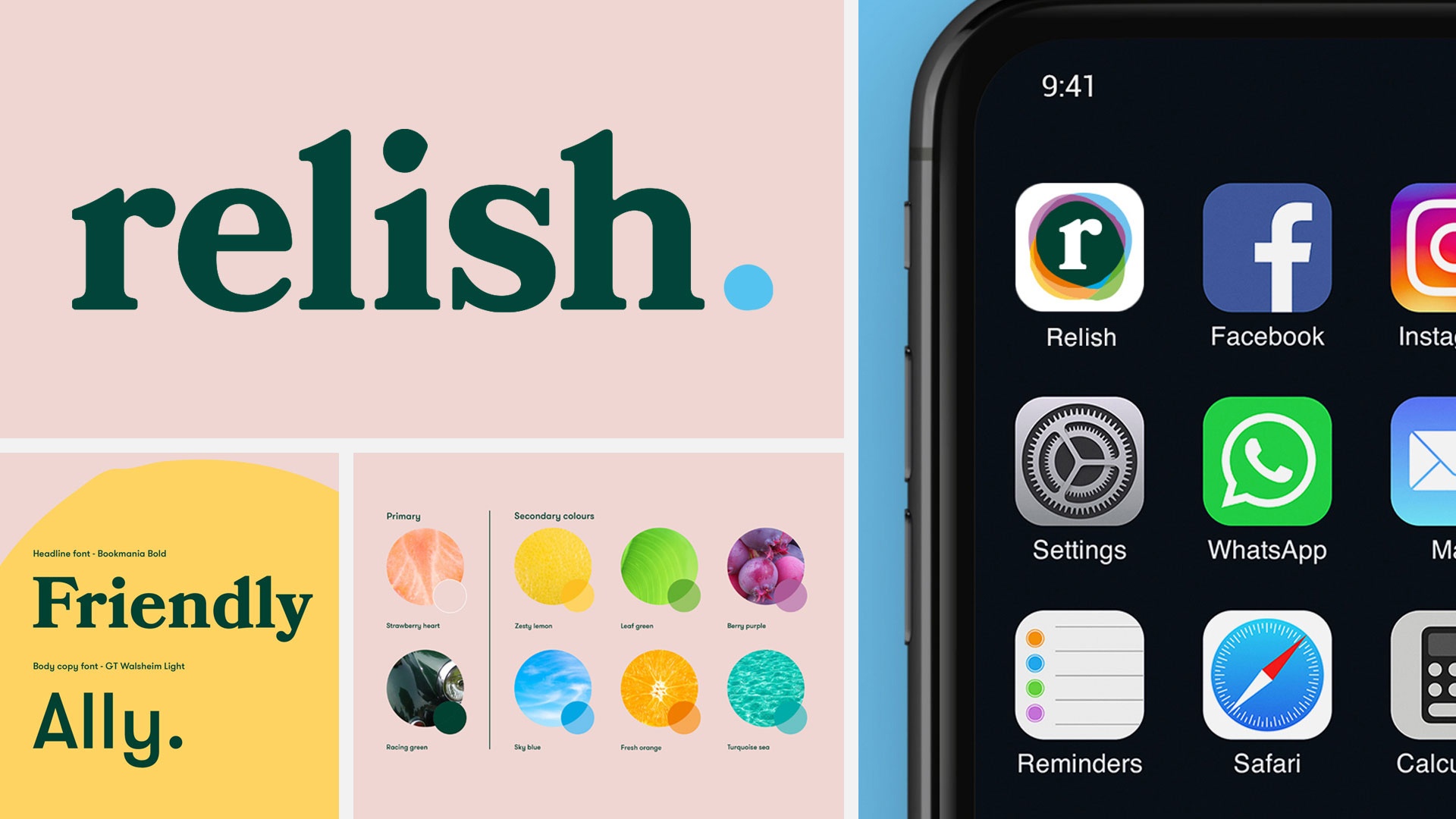
The new name is an attempt to “reframe the narrative around dementia”, she adds. “Instead of thinking of it as the end, it’s about how the brain works differently, and you have to adapt to it.”
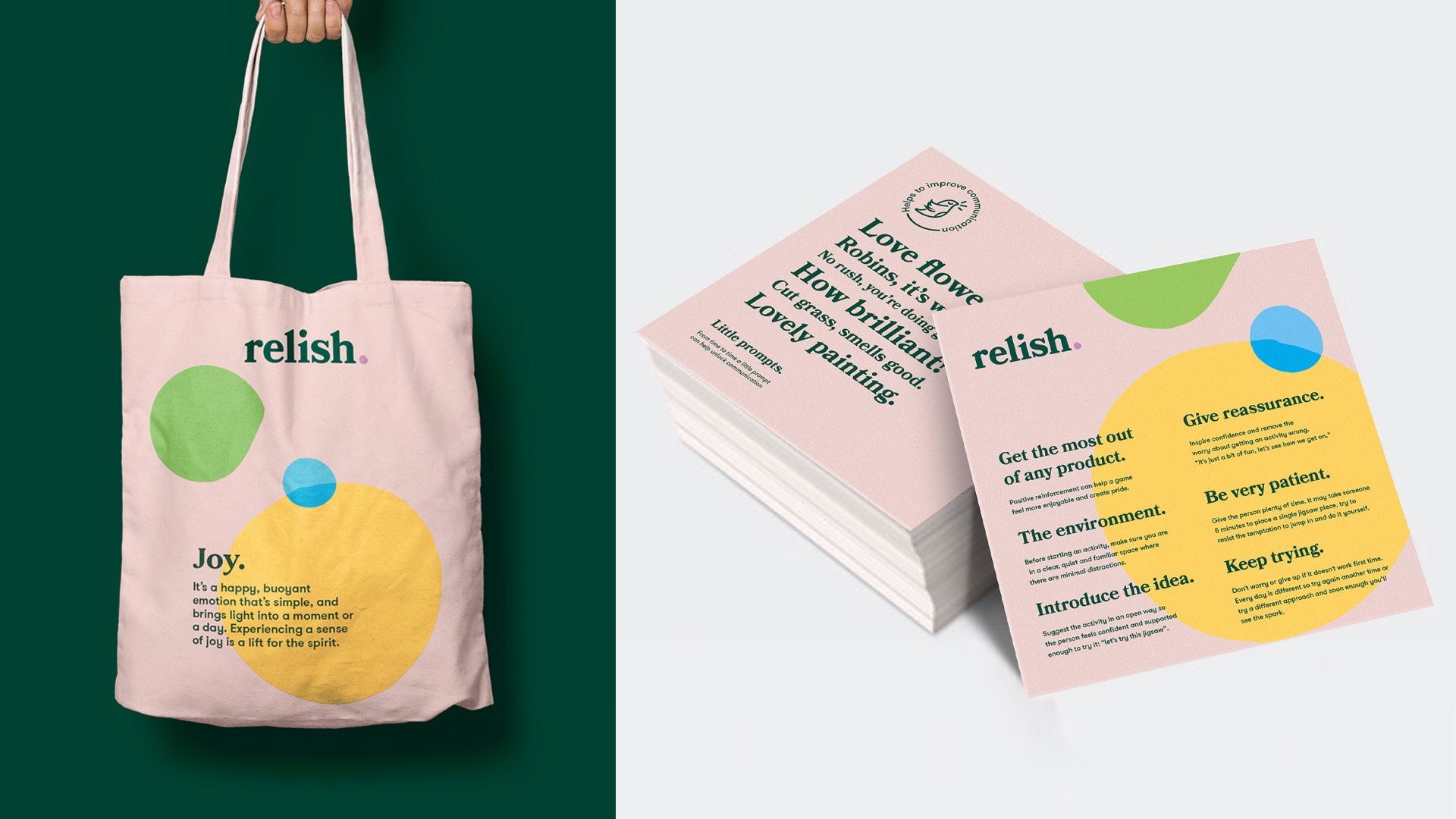
Relish was chosen for its evocative connotations. “We wanted carers to see this and feel positive and like the products could help them enjoy time with their loved ones,” she says.
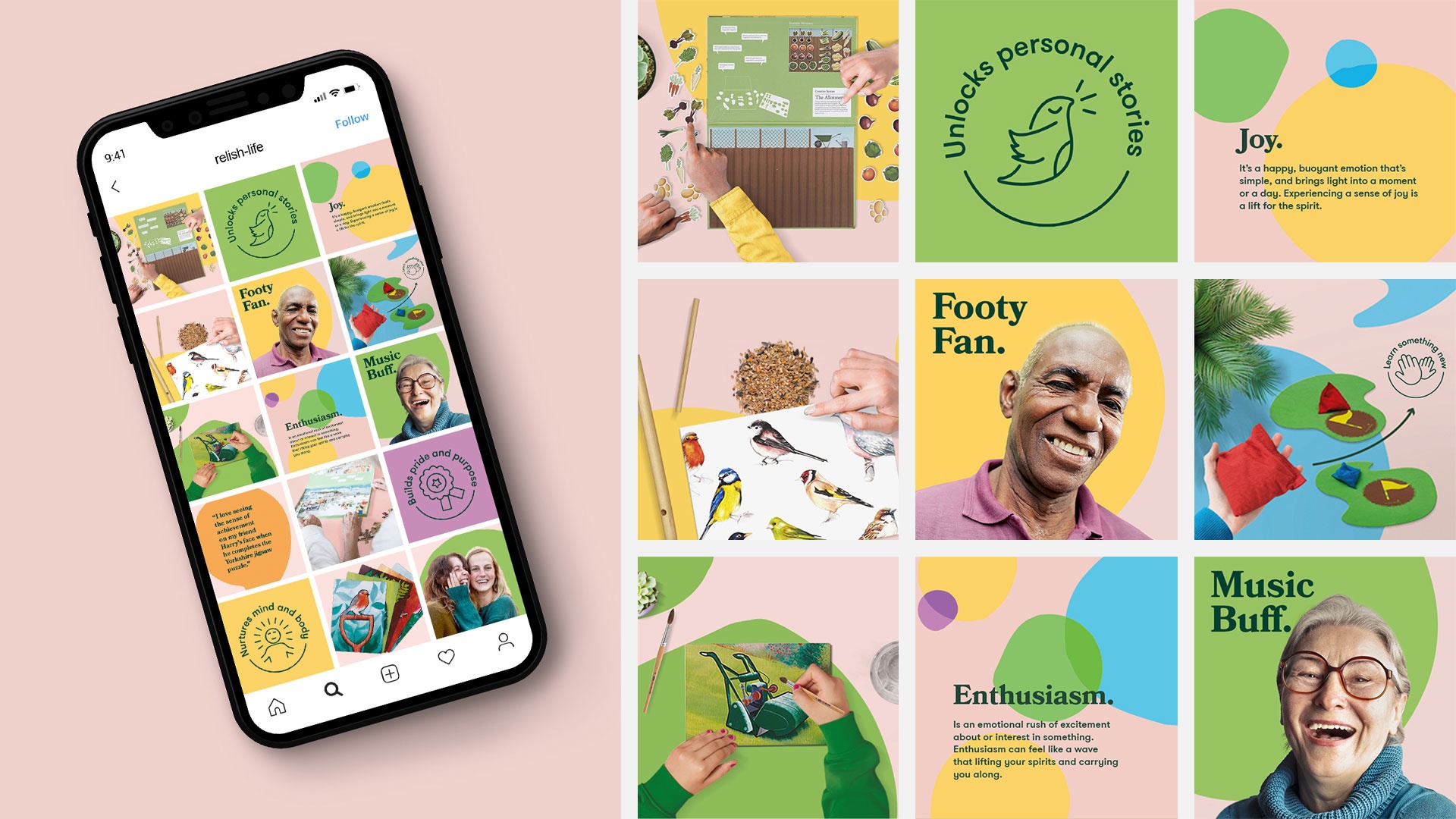
A sense of simplicity runs through the identity, ODA creative director Grant Willis says. The “friendly and approachable” lowercase logotype is paired with an “optimistic and joyful” colour palette comprising pale pink, a contrasting green and bright supporting tones.
While the branding targets carers, it also had to appeal to people living with dementia. The pink tone – which ODA calls strawberry heart – is inspired by the therapeutic use of strawberries in care homes. “It’s a fragrant and reminiscent smell that often helps patients remember a previous time,” Willis says.
Racing green was chosen for its traditional association, he adds. Shades such as zesty lemon were picked for their “sensorial” qualities as well.
Circular shapes are used throughout the identity, which aims to reinforce the clarity of the communications, according to Willis. Different shapes have been hand-painted to give a “hands-on and organic” approach, the designer adds.
Bookmania from Adobe has been chosen as the typeface owing to its “easy-to-recognise” letterforms, Willis says.
Packaging details
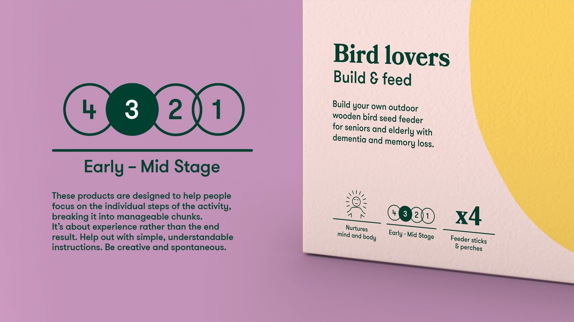
Packaging was designed with the retail space in mind, Willis says. “At every point, we thought: ‘Could I see this on a shelf in John Lewis?’”
A four-stage system has been designed which helps people choose the right products for a patient’s dementia type. This was created in collaboration with Relish experts, according to the design team.
There’s also a set of eight icons which indicate what the activity is best suited for, from building pride and purpose to strengthening connections.
These more positive icons are featured on the front of packaging while the stage-related indications are on the reverse.
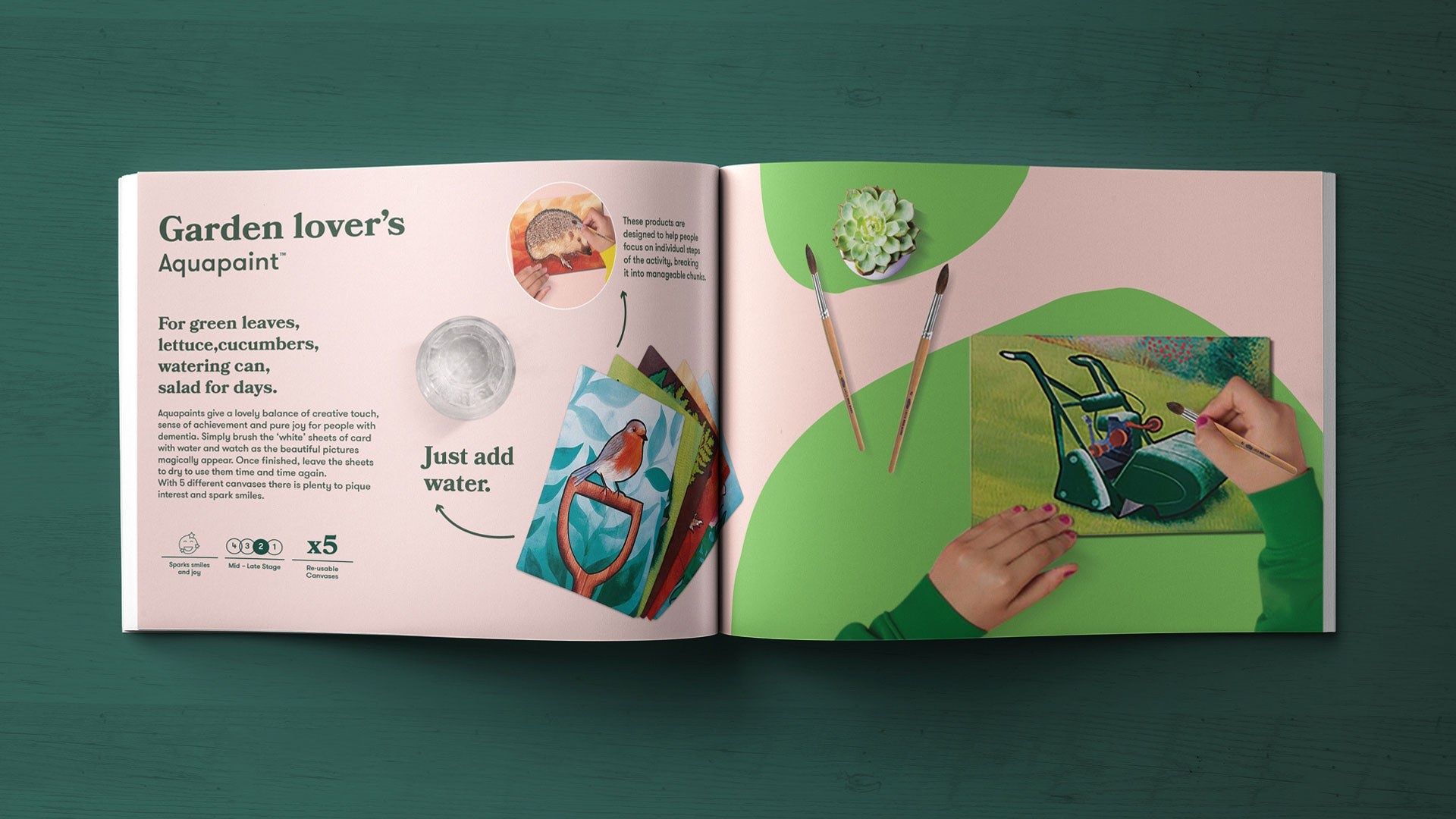
ODA has also created visual and branding guidelines for each of Relish’s signature products, such as music-based activity boxes to puzzles. These are in line with the brand’s new sensorial positioning, Willis explains.
Paint sets have been given more personal names such as nature-lover in the hope of reminding carers of what the patients used to be passionate about. “When you’re looking online, you think ‘my dad was a nature lover’ instead of just ‘this is a kit for painting trees’,” he says.
Packaging often includes imagery of hands to emphasise that the products aren’t intended for solo use but to foster a sense of connection, Willis adds.
Check out the full article here
11 February, 2021 | Henry Wong