- Featured
- Opinion
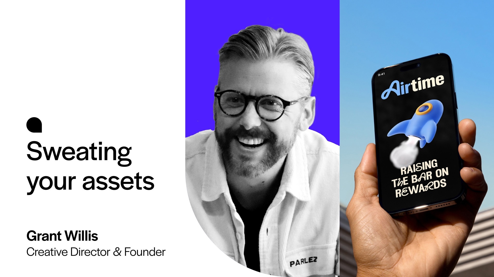
Lessons from Airtime’s bold new identity
Too often, brands invest in creating assets, only to use them sparingly or rigidly applying them across every channel. But when you think of your assets as tools that should work harder and smarter for your business, you can unlock enormous potential. At ODA, we call this “sweating your assets,” and our recent rebrand for Airtime is a great example of how fixed and flexible assets can extend creative expression and impact.
From cashback app to lifestyle companion
The challenge with Airtime was to evolve their brand from being seen as a cashback app into a lifestyle companion for the mobile generation. The goal was to create a brand that felt seamlessly integrated into everyday life while maintaining a strong identity across all channels.
We started off dropping the word “Rewards” from their name to move them beyond the cashback category and position Airtime as part of everyday moments — downtime, lunchtime, breaktime — all valuable “airtime.” To support this, we created a set of fixed assets that provide the foundation for brand recognition and trust:
A signature blue: Airtime’s bold sky blue is a constant across all touchpoints, delivering immediate brand recognition.
Streamlined logo: A modern wordmark with a flowing “A” that represents connectivity and seamlessness.
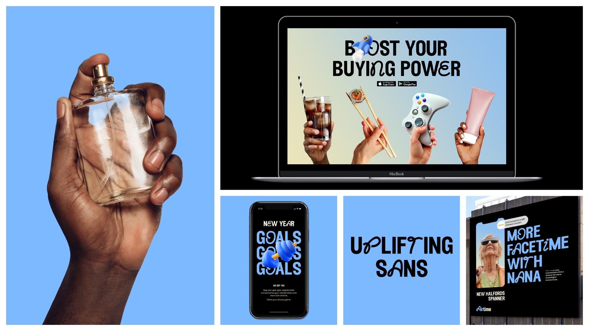
Bespoke dual typeface: A versatile typeface designed to add small, joyful flourishes to messaging, mirroring the everyday pops of joy Airtime users experience when saving money.
These fixed assets give the brand a consistent, recognisable identity that anchors every interaction across all channels.
Maximising creative potential with flexible assets
While fixed assets provide stability, Airtime needed flexible assets to allow the brand to adapt and engage across a variety of contexts.
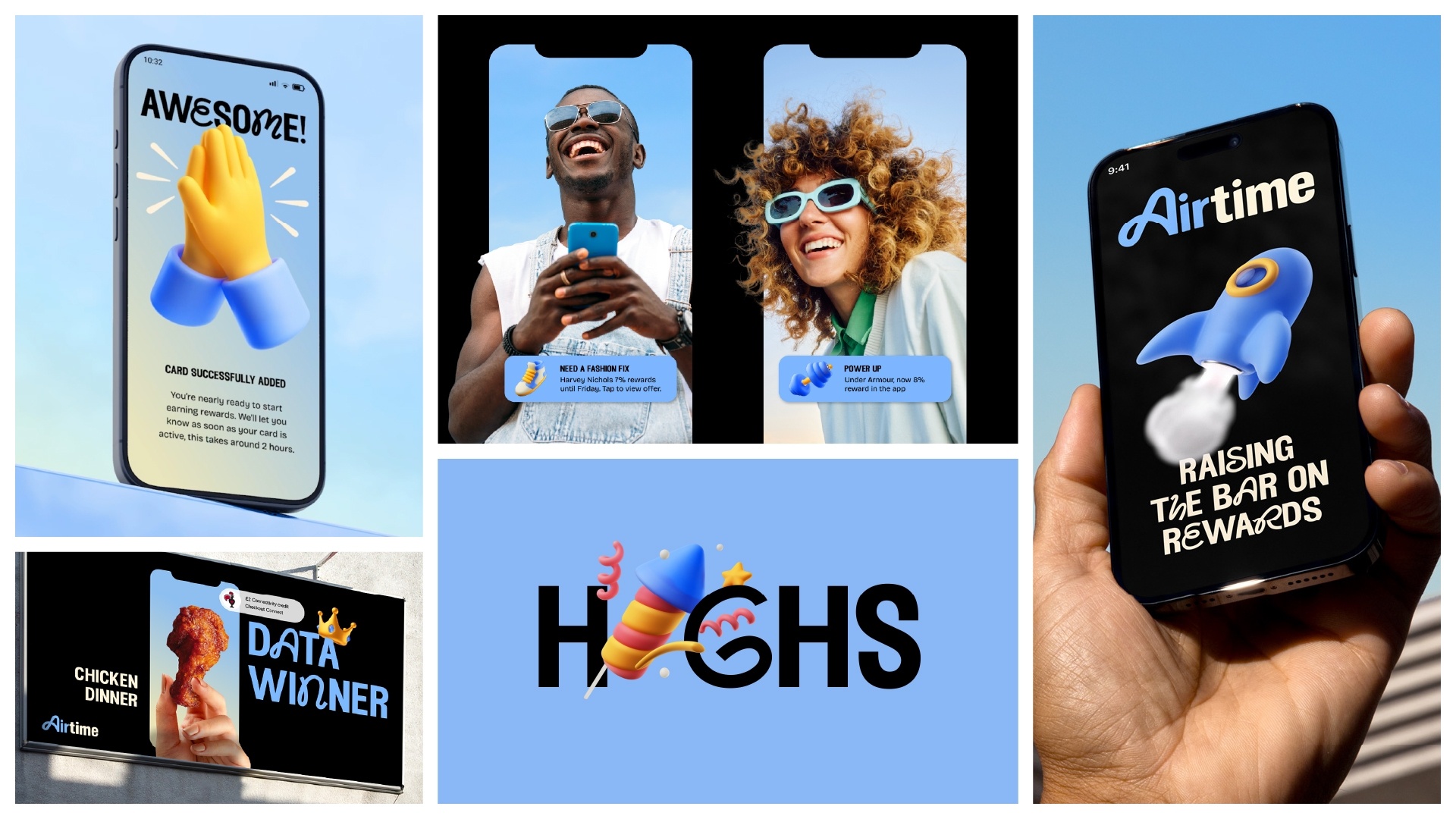
3D illustrations: We designed over 30 bespoke 3D expressions that are vibrant, playful, and unmistakably Airtime. Resembling inflated balloons, these illustrations are full of life. They can be used functionally (e.g., highlighting in-app deals) or emotionally (e.g., fireworks to celebrate rewards). Seasonal adaptations, such as Santa sleeves for Christmas or Black Friday price tags, extend their potential even further. The 3D expressions can even combine with the typeface to replace letters, offering another playful way to communicate the brand.
Photography styles: Two distinct styles bring Airtime’s brand to life. People-focused photography positions Airtime as a lifestyle companion, with users shot from below holding their phones with the sky in the background to represent air. Product-in-hand photography connects Airtime to tangible rewards, showcasing items like food, electricals, tech, and other products tied to specific deals.
These flexible assets allow Airtime to stay fresh, engaging, and relevant across all platforms, from in-app experiences to national campaigns.
Bridging B2B and B2C
Airtime’s brand system had to work seamlessly for both their consumer-facing app and their B2B retail partnerships. By tweaking the same set of assets, we ensured the brand could resonate with both audiences:
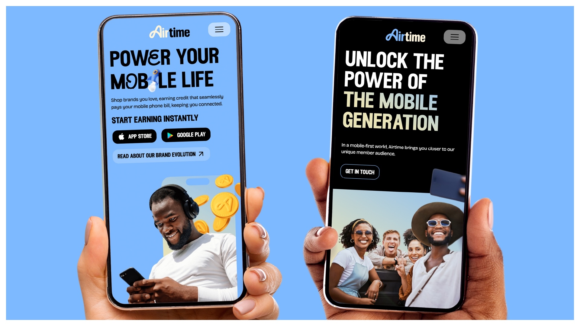
B2C: Bold blue, playful 3D expressions, and vibrant photography create a lively and engaging user experience.
B2B: A more subdued colour palette with black as the primary colour, functional photography, and simplified icons that convey professionalism and showcase the in-app opportunities for retailers.
Lessons from Airtime: How to sweat your brand assets
Anchor with fixed assets: Establish recognisable elements like logos, colours, and typography that create consistency.
Stretch with flexible assets: Develop adaptable tools like illustrations, animations, or photography to stay fresh and relevant.
Bridge audiences: Build a system that works seamlessly for both B2B and B2C without compromising on brand identity.
Adapt for the moment: Seasonal tweaks and campaign-specific assets keep your brand culturally relevant and engaging.
Airtime’s rebrand demonstrates the power of sweating brand assets. By combining fixed elements with flexible ones, we’ve built a system that doesn’t just look good — it works hard. From functional app icons to campaign-ready illustrations, every element plays a role in making the brand more engaging, adaptable, and impactful.
Whether you’re building a brand from scratch or refreshing an existing identity, the key is to make every asset count. By sweating your assets, you can maximise brand recognition, deepen audience engagement, and ultimately drive business success.
Grant Willis, Creative Director & Co-founder, ODA Branding
Want to learn how sweating your assets could transform your brand? Let’s talk.
For more insights and inspiration, follow ODA Branding — where branding means business.