- News
New rebrand for Matchtech: A people-powered superbrand
Jobs will always need to be filled, but the future of recruitment lies in something bigger: helping clients and candidates unlock human potential.
As one of the UK’s top three engineering recruitment companies, Matchtech has spent over 40 years at the heart of STEM, helping solve some of the world’s toughest challenges from clean energy to complex infrastructure. But the brand hadn’t kept pace. It felt dated, transactional and disconnected from the people who powered it.
In a sector shifting from job-filling to consultancy, intelligence and value creation, Matchtech’s strength was never the algorithm. It was the human spark.
We helped reposition the brand from transactional to transformational, creating a future-focused identity that puts pride, purpose and possibility back at its core — and reminds the industry what happens when you lead with humanity.
One powerhouse brand
A fragmented brand kept Gattaca’s intelligence locked in silos, adding friction between clients and candidates.
The challenge was to unite every part of its talent offering under one powerful idea: Matchtech, a single superbrand built on 40 years of STEM heritage.
In a world reinvented by AI, we built a brand that puts people, their ingenuity, optimism and problem-solving spirit at the centre.
People Powered Problem Solvers became our promise, a celebration of human intelligence and creativity. Because the future of recruitment isn’t automation, it’s the amplification of humanity.
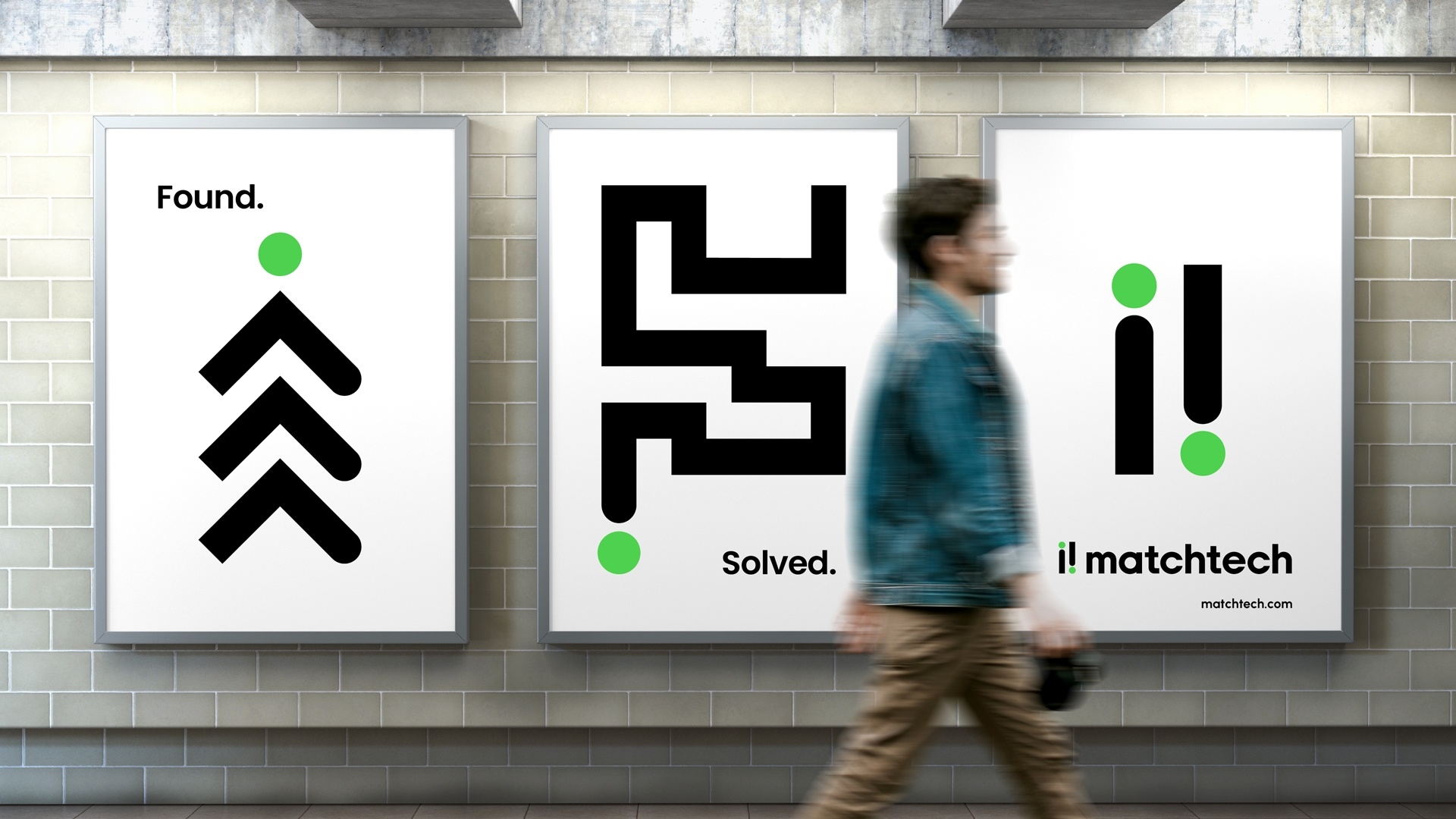
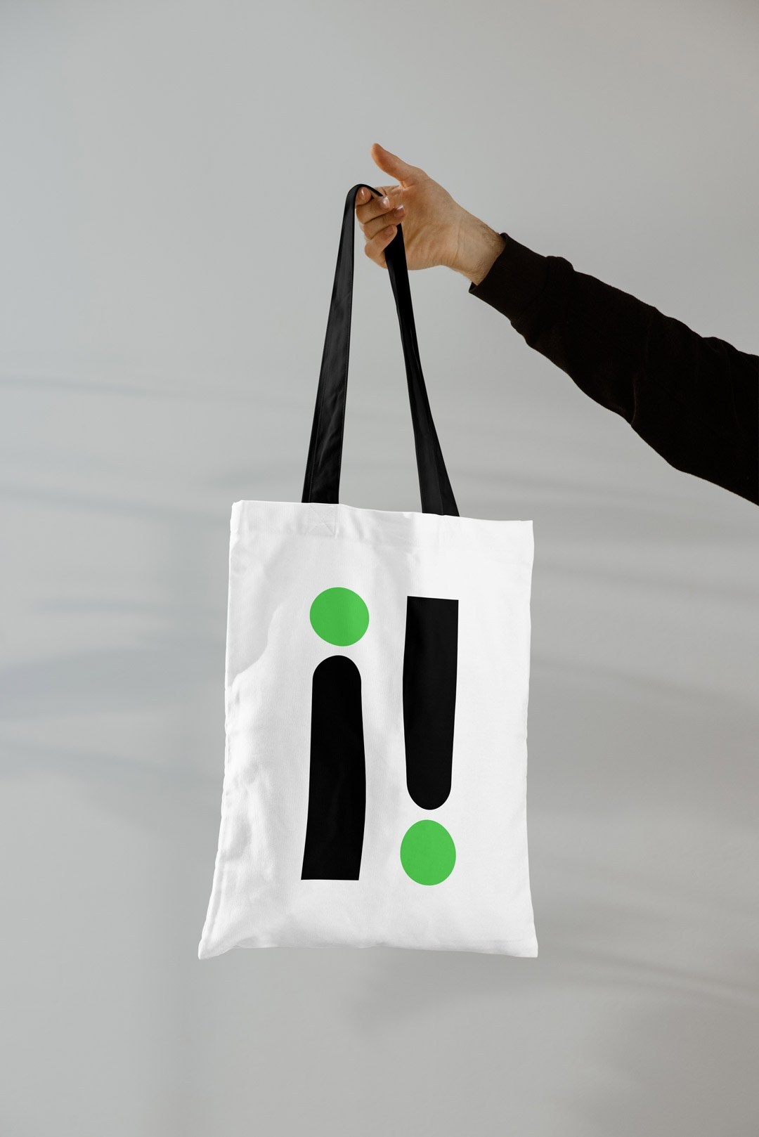
Simple human mark
The new brand and word mark are now confident and approachable. We purposely opted for lowercase lettering to reflect Matchtech’s blend of human warmth and intelligent tech, and the brand mark carries a subtle nod to people and that“aha” moment of problem-solving.
The mark forms the foundation of a simple, flexible design system that lets Matchtech’s specialist sectors express their individuality while still feeling part of something bigger. A tribe of tribes, distinct in expertise yet united by purpose.
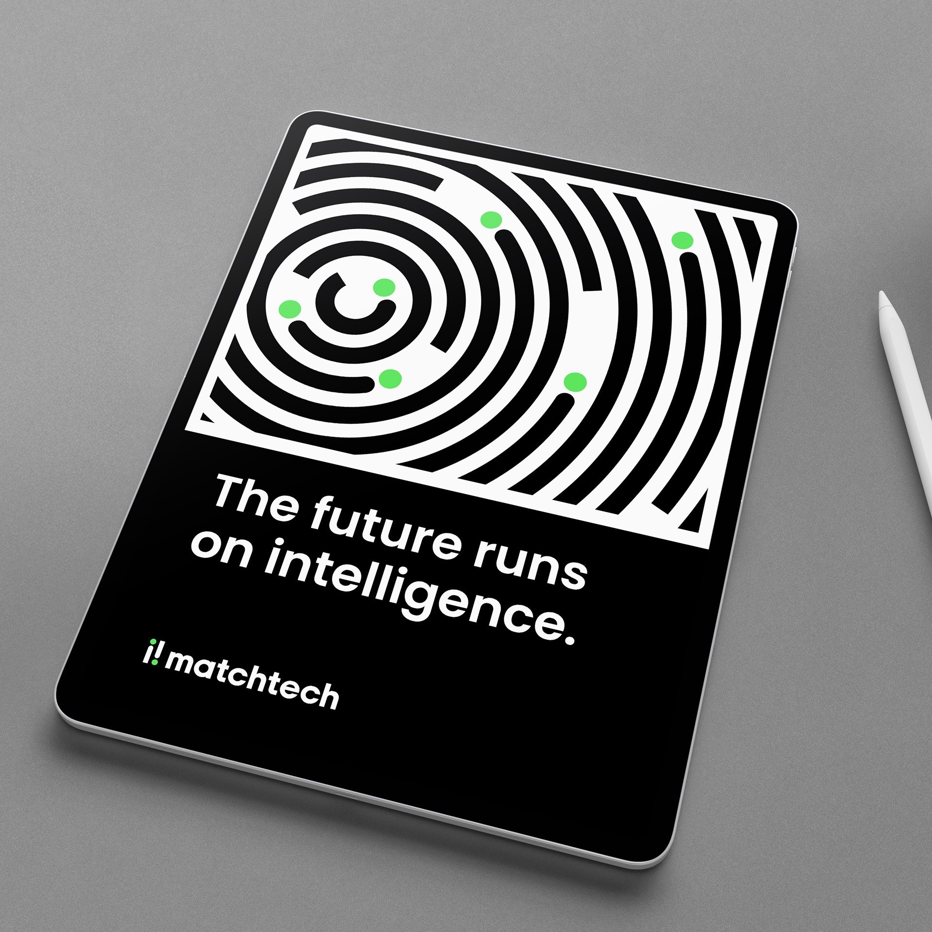
A system built to solve
The new design system is intelligent by design. It feels alive, always thinking, always solving. Inspired by the idea of intelligence buffering, it captures the brand’s agile, curious, ever-progressing nature.
With just a few smart assets, the identity flexes endlessly, proving that simplicity, used intelligently, can be powerfully distinctive. It’s a visual language that doesn’t shout but shows problem-solving and intelligence in a way that’s unmistakably Matchtech.
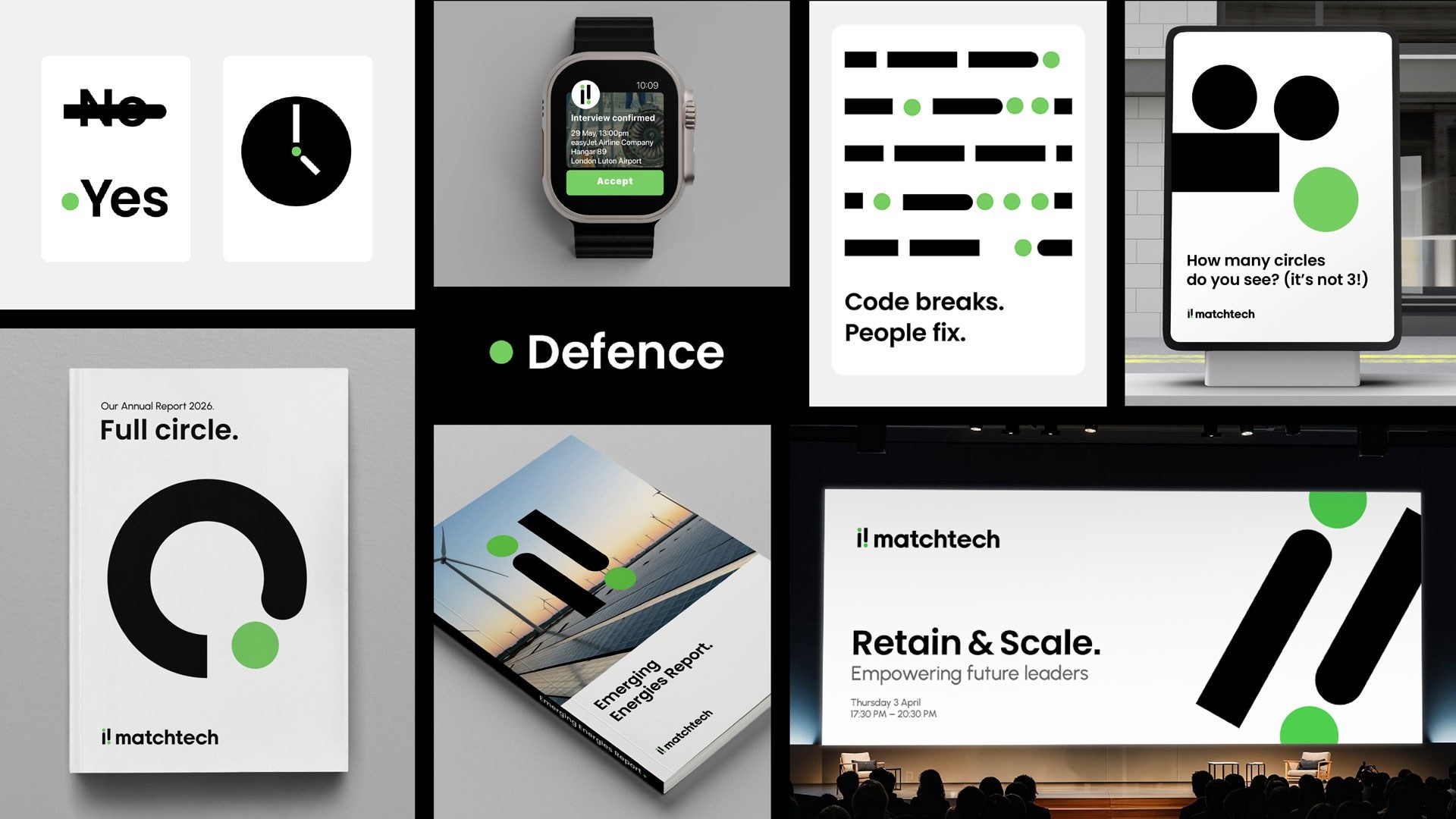
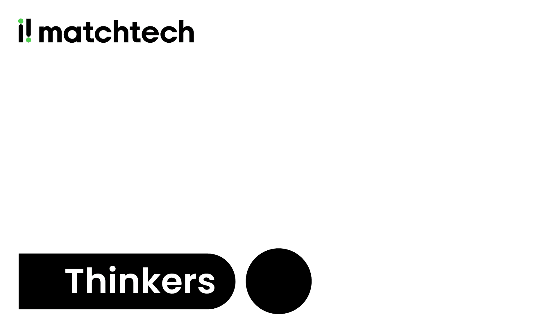
Clear thinking, positive energy
The identity is grounded in timeless black and white: confident, simple and uncluttered, giving Matchtech clarity and credibility.
Then we introduced a distinctive pulse of green, a super-positive, energised accent symbolising progress and the optimism of STEM. In a category weighed down by dark, heavy palettes, Matchtech stands out lighter, brighter and full of possibility.
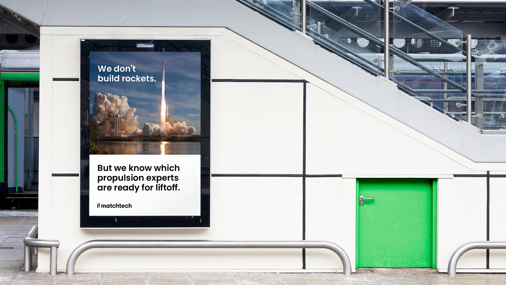
Swagger and substance
The new Matchtech voice is confident, human and unapologetically expert. It brings back a sense of swagger, a voice with something to say and the experience to back it up.
This isn’t the sound of recruiters chasing roles. It’s the voice of people who know the work, the industries and the possibilities inside out. It’s direct, warm and assured, speaking with authority, never formality.
Because Matchtech doesn’t just connect people to jobs. It connects human potential to progress, putting bigger thinking and deeper humanity back at the heart of recruitment.