- News
Costa Coffee colour book features in Digital Arts
How to define a brand’s look with the perfect colour toolkit
Find the perfect hue and ensure total colour consistency on a new branding project, with advice from one of the country’s leading agencies.
As any digital artist full well knows, the process of having consistency in colour when going from screen to print is a haphazard journey; the shades and colour cast of your digital piece won’t look entirely the same on the version that comes out of the printer.
This discrepancy between digital and physical can be further amplified when a brand has an array of items carrying its signature colours. Here a designer needs to consider a whole array of variables when tasked with creating a brand colour toolkit, a style book from which your client can ensure colour consistency.
“Your brief is to look at the in-store experience, print and supplier materials; essentially a colour toolkit is a B2B communication for printers and suppliers to gain greater consistency of a brand colour,” explains Grant Willis, a man who knows about colours and chainstores more than most.
As Creative Director at London’s Our Design Agency (ODA), he’s overseen brand identity work for clients as disparate as flower shows and care providers, along with a successful mission to bring Costa Coffee’s local and global outlets under the same uniform colour. This project came about when the company’s signature red was found to actually not be so signature across items in-store, and even on storefront signage both here and abroad.
This is when a designer can step in to save the day with their toolkit, but the first step is to find an optimum colour identity, the one shade which will define the client’s brand. Rebrand or not, this colour may already be staring at you straight in the face.
“With Costa, we first established the brand colour target,” Grant explains. “We agreed that the colour target was the iconic Costa Coffee take-away cup, that was a beacon for customers, so every other application had to match that colour.”
That said, while the present is an important consideration, it doesn’t hurt to look at the past of your brand, either.
“It was fascinating to research the different shades of colour that Costa Coffee had used since its first high street store and how much change there had been,” he enthuses. “In the 1970s it was a dark brown, the 1980s were characterised by a dark red, whereas the 1990s saw it move to a brighter red with the addition of a ‘pillar box’ red added to the palette that was more reminiscent of fast food.”
“We created a colour timeline to show the evolution of the brand colour over the decades and recommended darkening the palette to give it a more premium feel. In this context the darker red being proposed didn’t feel alien and as such Costa could see that the new colour we were recommending would work.”
Presenting your colour of choice ultimately depends on what your client wants — in the case of Costa, for example, this was to achieve uniformity across multiple markets with suppliers and printers.
After settling on a colour with your client, a technical break-down comes into play, as Grant explains.
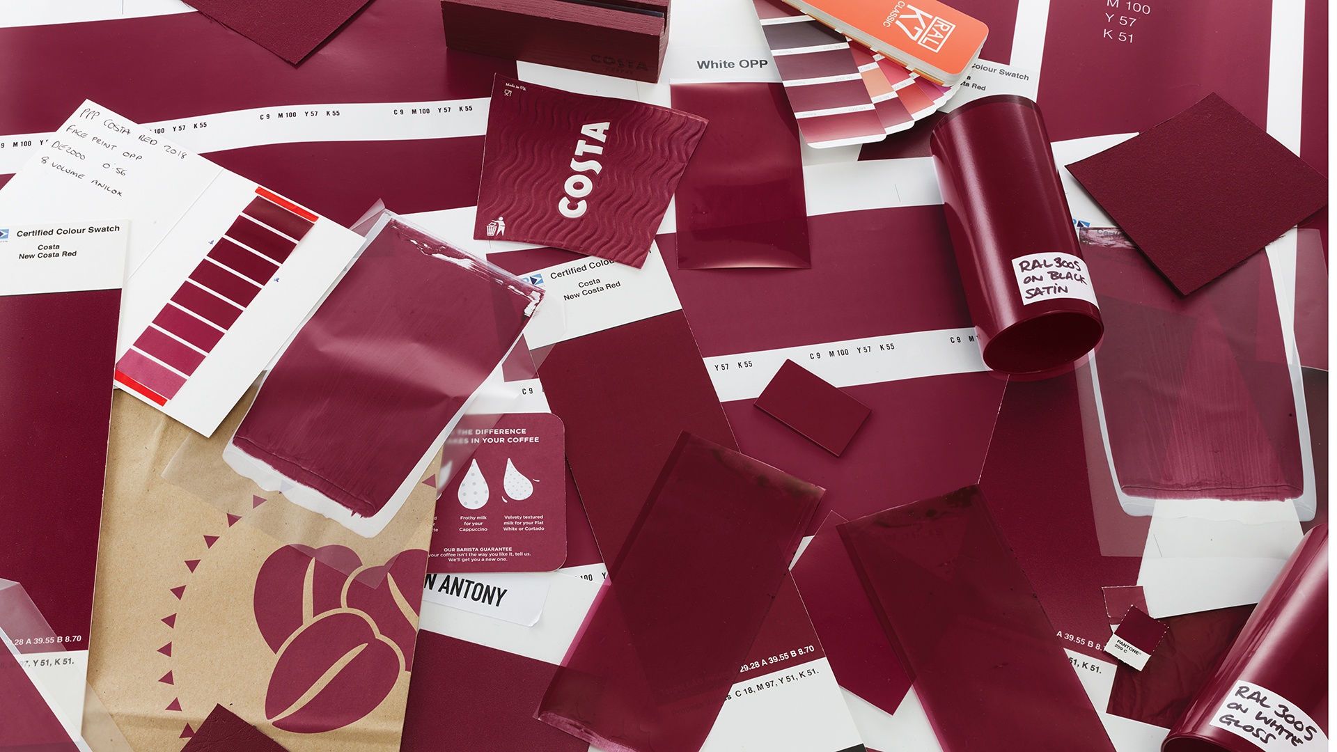
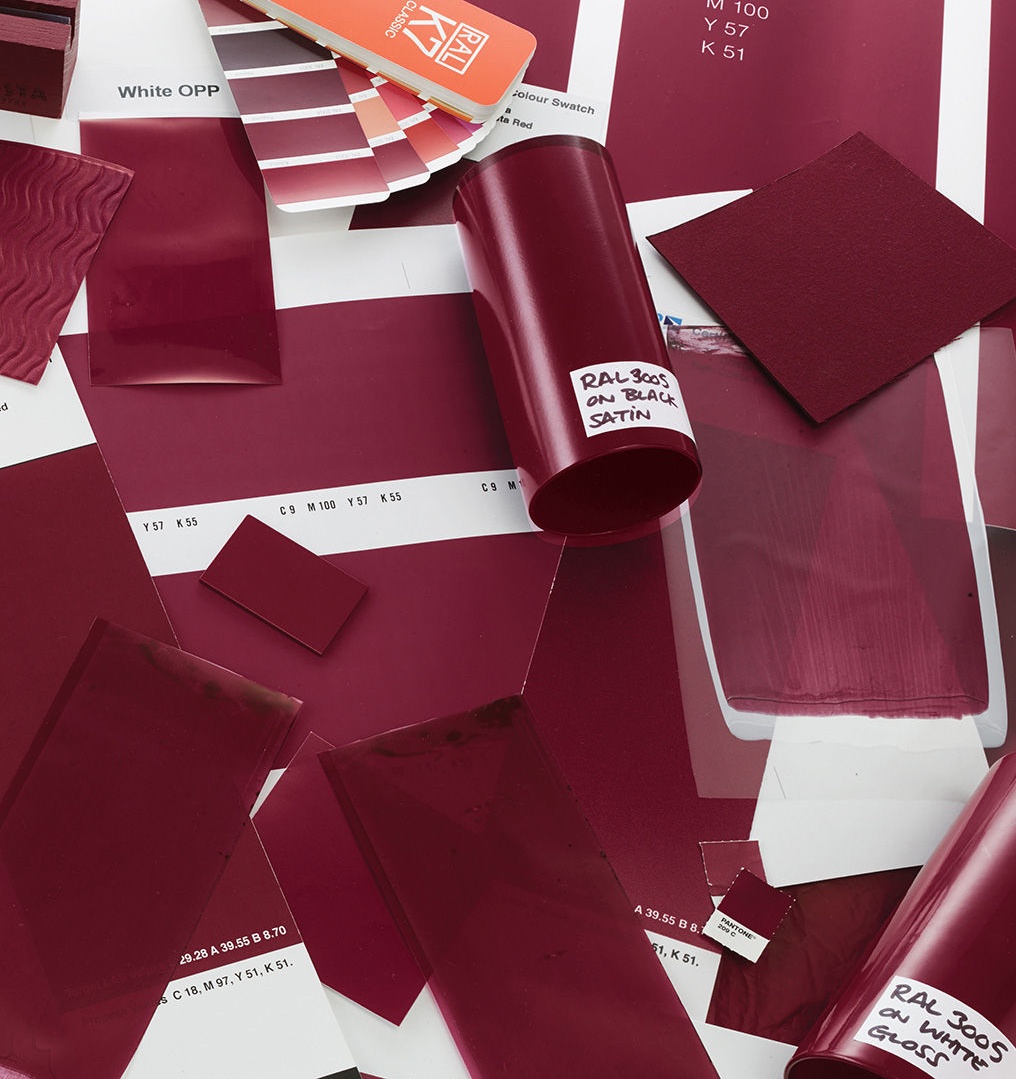
“We used a spectrometer to establish the make-up of that colour, and created print proofs on uncoated and coated paper with slight variations around this initial breakdown to decide which looked best.”
After gaining sign offs on these colours from the client, the process can hit a delay as you apply your colours to the various substrates used by the client — substrates being the base materials onto which your colour will be printed on. The Costa conundrum arose because of this array, with ODA finding there were around 50 – 60 different substrates and materials being used in a store environment that all unintentionally used varying degrees of red.
The various branches were following the original style guide, but ultimately this was irrelevant as the materials altered the look of the supposedly universal brand colour — something every designer should bear in mind when creating their kit.
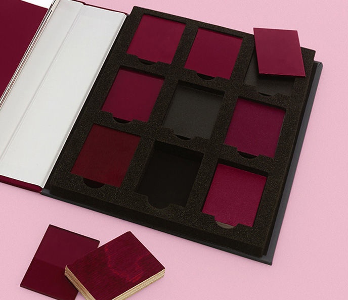
“There was such a wide range of materials, including vinyl, paper, foamex, wood and metal,” Grant explains. “Colours naturally appear in different shades depending on the base material, so we conducted an audit of every substrate and material in use across the company estate. Certain materials will only dye or stain a certain colour so we had to take that into account too.”
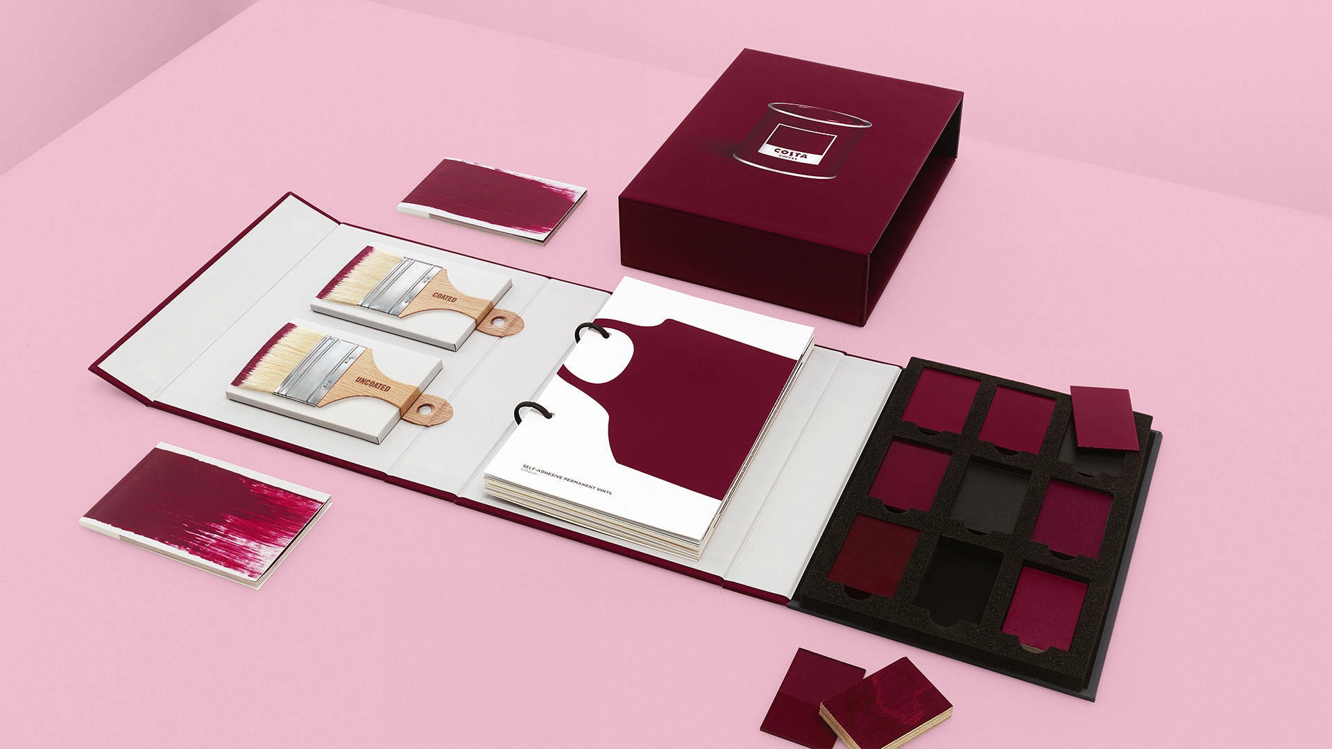
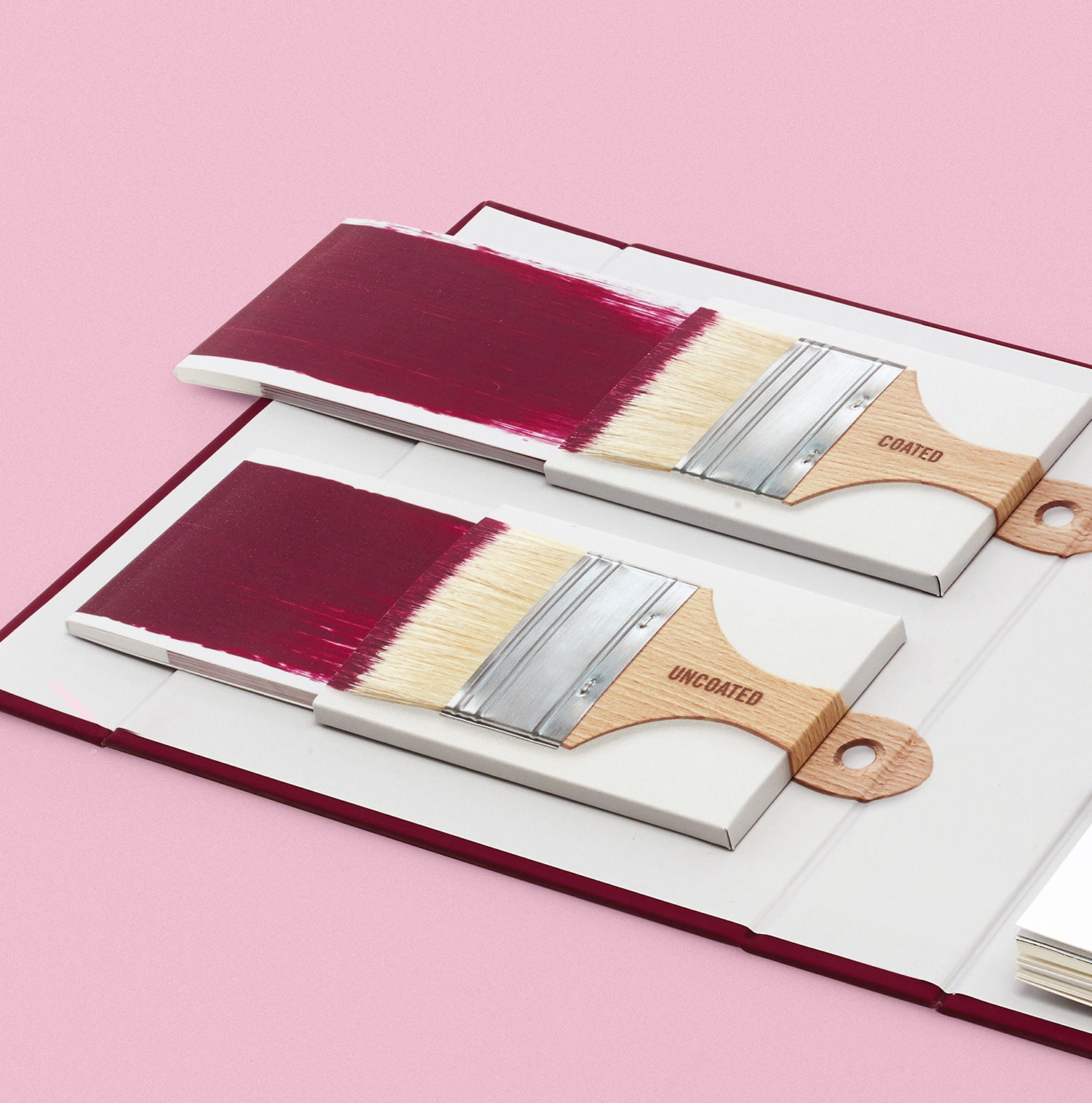
To get around this with your toolkit, a designer will need to make multiple large chips made of the chosen colour on coated and uncoated stock. This will then be sent to every printer and supplier which the client works with, “from the company that prints the lid on a yoghurt pot to the company that makes the uniform,” as in Grant’s experience.
“The scope was every single material used in and out of their stores, from posters to awnings, menu boards to window vinyls.”
Every company receives the colour swatch on coated and uncoated paper so they can test and try to match closer to the colour provided and send this back for approval. In some cases, this process can last two months or so.
“When we received all the new matches, we could then judge the consistency of colour across the board,” Grant continues. “We then sat with the client and signed off the ones they were happy with on each substrate. We show the client everything at every major stage as it’s important for a project of this type to have as many face-to-face meetings as possible.”
“We’re trying to create a blanket colour across multiple materials, so it ultimately needs to look consistent. The acid test was – what do the colours look like to the naked eye? That’s how the customer makes a judgement.”
“There’s a certain amount of acceptance for variation in colour,” Grant continues, “so if it’s on wood or kraft paper, the mind expects and accepts that it will look different to white card due to the natural base colour of those materials. But materials that all have a white base colour, like white card or white foamex for example, should all look the same or it’ll look like a mistake.”
In ODA’s case, they went back to the printers to readjust the settings of the reds that needed refining to ensure the colour was as uniform as possible across all the different substrates. Once this is sorted, you are ready to assemble your final toolkit.
A brand colour toolkit should include every substrate that the brand colour will appear on to provide uniformity across the client’s estate, with ideally a page for each material which displays the correct colour. As ODA ensured with their kit, the pages should be hole punched and placed on a ring binder for ease of use by the printer. This way, pages can be added if a new supplier is added with a new material in the future.
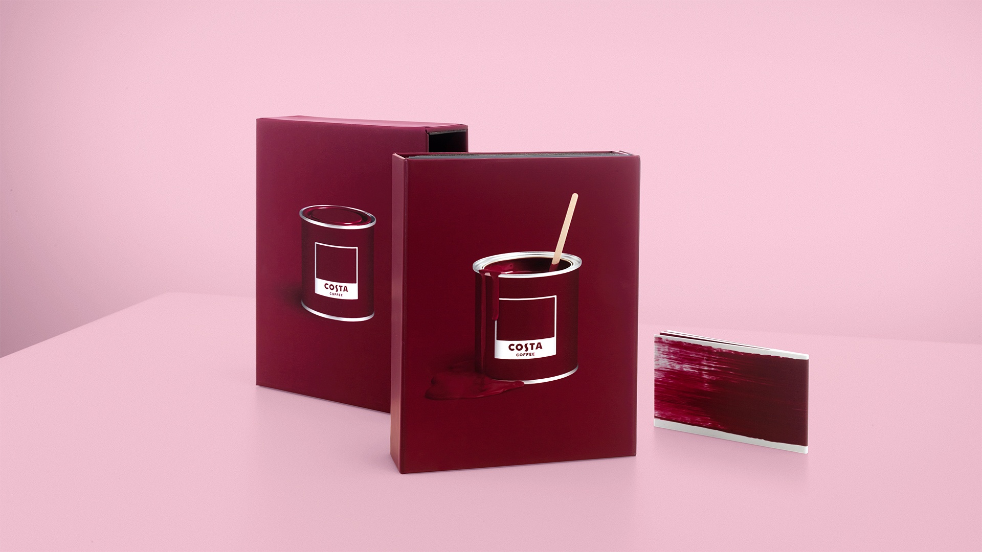
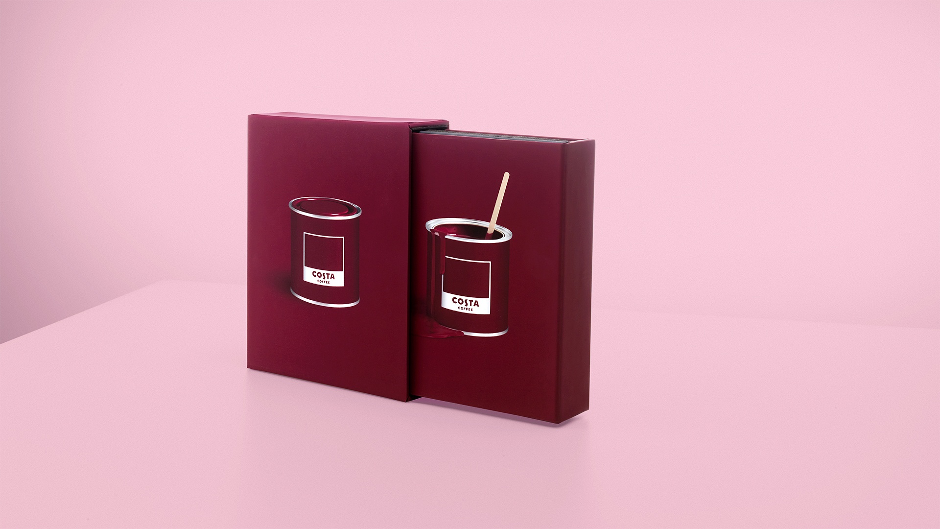
“A slipcase was also designed to hold the brand colour toolkit to protect the contents from fading,” Grant adds on the Costa toolkit. “We also made several mock-ups at key stages along the way to test the structural integrity of the book and show the way the kit opened and functioned in the way it was intended.”
The ODA touch also ensured the final product was more than just a customised swatch book; Grant recommends designers have a little fun with their toolkits.
“We made ten books in total, but Costa Coffee loved the book and has since asked us to make up to another 100,” he says. “It’s got paint brushes that pull paint marks out across the page, and the coffee stirrer in the paint pot is a nod to both Costa and the printers who will be using it. It’s full of personality and fun to use.”
In other words, don’t be afraid to add a little colour.
Check out the full article here
Read the Costa Brand Colour Toolkit case study
6 August, 2018 | Giacomo Lee