- News
Bruce's rebrand featured in Logo Designer
ODA Creates New Logo and Identity for Bruce’s Doggy Day Care
Branding agency ODA has rebranded Bruce’s Doggy Day Care to Bruce’s complete with a new logo and identity designed to appeal to modern pet owners.
Originally founded in 2008, Bruce’s Doggy Day Care is currently aiming to become the UK’s leading national dog day-care brand; the doggy day care market in Britain is said to be worth £1.3bn – and growing.
“The new brand needed to confidently distinguish Bruce’s as a breed apart from local centres and dog walkers and establish it as the category-defining brand experience,” says the agency.
“In the trend towards humanisation and strong bond between pet parents and their dogs, happiness is a major consideration. Our new brand proposition: ‘unleashing happiness and enriching dogs’ lives’ takes the Bruce’s brand beyond the functional need of day-care and into the more emotive world of enrichment,” further explains ODA’s creative strategist, Sarah Westwood.
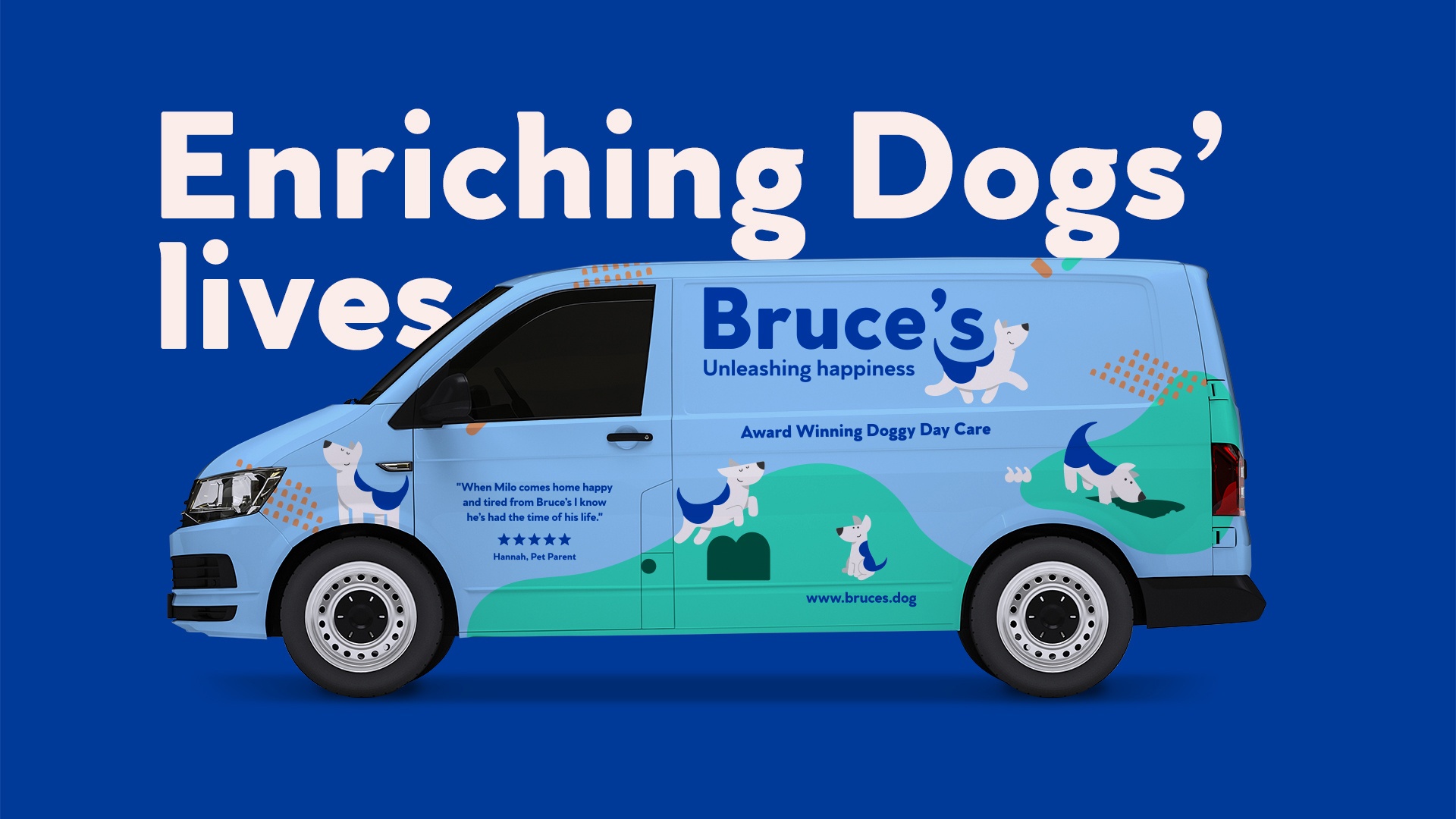
ODA started by stripping the name back to just the word Bruce’s, which is claimed to make the brand “more confident and definitive”.
“The original brand in blue and white felt functional and clinical,” comments ODA creative director, Grant Willis. “We were keen to move the identity on to something that felt more emotional: natural, warmer, positive and uplifting. The new identity is also designed for digital as we identified that the app was a distinctive asset and something pet parents loved.”
ODA’s aim was to create an identity that would not only be instantly recognisable but would also act as an emotional shorthand for the brand.
“The logo is formed from the shape of the Bruce’s B and carries its distinctive markings, embodying the distinctive happy expression of a ‘Bruce’s dog’,” says ODA’s design team.
“We created a family of dogs of different sizes and poses based on the iconic Bruce’s logotype to bring to life the happy social groups at Bruce’s and communicate the core themes of enrichment and socialisation,” adds Willis.
The accompanying typography is always left aligned to match the logo, while the new primary palette is described as “warm, positive and uplifting”, having been influenced by the “natural world of clear skies and green fields”.
Another key element of the new brand identity is a more playful tone of voice that deliberately “steers away from the didactic”.
“We defined a more playful and fun personality and balanced it with real expertise. Dogs are fun and copy needed to reflect that. We introduced simple dog-directed language to make calls to action more light-hearted,” says Westwood.
Check out the full article here
29 March, 2021