- News
Domino’s sub-brand strategy case study

Chicken is booming. It’s one of the fastest growing categories in fast food, fuelled by flavour experimentation and customer demand for more variety. Domino’s wanted a slice of that action.
But when your name is practically shorthand for pizza, how do you stretch credibly into chicken? Adding chicken to the menu wasn’t enough. Domino’s needed a sub-brand, its first, one with a personality, identity, and strategy aligned with the parent brand, but distinct enough to carry its own weight.
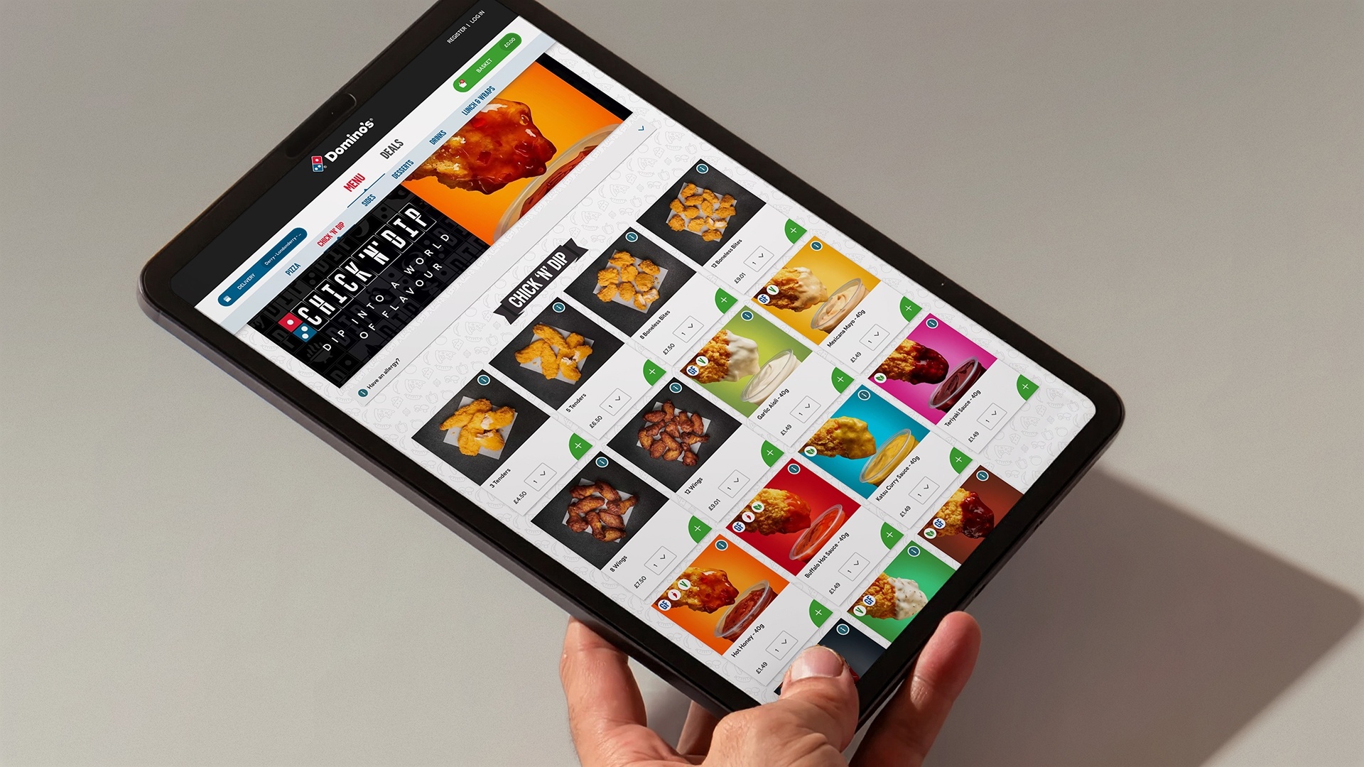
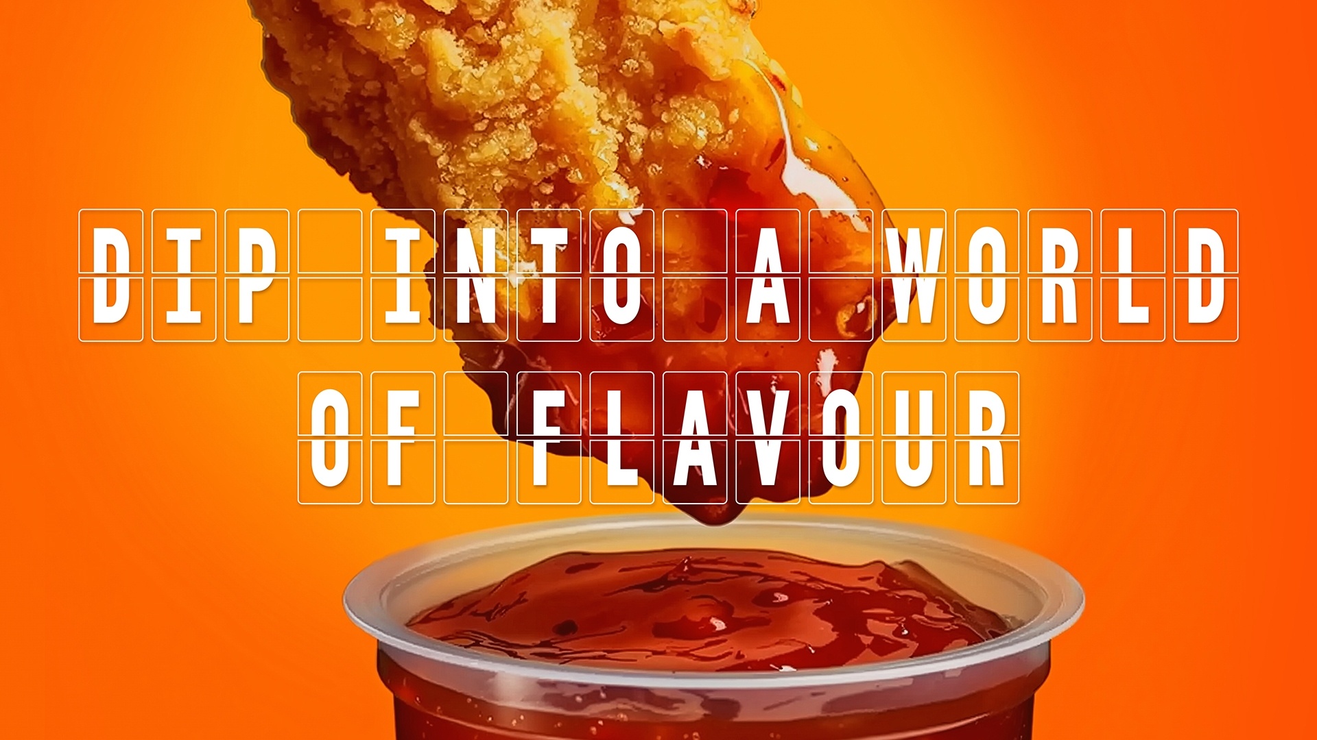
Dip into a world of flavour
We rooted the idea in Domino’s most loved asset after pizza: the dip. Already famous for dips, Domino’s had equity that wasn’t tied to pizza — the perfect bridge into chicken.
The proposition was simple: dip into a world of flavours, where Domino’s iconic dips meet high-quality chicken and global flavours.
Familiar enough to feel Domino’s, but expansive enough to open new territory with globally inspired tastes. More than a creative leap, it was a brand architecture move that made the stretch into chicken both credible and distinctive.
A sticky sub-brand name
Naming Domino’s first sub-brand was about more than a label — it had to signal a new chapter while staying true to the brand’s playful DNA.
Chick ‘N’ Dip is a name that works on every level. Bold and unmistakable, it tells you instantly what’s on offer, while its cheeky, conversational tone speaks in the same voice Domino’s customers already love. Most importantly, it ties chicken to Domino’s most ownable equity — the dip. More than just a product description, Chick ‘N’ Dip captures the spirit of the brand: fun, memorable, and unmistakably Domino’s.
“Chicken gave Domino’s permission to play, but the play had to be rooted in recognisable brand assets. By straightening the domino and reimagining it as a flip-board, we created a design system that feels familiar yet opens up a whole new world of flavour.”
Grant Willis Creative Director ODA Branding
Domino’s but different
The visual identity had to strike a delicate balance: familiar enough to feel like Domino’s, but distinct enough to signal something new. Chicken as a category allows more room for playfulness and even more licence to have fun. We wanted Chick ‘N’ Dip to embrace that spirit while staying grounded in Domino’s DNA.
We started with Domino’s most recognisable asset: the domino itself. By straightening it, we not only gave it a new stance to sit confidently alongside the Chick ‘N’ Dip name — we also unlocked it as a design shape in its own right. That shape became the foundation for the identity system, reimagined as a travel flip-board to cue movement, discovery, and a world of flavour.
From there, Chick ‘N’ Dip was given its own typeface and design language, ensuring it had a voice distinct from pizza, but still familiar. The colour palette leaned into Domino’s core shades for recognition, but expanded with bold, vibrant tones to hero the dips. Black and white provided a confident stage for flavour, while the flip-board device added energy, motion, and appetite appeal.
From there, Chick ‘N’ Dip was given its own typeface and design language, ensuring it had a voice distinct from pizza, but still familiar. The colour palette leaned into Domino’s core shades for recognition, but expanded with bold, vibrant tones to hero the dips. Black and white provided a confident stage for flavour, while the flip-board device added energy, motion, and appetite appeal.
The result is a brand world that feels Domino’s at its core, accessible, cheeky, and energetic, but with a freer, more playful edge that makes it right at home in the chicken space.